Scoring genre clarity...
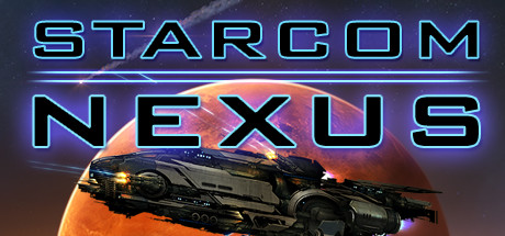
Starcom: Nexus capsule

Starcom: Nexus

Suddenly thrown into an unknown galaxy, you must explore, fight or befriend aliens and transform your ship from a small survey vessel into a powerful battlecruiser to unravel the mystery of the forces that brought you here and find your way home.

$7.99Very Positive(1,844)
SpaceSci-fiRPG
Wx3 Labs, LLCDec 12, 2019

Starcom: Nexus scores 77/100 — better than 77% of Space capsules (n=1,321).

Very Positive (1,844 reviews) · $7.99 · Released Dec 12, 2019 · By Wx3 Labs, LLC

Quick text summary

Starcom: Nexus scored 77/100 on Steam Analyzer — Good for a Space capsule. Top priority fix: [uniqueness_polish] Incorporate a distinctive visual element such as a unique alien silhouette, faction insignia, or ship upgrade module highlight to signal Starcom's specific identity and transformation mechanic.

Capsule scores by dimension

  • Genre Clarity: 8/10 — Clear sci-fi action-adventure spacecraft. The sleek military vessel with glowing engines and weapon hardpoints immediately signals sci-fi action gameplay. The planetary backdrop and space setting clearly establish the genre context. At TINY size, the sharp ship silhouette and orange planet still read as space-faring combat, though fine details blur but don't obscure the core message.
  • Title Readability: 9/10 — Excellent legibility across all sizes. STARCOM NEXUS uses a bold cyan outline with slight glow effect that maintains crisp letterforms even at TINY size. The two-line stacked layout provides strong hierarchy and the glowing neon aesthetic reinforces sci-fi theme. At SMALL and TINY sizes, every letter remains distinct and the title pops cleanly against the dark space background without any collapse or loss of readability.
  • Contrast & Color: 8/10 — Strong luminous separation with warm accents. The cyan neon title glows brilliantly against the dark #1b2838 background with excellent value separation. The warm orange planet and ship engine glow create complementary color contrast that guides focus without overwhelming. At TINY size, the bright title and warm planet core maintain silhouette clarity in grayscale, though some mid-tone engine details soften slightly.
  • Uniqueness & Polish: 7/10 — Polished sci-fi aesthetic, slightly familiar. The capsule demonstrates quality craftsmanship with realistic ship rendering, proper lighting, and coherent neon typography that feels premium. The composition tells a clear story—a military vessel in alien space ready for exploration and combat. However, the space-vessel-plus-planet setup is relatively common in sci-fi games, and while executed well, lacks a truly distinctive hook or memorable visual signature that sets it apart from competitor space action games.
  • Brand Consistency: 6/10 — Competent sci-fi branding, limited identity. The cyan neon aesthetic and military spacecraft design align with expected sci-fi visual language and likely match the game's UI and marketing. The orange planet palette choice creates a recognizable warm accent. However, without access to additional brand materials, there are no obvious iconic character, mascot, or signature symbol that would make this instantly recognizable as Starcom: Nexus specifically rather than any space action game; the branding feels more generic sci-fi than uniquely proprietary.
  • Composition: 8/10 — Clear hierarchy, well-balanced layout. The title anchors the top with the spacecraft dominating the lower-middle frame, creating natural eye flow from text to subject. The planet curves behind the ship providing layered depth without clutter. At SMALL and TINY sizes, the ship silhouette and title remain primary focal points with strong separation; the composition survives scaling well with safe margins and no edge-crop casualties.

What works

  • Title holds legibility at tiny scale. The cyan neon outline with glow maintains character distinction even when compressed to 120×45, ensuring the game name remains readable during quick scrolls.
  • Clear spatial depth and layering. Planet background, ship midground, and title overlay create visual hierarchy that guides attention and maintains visual interest across all viewing sizes.
  • Strong color-genre alignment. The cyan-to-orange palette and neon aesthetic immediately communicate sci-fi action without ambiguity or genre confusion.
  • Polished rendering quality. Ship details, lighting, and effects show professional craft that conveys a premium, competently-made game rather than an indie asset-flip.

What hurts the capsule

  • Generic sci-fi visual language. The space-vessel-and-planet composition is well-executed but common across dozens of space action games, offering no memorable visual signature unique to Starcom: Nexus.
  • Limited brand identity cues. No iconic character, mascot, or distinctive symbol that would allow recognition of this as Starcom specifically; feels like a generic sci-fi game template.
  • Minimal gameplay differentiation in visuals. The capsule conveys 'space combat' generically without hinting at the ship-transformation or alien-befriending mechanics that distinguish the game's core loop.

Priority fixes

  1. [uniqueness_polish] Incorporate a distinctive visual element such as a unique alien silhouette, faction insignia, or ship upgrade module highlight to signal Starcom's specific identity and transformation mechanic.
  2. [brand_consistency] Add a recognizable symbol or motif (e.g., a glowing nexus node, faction logo, or ship name badge) that can anchor brand recognition across future marketing materials.
  3. [genre_clarity] Include a subtle affordance that hints at the exploration or befriending mechanic—such as an alien entity outline, cargo hold glow, or dual-mode ship state—to differentiate from pure combat action games.

Store copy priority fixes

  1. [hook_strength] Expand the opening to include a unique selling point beyond the stranded premise—e.g., 'Suddenly thrown into an unknown galaxy with nothing but a shuttle and a modular construction system to build your way to power' would front-load the game's core differentiator.
  2. [uniqueness] Replace 'beautiful and mysterious open-world' with a specific claim about what makes exploration distinct—e.g., 'procedurally varied anomalies with branching storyline consequences' or 'faction-specific discovery rewards'.
  3. [feature_communication] Add one sentence about progression scope and player power fantasy—e.g., 'Transform your survey shuttle into a weaponized battlecruiser through research and customization' (already in short desc but missing from detailed feature list).
  4. [tone_match] Inject personality into the academy framing—replace 'Sure it's just a light shuttle, but you've got to start somewhere, right?' with a more distinctive voice that reflects the game's tone.

Related guides

Steam app ID: 863590 · Tags: Space, Sci-fi, RPG, Exploration, Action