Scoring genre clarity...
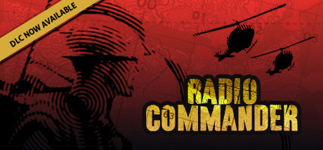
Radio Commander: Vietnam '64 capsule

Radio Commander: Vietnam '64

Use the radio to give commands to the soldiers on the battlefield. Keep track of the situation based on their voice reports only. Lead US platoons to clash with Vietcong in a realistic, innovative approach to the RTS genre. Make hard choices in a narrative driven experience, and face the outcome.

$9.99Mostly Positive(1,748)
SimulationSingleplayerWargame
Serious SimOct 10, 2019

Radio Commander: Vietnam '64 scores 73/100 — better than 51% of Simulation capsules (n=5,423).

Mostly Positive (1,748 reviews) · $9.99 · Released Oct 10, 2019 · By Serious Sim

Quick text summary

Radio Commander: Vietnam '64 scored 73/100 on Steam Analyzer — Good for a Simulation capsule. Top priority fix: [genre_clarity] Add a visual element that suggests radio communication or command—such as a radio headset silhouette, sound wave motif, or command center UI detail—to communicate the unique narrative-driven radio command mechanic.

Capsule scores by dimension

  • Genre Clarity: 7/10 — Military strategy clear but Vietnam setting subtle. The silhouetted helicopters, concentric blast patterns, and military aesthetic immediately signal a war strategy game. At tiny size, the helicopter iconography and dark military imagery remain recognizable. However, the Vietnam-specific period detail is lost at thumbnail size, reading as generic military strategy rather than a historically grounded narrative-driven simulation.
  • Title Readability: 8/10 — Bold yellow title stands out strongly. RADIO COMMANDER in bright yellow-gold renders clearly against the red background at all sizes, with strong value contrast and legible letterforms. The tagline 'DLC NOW AVAILABLE' in the top banner is readable at full size but becomes illegible at tiny size, which is acceptable secondary information. At small and tiny sizes, the main title remains the dominant readable element.
  • Contrast & Color: 8/10 — High-contrast red and yellow creates pop. The saturated red background with bright yellow title text creates strong value separation that reads clearly against Steam's dark background even at thumbnail size. The black silhouettes and line work provide additional contrast layers. The grayscale test shows the yellow maintains excellent separation and the black outlines preserve silhouette clarity throughout all viewing sizes.
  • Uniqueness & Polish: 7/10 — Distinctive military aesthetic with thematic depth. The hand-drawn style helicopter silhouettes and blast pattern graphics evoke a period-authentic Vietnam War aesthetic that differentiates it from generic RTS titles. The radio-communication concept is not visually explicit here, but the overall military briefing room atmosphere suggests strategy and command. The execution feels intentional and crafted rather than templated, though it doesn't visually communicate the unique 'radio-only command' mechanic that defines the game.
  • Brand Consistency: 7/10 — Cohesive military theme with period style. The line-art illustration style, red and black color palette, and helicopter iconography create a recognizable identity consistent with a Vietnam War strategy game. The yellow accent color used for the title helps establish a signature look. Without reference to the 14 store screenshots, internal cohesion appears strong—the hand-drawn aesthetic, atmospheric background pattern, and typography work together without jarring shifts in rendering or tone.
  • Composition: 7/10 — Balanced layout with clear title hierarchy. The title sits in the center-right lower portion with strong focal weight from the yellow color, while helicopter silhouettes anchor the upper-left and center-right areas, creating natural eye flow. The composition avoids clutter and maintains safe margins from edges. At small and tiny sizes, the layout remains coherent, though at extreme reduction the helicopter details blur slightly and the tagline disappears—acceptable given secondary importance.

What works

  • Strong yellow-red contrast. The bright yellow title pops distinctly against the saturated red background and Steam's dark interface, maintaining readability at all sizes including tiny thumbnails.
  • Distinctive military aesthetic. Hand-drawn helicopter silhouettes and blast patterns create a period-authentic Vietnam War atmosphere that differentiates from generic strategy game templates.
  • Clean focal hierarchy. The title placement and color weight guide eye flow naturally without competing elements or scattered attention across the composition.

What hurts the capsule

  • Radio-only mechanic not visually communicated. The capsule shows military command but does not hint at the game's unique selling point—communication via voice reports and radio commands only.
  • Secondary tagline becomes unreadable at tiny size. The 'DLC NOW AVAILABLE' banner is too small to parse at thumbnail sizes, though this is low priority as it is secondary information.
  • Vietnam '64 historical context subtle. While the military aesthetic reads clearly, the specific Vietnam War setting and 1964 period detail are not visually distinct at small sizes, potentially misread as generic Cold War strategy.

Priority fixes

  1. [genre_clarity] Add a visual element that suggests radio communication or command—such as a radio headset silhouette, sound wave motif, or command center UI detail—to communicate the unique narrative-driven radio command mechanic.
  2. [uniqueness_polish] Incorporate a period-specific detail like a 1960s radio, military insignia, or Vietnam-era typography accent to reinforce the historical setting beyond generic military aesthetics.
  3. [composition] Ensure the blast pattern and helicopter silhouettes maintain visual clarity at 120×45 pixel size; consider simplifying fine line detail if blur becomes apparent at extreme reduction.

Related guides

Steam app ID: 871530 · Tags: Simulation, Singleplayer, Wargame, Real Time Tactics, Experimental