Scoring genre clarity...
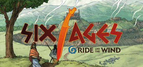
Six Ages: Ride Like the Wind capsule

Six Ages: Ride Like the Wind

Life between myths. Lead the Riders clan into legend or obscurity as you explore an ancient world. Plan ahead as you navigate this challenging storybook strategy game, immersing you in the land of old gods and magic also seen in King of Dragon Pass.

$8.99Very Positive(458)
Choices MatterInteractive FictionRPG
A SharpOct 17, 2019

Six Ages: Ride Like the Wind scores 60/100 — better than 0% of Choices Matter capsules (n=2,195).

Very Positive (458 reviews) · $8.99 · Released Oct 17, 2019 · By A Sharp

Quick text summary

Six Ages: Ride Like the Wind scored 60/100 on Steam Analyzer — Solid for a Choices Matter capsule. Top priority fix: [title_readability] Simplify subtitle or remove it; ensure 'SIX AGES' alone reads clearly at 120x45 with stronger outline weight or drop shadow for tiny survival.

Capsule scores by dimension

  • Genre Clarity: 7/10 — Strategy RPG with pastoral setting clear. The pastoral landscape, mounted figure, and storybook art style communicate a strategic narrative game set in a fantasy world. At tiny size, the silhouette of the rider and natural setting still convey a slower-paced, narrative-driven experience rather than action-focused gameplay. Genre messaging is solid but not immediately distinctive—could read as many different RPG types.
  • Title Readability: 6/10 — Title readable at full, struggles tiny. The 'SIX AGES' wordmark in bold red/orange with orange '6' is clear at full header size and small capsule size, but at tiny 120x45 thumbnail the letterforms compress and become harder to parse quickly. The red outline against the pale background helps, but the subtitle 'RIDE THE WIND' becomes illegible at tiny size, creating incomplete brand communication on quick scroll.
  • Contrast & Color: 6/10 — Adequate separation with some muddy zones. The red/orange title text contrasts well against the light background, and the mounted figure reads clearly against the sky. However, the mid-tone greens and earth tones of the landscape create soft transitions that lose definition at tiny size, and the dense tree foliage blends into itself without strong value separation.
  • Uniqueness & Polish: 6/10 — Competent storybook style, generic execution. The watercolor-influenced landscape and hand-drawn aesthetic give a storybook quality appropriate to the game's themes, but the composition and character placement feel conventional for the genre. The art is clean and professional, but lacks a distinctive hook or visual moment that communicates this game's unique mechanics or story hook compared to other fantasy RPGs.
  • Brand Consistency: 5/10 — Minimal internal cohesion cues present. The palette and rendering style are consistent across the visible elements, but there are no strong iconic symbols, character recognition motifs, or signature design elements that would make this capsule recognizable as 'Six Ages' specifically versus a generic fantasy RPG. The subtitle 'Ride the Wind' is narrative flavor but not a visual brand anchor.
  • Composition: 6/10 — Balanced but predictable landscape layout. The composition uses a clear foreground (rider), midground (tree), and background (hills), creating decent depth layering. The title placement overlays the upper portion without obscuring key elements, and the rider is centered as the focal point. However, the layout feels static and predictable—the rider and tree are positioned in expected places with no compositional tension or visual surprise that would make it stand out at small sizes.

What works

  • Strong red title contrast. The bold red/orange 'SIX AGES' text with outline separation reads clearly against the pale background at full and small sizes.
  • Appropriate thematic art style. The watercolor landscape and hand-drawn aesthetic effectively communicate a storybook strategy game aligned with the game's narrative focus.
  • Clear primary focal point. The mounted rider serves as an unambiguous visual anchor that guides attention and maintains hierarchy across viewing sizes.

What hurts the capsule

  • Subtitle illegible at tiny size. 'RIDE THE WIND' becomes unreadable at 120x45 pixels, fragmenting the brand message during quick Steam scrolling.
  • Generic fantasy landscape composition. The pastoral scene with tree, rider, and hills reads as a standard RPG template without distinctive visual storytelling or mechanical hints.
  • Soft value transitions in foliage. Mid-tone greens and tree details blur together at small sizes, reducing silhouette clarity and visual separation.
  • No iconic brand identity signal. The capsule lacks a recognizable symbol, character silhouette, or signature motif that could anchor brand recall compared to competitors.

Priority fixes

  1. [title_readability] Simplify subtitle or remove it; ensure 'SIX AGES' alone reads clearly at 120x45 with stronger outline weight or drop shadow for tiny survival.
  2. [uniqueness_polish] Add a distinctive visual element—such as a unique character trait, magical effect, or cultural costume detail—that hints at the Riders clan identity or the game's mechanics.
  3. [contrast_color] Increase value separation in tree and foliage with darker shadow lines or edge highlights to maintain silhouette definition at small sizes.
  4. [composition] Introduce compositional tension such as dynamic rider pose or angled landscape line to differentiate from generic fantasy RPG template.

Store copy priority fixes

  1. [hook_strength] Combine the short and detailed opening into a single stronger version: remove the duplicate 'Life between myths' line and lead with a unique hook such as 'Guide the Riders clan through four centuries of survival, politics, and divine intrigue in Glorantha' to differentiate from KoDP mentions.
  2. [feature_communication] Add a brief paragraph explaining the turn structure and core gameplay loop: e.g., 'Each season presents story encounters and resource decisions. Manage your clan's food, weapons, and alliances while navigating supernatural events that echo through generations.' This clarifies what 'moment-to-moment' play feels like.
  3. [audience_targeting] Insert a sentence explicitly positioning the game for its core audience early in the detailed description: 'If you loved King of Dragon Pass, or seek deep narrative strategy with consequences that reshape your clan across centuries, Six Ages is built for you.' This validates existing fans while signaling new players that heavy story+strategy is the appeal.
  4. [uniqueness] Replace or expand the generic 'same world as King of Dragon Pass' phrasing with a concrete differentiator: 'Explore a younger Glorantha thousands of years before King of Dragon Pass—discover the myths that shaped future kingdoms, and forge your own Riders legacy from scratch.' This frames it as prequel exploration, not just a reskin.

Related guides

Steam app ID: 881420 · Tags: Choices Matter, Interactive Fiction, RPG, Simulation, Strategy