Scoring genre clarity...

Slottoki capsule

Slottoki

The slot machine roguelike. Level up your symbols, collect powerful items, and create game-breaking builds to win big.

StrategyRogueliteCasual
Async GamesComing soon

Slottoki scores 73/100 — better than 57% of Strategy capsules (n=5,329).

Released Coming soon · By Async Games

Quick text summary

Slottoki scored 73/100 on Steam Analyzer — Good for a Strategy capsule. Top priority fix: [genre_clarity] Add subtle UI or symbol hints (e.g., small card silhouettes, rune patterns, or upgrade icons) within or near the gems to signal the roguelike strategy layer at all sizes.

Capsule scores by dimension

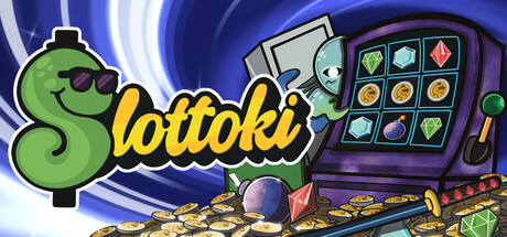
  • Genre Clarity: 7/10 — Casual game vibe clear, mechanics unclear. The playful green worm mascot with sunglasses and bright color palette immediately signal a casual, lighthearted indie game. However, at TINY size the gem shapes behind the character are the only hint toward the slot machine mechanic—the roguelike strategy layer is not visually communicated. The genre feels approachable but the specific gameplay loop (slot roguelike) is not obvious from visuals alone without reading the title.
  • Title Readability: 8/10 — Bold yellow title stands out well. The 'Slottoki' title in thick yellow lettering with a black outline reads clearly at FULL and SMALL sizes against the green background and geometric shapes. At TINY size the title remains legible due to weight and color contrast, though fine serifs in the 'i' may blur slightly. Strategic placement in the upper portion with the character below ensures the title remains in a safe zone across all viewing sizes.
  • Contrast & Color: 8/10 — Strong warm-cool palette separation. The lime green character pops against the cooler background tones (blues, purples) and the warm golden-yellow title creates excellent value separation from both. At TINY size the silhouette of the worm and gems remains distinct and readable against the Steam dark background. The saturated primary colors (red, green, yellow, blue gems) create a vibrant, non-muddy visual field with clear edges throughout.
  • Uniqueness & Polish: 7/10 — Charming mascot, familiar casual aesthetic. The quirky green worm character with sunglasses is memorable and has personality, suggesting a tongue-in-cheek tone that differentiates it from generic slot games. The geometric gem shapes and playful art style feel intentional and polished rather than template-based. However, the overall visual language sits within the well-established casual indie palette (bright colors, rounded forms, cheerful tone) without a singular standout hook that screams 'slot roguelike'—it reads as a fun casual game first, strategy game second.
  • Brand Consistency: 7/10 — Cohesive playful identity, recognizable mascot. The bright, saturated color palette and the green worm mascot with sunglasses feel like a consistent brand voice—playful, confident, and approachable. The geometric gem motif reinforces the slot theme internally. Without seeing store screenshots, the mascot and palette appear strong enough to anchor recognition, though the identity leans toward 'fun casual game' rather than specifically signaling 'strategic deck-building roguelike' as a unique selling point.
  • Composition: 7/10 — Clear focal point, balanced layout. The green worm character anchors the center-left and draws the eye immediately, while the geometric gems frame and balance the composition on either side. The title sits above in the upper safe zone without edge-hugging. At SMALL and TINY sizes the character remains the clear primary subject and the gems provide supporting visual rhythm without competing for attention.

What works

  • Strong title contrast and readability. Yellow text with black outline pops against green background and remains legible at tiny size.
  • Charming mascot with personality. The sunglasses-wearing worm feels distinctive and memorable compared to generic slot game icons.
  • Vibrant color separation from Steam background. Warm and cool tones create excellent value contrast that ensures silhouettes read clearly in grayscale and at quick glance.

What hurts the capsule

  • Slot roguelike mechanic not visually obvious. At tiny size the gems and character do not clearly communicate that this is a strategic deck-building roguelike rather than a simple casual clicker.
  • Generic casual palette may blur with competitors. While charming, the bright primary colors and playful worm aesthetic align closely with other indie casual titles, reducing visual distinctness in browsing.
  • Busy background pattern competes with focal point. The scattered coin texture fills the background and creates visual noise that slightly distracts from the central character and gem composition.

Priority fixes

  1. [genre_clarity] Add subtle UI or symbol hints (e.g., small card silhouettes, rune patterns, or upgrade icons) within or near the gems to signal the roguelike strategy layer at all sizes.
  2. [uniqueness_polish] Strengthen the unique selling point visually by integrating a visual metaphor for 'level-up' or 'build crafting' (e.g., stacked symbols, glow effects, or ascending gem hierarchy) to differentiate from generic casual slots.
  3. [composition] Reduce or simplify the background coin scatter to decrease visual clutter and allow the central character and gem composition to command full attention at small sizes.
  4. [brand_consistency] Ensure the worm mascot and gem motif appear consistently across all store assets and promotional materials to build icon recognition.

Related guides

  • Steam page optimisationCapsule, copy, screenshots, tags — the full Steam page conversion stack.
  • Steam tags guideTag selection, ordering, and how it shapes Steam's recommendation rails.

Steam app ID: 896120 · Tags: Strategy, Roguelite, Casual, Incremental, Roguelike