Scoring genre clarity...
Axis & Allies 1942 Online capsule

Axis & Allies 1942 Online

Play the classic board game, Axis & Allies 1942 2nd Edition! Act as WWII powers in a turn-based strategy game that fits your screen and schedule— get notified on your turn and command armies at your own pace! Team up with friends, challenge the world’s top players, or go solo vs. A.I.

$19.99Mostly Positive(23)
WargameBoard GameStrategy
BeamdogNov 9, 2021

Axis & Allies 1942 Online scores 87/100 — better than 99% of Wargame capsules (n=476).

Mostly Positive (23 reviews) · $19.99 · Released Nov 9, 2021 · By Beamdog

Quick text summary

Axis & Allies 1942 Online scored 87/100 on Steam Analyzer — Excellent for a Wargame capsule. Top priority fix: [genre_clarity] Maintain current clear military iconography to preserve WWII strategy identity—no changes needed.

Capsule scores by dimension

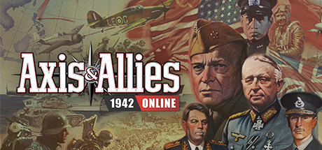
  • Genre Clarity: 9/10 — WWII strategy instantly recognizable. The capsule immediately communicates turn-based historical strategy through iconic WWII military commanders, period aircraft, maps, and flags. At tiny size, the military uniforms, general portraits, and historical aesthetic remain unmistakably clear, signaling a serious strategy game set in WWII without ambiguity.
  • Title Readability: 9/10 — Bold white title with strong contrast. The title 'Axis & Allies' is rendered in large, bold white sans-serif with a thin anchor/sword icon separator, ensuring excellent legibility at all sizes including tiny thumbnails. The subtitle '1942 ONLINE' sits on a red background bar that provides further contrast and hierarchy, remaining fully readable even at 120x45px.
  • Contrast & Color: 9/10 — Warm vintage palette pops cleanly. Warm sepia and tan tones throughout contrast well against the Steam dark background #1b2838, with white title text providing strong value separation. The red accent bar for '1942 ONLINE' adds vibrant pop without overwhelming the composition, and military silhouettes maintain clear edges even in grayscale.
  • Uniqueness & Polish: 8/10 — Authentic historical design with premium feel. The capsule employs a cohesive vintage propaganda poster aesthetic with period-accurate military uniforms, commanders' portraits, and historical maps that feel intentional and polished, not generic template work. The anchor/sword icon and red bar treatment add branded touches that elevate the presentation above standard strategy game capsules while authentically representing the board game's historical setting.
  • Brand Consistency: 8/10 — Strong WWII identity with recognizable elements. The capsule establishes a clear internal identity through consistent warm vintage color grading, historical military portraiture, and period iconography (flags, aircraft, uniforms, maps). The white title treatment with separator icon and red accent bar create memorable brand signals that reinforce the classic board game's serious strategic positioning.
  • Composition: 9/10 — Balanced hierarchy with clear focal point. The title dominates the top third with confident placement on controlled background, while four military commander portraits create a strong center focal point at mid-composition, flanked by supporting historical elements (aircraft, flags, maps) that frame without competing. Safe margins protect key elements across Steam crop scenarios, and the layering from background maps through portraits to foreground title creates effective depth that reads cleanly at tiny size.

What works

  • Exceptional title legibility. White bold typography with high contrast anchor icon and red accent bar ensures the game title remains crisp and readable at all sizes down to 120x45px thumbnails.
  • Authentic historical aesthetic. Vintage WWII propaganda poster styling with period uniforms, commander portraits, and historical maps creates premium, intentional visual storytelling rather than generic strategy game imagery.
  • Strong genre communication. Military commanders, aircraft, flags, and maps immediately signal turn-based historical strategy without ambiguity, making genre and setting crystal clear even at tiny size.
  • Cohesive warm color palette. Sepia and tan tones with red accents create a unified nostalgic aesthetic that pops against Steam's dark background while maintaining internal visual consistency.

What hurts the capsule

  • Busy background elements. The background contains many competing details (map gridlines, troops, aircraft) that could risk slight visual confusion when viewed as a tiny thumbnail, though current execution manages this well.
  • Portrait similarity at scale. At very small sizes, the four commander portraits may begin to feel less distinct as individual faces blur together, potentially reducing character recognition below full size.

Priority fixes

  1. [genre_clarity] Maintain current clear military iconography to preserve WWII strategy identity—no changes needed.
  2. [title_readability] Ensure white title outline thickness remains visible at 120px width during any future refinements to sustain tiny-size legibility.

Store copy priority fixes

  1. [hook_strength] Rewrite the opening to lead with the asynchronous turn system as the key innovation: 'Command WWII armies at your own pace—get notified when it's your turn and play across 24 hours, weeks, or whenever you're free.' This replaces generic 'classic' with specific mechanic.
  2. [uniqueness] Add a sentence differentiating the digital version from the board game: 'Includes [specific feature board game lacks, e.g., AI difficulty levels, automated rule enforcement, or ranked progression]' to justify why players should choose this over owning the physical game.
  3. [feature_communication] Replace or condense the atmospheric WWII closing paragraph with one concrete feature or USP sentence, or move it after the mechanics list to avoid burying gameplay information.

Related guides

Steam app ID: 898920 · Tags: Wargame, Board Game, Strategy, Turn-Based Strategy, Tabletop