Scoring genre clarity...

Moduwar capsule

Moduwar

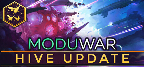
Moduwar is an adaptive organic RTS where you control an alien creature, Modu - and your body is your army. Grow new organs, split, merge and mutate them into unique units that adapt to your needs as you fight against human and alien threats in single and multiplayer modes.

$8.99Very Positive(119)
Early AccessRTSStrategy
Biohex StudiosJun 3, 2025

Moduwar scores 63/100 — better than 5% of Early Access capsules (n=3,121).

Very Positive (119 reviews) · $8.99 · Released Jun 3, 2025 · By Biohex Studios

Quick text summary

Moduwar scored 63/100 on Steam Analyzer — Solid for a Early Access capsule. Top priority fix: [uniqueness_polish] Remove the HIVE UPDATE subtitle text from the capsule and replace with a single strong tagline or leave the title solo to improve brand permanence and professional feel.

Capsule scores by dimension

  • Genre Clarity: 6/10 — Sci-fi RTS hint, ambiguous. The space battle imagery with laser beams, alien organic masses, and what appear to be warships in the upper background suggest a sci-fi strategy or shooter context. At tiny size the organic blob in the center could read as a bullet hell or action game rather than an RTS, and the unique 'your body is your army' mechanic is not communicated visually. The hexagon logo with a creature icon in the top left provides a subtle strategy cue but collapses entirely at tiny size.
  • Title Readability: 7/10 — Bold title reads at small size. MODUWAR in green and white bold lettering with clean contrast against the dark background reads well at small and even tiny sizes due to its large weight and simple letterforms. The subtitle HIVE UPDATE in yellow below is readable at small size but becomes very difficult to parse at tiny size, and its presence as a secondary line competes with the main title for hierarchy. The two-tone color split on MODUWAR between green and white is a clever stylistic choice that holds up reasonably well at reduced sizes.
  • Contrast & Color: 7/10 — Good separation with vivid palette. The warm pink and purple organic mass in the center contrasts well against the deep blue-purple space background, and the bright laser beam streaks add dynamic energy and value contrast. Against Steam's #1b2838 dark background the overall image pops reasonably well due to the bright central glow and title colors. In grayscale the silhouette of the organic creature mass loses some edge definition against the slightly lighter background sky, reducing separation at tiny size.
  • Uniqueness & Polish: 6/10 — Competent but genre-generic feel. The space battle aesthetic with lasers and organic alien forms is visually interesting and the dual-threat composition of alien blobs versus human warships hints at the game's conflict, but the overall execution feels somewhat stock sci-fi rather than distinctly memorable. The HIVE UPDATE subtitle text reduces the capsule's timelessness and makes it feel like a promotional patch note rather than a product identity. Compared to top-performing indie capsules like Hades II or DAVE THE DIVER, the design lacks a singular iconic visual hook that would make it stand out on a scroll.
  • Brand Consistency: 6/10 — Internal cohesion is functional. The hexagonal logo in the top left with the alien creature silhouette is a consistent brand motif that ties to the game's identity, and the green and yellow title palette provides a recognizable color signal. However the HIVE UPDATE label undermines a clean brand read by turning the capsule into a versioned announcement rather than a stable identity asset. The organic alien versus mechanical human ships theme is coherent internally but does not establish a strongly unique signature that would be immediately recognizable across multiple store assets.
  • Composition: 6/10 — Centered action, adequate hierarchy. The central organic mass serves as a focal point with the warships in the upper background providing depth layering, and the title block anchored at the bottom creates a clear bottom-heavy hierarchy. At small size the composition reads as a center subject with text below, which is functional, but the top-left hexagon logo competes slightly with the upper scene rather than anchoring quietly. The title block with two lines of text stacked creates a slight clutter at tiny size where HIVE UPDATE becomes unreadable noise rather than useful information.

What works

  • Bold readable title at small size. MODUWAR in large green and white bold type with high contrast against the dark background remains legible even at small capsule dimensions.
  • Dynamic sci-fi scene with depth. The layered composition of organic alien mass in the foreground and warships in the background creates a sense of scale and conflict that communicates an action-oriented sci-fi game.
  • Vivid color palette pops on dark Steam background. The warm pink organic glow, bright laser streaks, and bold yellow subtitle create enough luminance contrast to catch the eye during a quick scroll against #1b2838.
  • Hexagon logo provides brand anchor. The top-left hexagonal badge with a creature silhouette is a consistent identity element that could become recognizable across store assets.

What hurts the capsule

  • HIVE UPDATE subtitle hurts brand permanence. Placing a patch name on the capsule makes it feel like a limited promotional asset rather than a stable store identity, reducing shelf life and professionalism compared to top genre peers.
  • Organic creature silhouette unclear at tiny size. The central alien mass loses its distinctive shape at tiny thumbnail size and can read as generic particle effects or explosion rather than a creature that is also your army.
  • Genre mechanic not communicated visually. The unique RTS hook of growing and splitting organs into units is not represented in the imagery, making it indistinguishable from a standard sci-fi shooter at small sizes.
  • Top-left logo competes with scene composition. The hexagon badge in the upper left draws partial attention away from the central action scene and creates a slightly cluttered upper region that is lost at tiny size anyway.

Priority fixes

  1. [uniqueness_polish] Remove the HIVE UPDATE subtitle text from the capsule and replace with a single strong tagline or leave the title solo to improve brand permanence and professional feel.
  2. [genre_clarity] Revise the central visual to more clearly depict a recognizable creature or unit formation that communicates the organic RTS mechanic, such as a distinct creature body with branching units extending from it.
  3. [title_readability] Consolidate the title to a single bold line with increased size so it occupies more vertical space and remains impactful at tiny 120x45 thumbnail size.
  4. [contrast_color] Increase the value contrast between the organic alien mass silhouette and the background sky by darkening the mid-background or brightening the creature's edge lighting to improve grayscale separation.

Store copy priority fixes

  1. [feature_communication] Add a sentence explaining how the three factions differ mechanically or strategically (e.g., 'Each faction evolves distinct organ types reflecting their biology and combat philosophy') to justify the campaign choice mechanic.
  2. [tone_match] Integrate narrative stakes into the gameplay description rather than relegating story to the final paragraphs—e.g., 'As you grow your Modu and reclaim Arkadia, decide whether to serve the ERE or break free' to maintain consistent voice.
  3. [audience_targeting] Add explicit signals about difficulty progression and learning curve, such as 'Tutorials ease you into organ combinations before facing multiplayer rivals' or 'Survival Mode ramps from waves 1–50' to clarify whether this suits new RTS players or veterans only.

Related guides

Steam app ID: 923100 · Tags: Early Access, RTS, Strategy, FMV, Base Building