Scoring genre clarity...
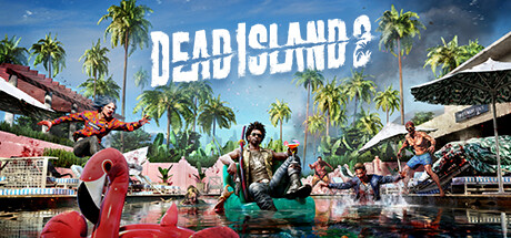
Dead Island 2 capsule

Dead Island 2

A deadly virus is spreading across Los Angeles, turning its inhabitants into zombies. Bitten, infected, but more than just immune, uncover the truth behind the outbreak and discover who - or what - you are. Survive, evolve and become the ultimate Zombie Slayer.

$4.99Mostly Positive(866)
Co-opZombiesGore
Dambuster StudiosApr 22, 2024

Dead Island 2 scores 72/100 — better than 37% of Co-op capsules (n=1,661).

Mostly Positive (866 reviews) · $4.99 · Released Apr 22, 2024 · By Dambuster Studios

Quick text summary

Dead Island 2 scored 72/100 on Steam Analyzer — Good for a Co-op capsule. Top priority fix: [composition] Tighten composition toward center to ensure key visual elements remain uncroppable at standard Steam capsule widths.

Capsule scores by dimension

  • Genre Clarity: 8/10 — Zombie action with clear setting. The capsule immediately communicates action-adventure zombie gameplay through multiple visual cues: infected characters in dynamic combat poses, tropical resort setting with visible undead, vibrant blood-red accents suggesting violence, and party-based group formation. At TINY size, the silhouettes of multiple armed figures against a bright background and the red flamingo pool floats remain readable as an action game, though the zombie nature becomes less obvious.
  • Title Readability: 7/10 — Bold title, readable at all sizes. DEAD ISLAND 2 is rendered in large, thick white sans-serif lettering positioned across the upper-middle area with clear contrast against the blue sky. The title holds legibility at SMALL and TINY sizes due to weight and simplicity, though the sharp-edged letterforms are clean rather than decorative. The geometric positioning works well and avoids noisy texture overlap.
  • Contrast & Color: 8/10 — Strong value separation, tropical pop. The bright blue sky and white title create excellent contrast against both the Steam dark background and the scene itself. The red flamingo floats, orange-clothed zombie, and vibrant green palm trees form a saturated, warm color palette that pops distinctly against the dark blue water and background. At TINY size, the red accents and white title remain clearly separated and readable in grayscale.
  • Uniqueness & Polish: 7/10 — Fun aesthetic, competent execution. The surreal vacation-turned-zombie-apocalypse concept with resort setting and stylized undead characters feels more distinctive than standard zombie fare, particularly the garish red pool floats contrasting with infected tourists. The photorealistic rendering and careful lighting create a polished, cinematic look. However, the concept of zombies in exotic locations is not entirely novel, and the visual hook relies on recognizing the absurdist tone rather than showcasing a unique mechanic or art style.
  • Brand Consistency: 6/10 — Coherent but generic zombie aesthetic. The image maintains consistent rendering quality, warm color grading, and tropical setting that align with Dead Island franchise DNA. However, without referencing the 9 available screenshots, the visual identity does not present strongly memorable iconic elements—no signature character, motif, or palette that would be immediately recognizable as Dead Island 2 specifically versus other zombie action games. The resort floats and bright aesthetic are distinctive enough to differentiate from grimdark competitors.
  • Composition: 7/10 — Clear focal point, good depth layering. The composition uses effective foreground-midground-background separation: red flamingo floats and infected characters occupy the center and mid-ground, while palm trees and structures recede into the bright sky. The title sits comfortably in the upper area without obscuring key visuals. At SMALL and TINY sizes, the central cluster of figures and red accents remain the primary focus, though some edge elements (particularly right-side structure) risk cropping at Steam's standard dimensions.

What works

  • Strong color contrast and visual pop. The warm tropical palette with vibrant reds, greens, and blues separates cleanly against the Steam dark background and reads well even at tiny thumbnail size.
  • Bold, legible title treatment. Large white sans-serif lettering maintains readability across all viewing sizes without decorative fussiness or collapse.
  • Effective depth and focal hierarchy. The composition layers foreground action (flamingos, infected), midground characters, and background environment to create visual interest and a clear primary subject at scale.
  • Polished cinematic presentation. Professional lighting, realistic textures, and color grading convey AAA production value and visual quality.

What hurts the capsule

  • Generic zombie concept execution. While the resort setting is fun, the visual identity does not establish a signature brand motif or memorable icon that distinguishes Dead Island 2 from competing zombie action games.
  • Limited genre iconography specificity. At TINY size, the image reads as 'zombie action game' but does not communicate unique mechanical hooks or Dead Island franchise-specific visual language.
  • Edge composition risk at Steam crop. The right-side structures and some character silhouettes sit close to frame edges and may be partially cropped depending on Steam's capsule display dimensions.

Priority fixes

  1. [composition] Tighten composition toward center to ensure key visual elements remain uncroppable at standard Steam capsule widths.
  2. [brand_consistency] Introduce a signature visual motif or iconic character silhouette in a consistent location to strengthen Dead Island 2 franchise recognition.
  3. [genre_clarity] Add a subtle UI element or weapon silhouette in the mid-ground to clarify the action-slayer mechanical identity at TINY size.

Store copy priority fixes

  1. [feature_communication] Replace the entire detailed description with a structured overview of core features: character abilities, signature weapons/Gore system, progression mechanics, co-op mission types, and map settings. This is the single highest-impact fix as the current text provides zero gameplay information.
  2. [uniqueness] Add a differentiator sentence to the short description such as 'Master devastating combos and witness extreme zombie dismemberment' or 'Play as unique survivors with evolving abilities' to distinguish this from generic zombie games.
  3. [hook_strength] Rewrite the opening line to lead with a visceral, character-forward hook: 'You're immune to the virus ravaging Los Angeles—now weaponize it' rather than the passive 'A deadly virus is spreading,' to create curiosity and ownership.
  4. [feature_communication] Add a sentence about co-op depth and replayability: 'Team up with up to X players in campaign missions, or compete in [specific mode]' to clarify multiplayer structure and appeal.

Related guides

Steam app ID: 934700 · Tags: Co-op, Zombies, Gore, First-Person, Action-Adventure