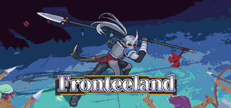
Fronteeland scores 77/100 — better than 79% of Action capsules (n=8,534).

Quick text summary

Fronteeland scored 77/100 on Steam Analyzer — Good for a Action capsule. Top priority fix: [uniqueness_polish] Add a distinctive visual hook such as an iconic character trait, signature weapon design, or UI element that differentiates the capsule from generic action-combat templates and creates a memorable brand marker.

Capsule scores by dimension

  • Genre Clarity: 8/10 — Clear action combat gameplay signals. The pixel-art character in mid-air combat pose with visible weapon, surrounded by projectiles and enemy silhouettes, immediately communicates fast-paced action gameplay. The dynamic aerial positioning and visible combat effects read well at small size, though the genre subtype (hack-and-slash vs shooter) could be slightly clearer from the weapon alone at tiny size.
  • Title Readability: 9/10 — Bold white title excellent contrast. The title 'Fronteeland' uses thick white letters with a dark outline/shadow on a semi-transparent dark bar, ensuring strong legibility at all sizes including tiny. The strategic placement in the lower third on a controlled background prevents text overlap with busy action elements above.
  • Contrast & Color: 8/10 — Strong value separation and saturation. The bright cyan/turquoise foreground terrain contrasts sharply against the darker blue sky and purple background, with the white character and projectiles cutting cleanly through mid-tones. At tiny size, the silhouette remains readable due to clear light-dark separation, though some mid-tone detail in projectiles blurs slightly.
  • Uniqueness & Polish: 7/10 — Competent pixel art with action flair. The capsule delivers solid pixel-art aesthetic with intentional combat framing and dynamic pose, but the scene composition uses fairly standard action-game tropes without a distinctive visual hook that elevates it beyond genre baseline. The visual storytelling is functional—you understand combat and movement—but lacks a memorable unique mechanic or art direction signature that would make it stand out among similar indie action titles.
  • Brand Consistency: 6/10 — Competent but generic pixel aesthetic. The pixel-art style is consistent with the game's visual identity shown in store screenshots, and the warm-to-cool color palette matches in-game graphics. However, there are no distinctive brand markers such as iconic character features, signature UI elements, or unique visual motifs that would allow immediate recognition in a crowded storefront without the title.
  • Composition: 8/10 — Clear focal point with good hierarchy. The airborne character occupies the visual center with weapon clearly visible, while surrounding projectiles and enemies create supporting action context without competing for attention. The title placement in the lower safe zone avoids cropping risk, and the depth layering (foreground terrain, mid-ground combat, background sky) creates readable hierarchy even at tiny size where the character remains the primary focal point.

What works

  • Excellent title legibility. White text with dark outline on a dark bar ensures the title reads cleanly at all viewing sizes including tiny thumbnails.
  • Strong color-value separation. Cyan foreground and white character create sharp contrast against dark background, maintaining silhouette clarity at small sizes.
  • Action gameplay instantly clear. Dynamic pose, visible weapons, projectiles, and enemies immediately communicate fast-paced combat without ambiguity.
  • Safe composition and margins. Critical elements avoid edge hudging and title placement in lower safe zone prevents Steam crop issues.

What hurts the capsule

  • Generic action-game composition. The scene uses familiar 'character in combat pose surrounded by effects' framing found in dozens of indie action titles without distinctive visual storytelling.
  • No recognizable brand signature. The capsule lacks iconic character features, memorable UI treatment, or unique visual motif that would enable recognition without the title text.
  • Pixel-art detail loss at tiny scale. While silhouettes hold up, individual projectile and enemy details blur together at 120x45, reducing the sense of crafted intentionality.

Priority fixes

  1. [uniqueness_polish] Add a distinctive visual hook such as an iconic character trait, signature weapon design, or UI element that differentiates the capsule from generic action-combat templates and creates a memorable brand marker.
  2. [brand_consistency] Emphasize a recognizable character feature or signature visual style element that appears consistently across marketing materials to build brand recall beyond the title.
  3. [composition] Strengthen the focal point by adding subtle visual guides (lighting, color emphasis) that lead the eye to the character and primary weapon, reducing perceived clutter in the mid-ground effects.

Store copy priority fixes

  1. [uniqueness] Add a specific, concrete differentiator in the short description—e.g., 'the only hack-and-slash where weapons physically break mid-combat, forcing constant tactical switches' or 'combine 50+ relics into unique synergies no other roguelike offers.'
  2. [hook_strength] Replace 'pure, primal combat fun' with a more specific and memorable hook that contrasts with other roguelikes—e.g., 'No story, no mercy. Only weapons, relics, and split-second choices that define your survival.'
  3. [audience_targeting] Add one sentence clarifying intended difficulty or player type—e.g., 'Perfect for players who love fast-paced action and don't mind replaying to master new weapon combos' or 'Designed for hardcore roguelike veterans seeking a pure combat challenge.'

Related guides

Steam app ID: 956710 · Tags: Action, Top-Down, 2D, Combat, Roguelite