Scoring genre clarity...

Decks of Dexterity capsule

Decks of Dexterity

The bullet hell card game! Decks of Dexterity fuses bullet hell shooter gameplay with a strategic turn based card game. Discover cards to gain abilities and unleash powerful combos!

$14.99Positive(29)
Card GameBullet HellTop-Down Shooter
Coded GamesJun 8, 2026

Decks of Dexterity scores 73/100 — better than 55% of Card Game capsules (n=1,065).

Positive (29 reviews) · $14.99 · Released Jun 8, 2026 · By Coded Games

Quick text summary

Decks of Dexterity scored 73/100 on Steam Analyzer — Good for a Card Game capsule. Top priority fix: [genre_clarity] Add subtle bullet patterns or wave effects behind the robot to visually reinforce the bullet hell gameplay mechanic at a glance.

Capsule scores by dimension

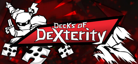
  • Genre Clarity: 7/10 — Clear action card hybrid concept. The capsule communicates a fusion of bullet hell and card mechanics through the stylized robot character in dynamic pose, playing cards scattered throughout, and energetic red particle effects suggesting fast-paced action. At tiny size, the cards and robot silhouette read clearly enough to hint at the card game + action blend, though the specific bullet hell gameplay is less obvious without the descriptor.
  • Title Readability: 8/10 — Bold legible title with strong outline. The 'Decks of Dexterity' text uses a thick white outline and all-caps sans-serif that maintains clarity from full size down to small. The red diagonal banner provides a controlled, high-contrast background for the title placement. At tiny size the text remains readable, though some serifs may blur slightly—the bold weight and outline preserve the message effectively.
  • Contrast & Color: 8/10 — Strong red-on-dark with clean separation. The vibrant red gradient background, bright white robot and card elements, and deep burgundy/black edges create excellent value separation against the Steam dark background #1b2838. White robot silhouette and playing card imagery pop distinctly; in grayscale, the light-to-dark contrast holds well and avoids muddy mid-tones. Small and tiny sizes maintain clear silhouette definition.
  • Uniqueness & Polish: 7/10 — Stylized action with recognizable identity. The white linework robot character and scattered playing card elements establish a cohesive, slightly retro-comic aesthetic that feels intentional and polished rather than generic. The dynamic pose and card placement communicate the core mechanic effectively. However, the execution stays within familiar indie game visual language without a standout signature element that would elevate it to premium tier—solid craft but not visually distinctive enough to feel exceptional.
  • Brand Consistency: 7/10 — Coherent art style, limited icon recognition. The white linework robot character, playing card motif, and red-and-black color scheme are internally consistent across the capsule and align with the game's core concept of cards + action. The rendering style is clean and recognizable. However, without access to the 11 store screenshots, the memorable brand identity markers (iconic character design, signature palette beyond red/white/black, or unique symbols) cannot be fully validated—the design reads as cohesive but not yet iconic.
  • Composition: 7/10 — Balanced layout with clear focal point. The robot character occupies the left-center as the primary focal point, the title banner runs diagonally across the middle-right providing secondary emphasis, and scattered playing cards create supporting visual rhythm without cluttering. The composition maintains good hierarchy and guides the eye effectively. Safe margins are respected, and the design remains readable at small and tiny sizes, though the diagonal banner risks minor edge cropping on some display ratios.

What works

  • Strong title contrast and readability. White outlined text on red diagonal banner reads clearly at all sizes from full to tiny, with consistent letterform clarity and no decorative compromise.
  • Cohesive visual identity. White linework robot, red-and-black palette, and card motif work together as a unified concept that communicates the card + action fusion without requiring external context.
  • Effective use of negative space. Dark edges frame the action, preventing clutter and allowing the bright central elements to pop clearly against the Steam background.

What hurts the capsule

  • Limited brand icon distinctiveness. While the robot character is present, it lacks a signature design trait (unique silhouette, facial feature, or emblem) that would make it instantly recognizable versus other indie action games.
  • Bullet hell element underemphasized visually. The particle effects hint at action but don't clearly signal the bullet hell sub-genre; the gameplay hook is mostly communicated through the description rather than visual cues alone.
  • Diagonal banner crop vulnerability. The red title banner's diagonal angle places portions near the top and right edges, risking truncation or awkward framing on different display aspect ratios or Steam thumbnail crops.

Priority fixes

  1. [genre_clarity] Add subtle bullet patterns or wave effects behind the robot to visually reinforce the bullet hell gameplay mechanic at a glance.
  2. [brand_consistency] Develop a signature mark or emblem (robot badge, card symbol, or dexterity icon) that appears consistently across marketing to build iconic recognition.
  3. [composition] Adjust the diagonal banner angle or scale to ensure all critical title text clears safe margins by at least 15–20 pixels on all edges to prevent Steam crop loss.
  4. [uniqueness_polish] Consider adding a subtle glow, shadow, or accent color to the robot character to make it feel more premium and distinct from generic indie action game assets.

Store copy priority fixes

  1. [feature_communication] Add a brief sentence explaining the progression loop: 'Each run lets you discover new cards and treasures; unlock classes by defeating campaigns or completing quests.' This clarifies how players advance from novice to mastery.
  2. [tone_match] Rewrite the Competitive Leaderboards section in the same upbeat voice as the rest of the copy (e.g., 'Race for speedrun records, pull off wild overkills, or dominate the Monthly Trial!' instead of formal bullet points).
  3. [audience_targeting] Add one sentence explicitly addressing accessibility: 'Play at your own pace with timed-input optional, mouse-only, or touch controls—no twitch reflexes required to enjoy the card-fusion strategy.' This makes the inclusive design a selling point rather than hidden in categories.
  4. [hook_strength] Move the 8-year development note earlier in the detailed description (e.g., after the opening paragraph) to build credibility and signal polish, rather than burying it in the Community Focus section.

Related guides

Steam app ID: 968530 · Tags: Card Game, Bullet Hell, Top-Down Shooter, Roguelike, Perma Death