Scoring genre clarity...

Rogue Monster Rush capsule

Rogue Monster Rush

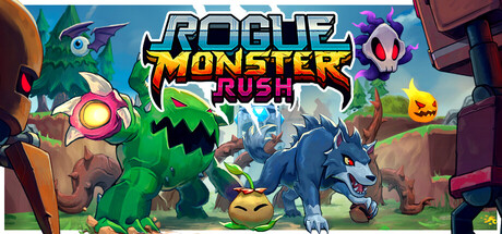
A unique Tower Defense game featuring Monster Collecting and Roguelike mechanics. Hatch, upgrade, and command a party of monster defenders, while unleashing player spells, to defend your base from the hordes of invading robots.

$11.99Very Positive(12)
Tower DefenseCreature CollectorRoguelike
Ghost Vibes LLCMar 7, 2026

Rogue Monster Rush scores 72/100 — better than 51% of Tower Defense capsules (n=685).

Very Positive (12 reviews) · $11.99 · Released Mar 7, 2026 · By Ghost Vibes LLC

Quick text summary

Rogue Monster Rush scored 72/100 on Steam Analyzer — Good for a Tower Defense capsule. Top priority fix: [genre_clarity] Strengthen tower defense visual language by adding clear lane markers, defensive positioning cues, or a wave-threat element (e.g., incoming robot formation) to signal the specific gameplay type more explicitly.

Capsule scores by dimension

  • Genre Clarity: 7/10 — Monster defense gameplay readable. The capsule clearly communicates a monster-collecting tower defense theme through the prominent green monster character and blue robot antagonist in the center, supported by floating monster icons and a battle-ready composition. At tiny size, the core conflict (monsters vs robots) and casual indie aesthetic remain apparent, though the specific roguelike and tower defense mechanics are not explicitly obvious from visuals alone. The cheerful art style and creature focus signal casual strategy rather than hardcore complexity.
  • Title Readability: 8/10 — Title clear with minor layering. The 'ROGUE MONSTER RUSH' title uses bold white lettering with thick black outline and yellow secondary text, positioned prominently in the upper-center region with controlled background support. At full size it is crisp and readable; at small size the outline helps maintain legibility; at tiny size the main text remains identifiable though 'MONSTER RUSH' reads more clearly than 'ROGUE'. The strategically isolated placement on a simpler background area prevents text-on-clutter issues.
  • Contrast & Color: 8/10 — Vibrant palette pops effectively. The capsule uses a warm gradient background (orange-brown earthtones) with bright primary-colored monsters (green, blue, yellow) and accent colors (purple, pink) that create strong value separation against the dark Steam background. The glowing yellow monster eye and bright UI elements add visual punch, and the overall warm-to-cool color transition creates clear depth. In grayscale, the light monster silhouettes and bright centers maintain good contrast against mid-tone background structures.
  • Uniqueness & Polish: 7/10 — Competent cartoon style, moderate originality. The capsule displays solid cartoon rendering with appealing monster designs, coherent lighting, and intentional visual hierarchy that suggests quality indie craft. However, the casual monster-collecting theme with colorful creatures in a battle scene is a familiar visual trope in indie gaming (comparable to games like Moonstone Island or casual tower defense titles). The execution is clean and professional, but the core visual concept lacks a distinctive hook that sets it apart from genre peers.
  • Brand Consistency: 6/10 — Consistent but generic monster identity. The capsule demonstrates internal cohesion through a unified art style, consistent character design language, and a recognizable warm-and-cool color palette that likely extends across the 14 store screenshots. The green monster design shows personality, but without access to the full brand suite, there is no evidence of a signature motif, iconic symbol, or distinctive visual identity that would make this capsule immediately recognizable as 'Rogue Monster Rush' versus another casual monster game. The identity is competent but not memorable.
  • Composition: 7/10 — Clear hierarchy with balanced depth. The composition uses strong foreground-midground-background layering with the blue and green monsters anchoring the center focal point, supported by smaller creatures and UI elements above, and environmental structures framing the edges. Title placement in the upper region keeps prime real estate for gameplay imagery. At small and tiny sizes, the central monster silhouettes remain the primary read, though the 14 floating icons and right-side structure add minor clutter that slightly competes for attention in quick scroll. Safe margins appear adequate, and edge proximity poses no obvious cropping risk.

What works

  • Strong color contrast against dark background. The warm gradient and bright creature colors create excellent value separation that makes the capsule pop on the Steam dark background even at tiny thumbnail size.
  • Clear central focal point with depth layering. The blue and green monsters in the center create an immediate read of the core conflict (monsters vs invaders) with effective foreground-midground-background structure.
  • Legible title with protective outline treatment. The white-with-black-outline title remains readable at small size due to strategic placement and outline thickness preventing letterform collapse.

What hurts the capsule

  • Generic casual monster-collecting aesthetic. While well-executed, the core visual concept of colorful creatures in a battle scene lacks a distinctive visual hook that differentiates it from genre peers like Moonstone Island or similar indie titles.
  • Floating icons add visual noise at small sizes. The 14 scattered monster icons in the upper region create minor clutter that slightly competes with the central focal point during quick scroll and reduces visual clarity at tiny thumbnail size.
  • Roguelike and tower defense mechanics not visually explicit. The capsule communicates 'monster battle game' clearly but does not visually hint at the specific tower defense placement mechanics or roguelike run-based progression that differentiate it from standard battle games.

Priority fixes

  1. [genre_clarity] Strengthen tower defense visual language by adding clear lane markers, defensive positioning cues, or a wave-threat element (e.g., incoming robot formation) to signal the specific gameplay type more explicitly.
  2. [uniqueness_polish] Develop a signature visual motif or distinctive monster design that creates immediate brand recognition across the store and differentiates from generic casual monster games.
  3. [composition] Reduce visual noise by consolidating or repositioning the 14 floating monster icons into a tighter cluster or secondary bar to prioritize the central conflict as the sole focal point at small sizes.

Store copy priority fixes

  1. [hook_strength] Rewrite the short description opening to lead with a verb and emotional hook: replace "A unique Tower Defense game featuring..." with something like "Hatch and command a monster army against endless robot waves in this roguelike tower defense mashup where every run is different."
  2. [uniqueness] Add a sentence to the detailed description that explains what the three-way hybrid enables that single-genre games do not (e.g., "The fusion of roguelike progression with active tower defense and creature customization creates replayability and strategic depth neither genre achieves alone").
  3. [audience_targeting] Insert a paragraph that explicitly addresses player type: "Perfect for strategy fans who love creature collectors and roguelikes, and for tower defense players seeking more active, moment-to-moment decision-making."
  4. [feature_communication] Add 1–2 sentences describing the meta-progression or unlock systems that carry forward between runs, to clarify long-term engagement beyond individual playthrough loops.

Related guides

Steam app ID: 971220 · Tags: Tower Defense, Creature Collector, Roguelike, Indie, Strategy