Scoring genre clarity...

Automachef capsule

Automachef

Welcome to Automachef, a resource management puzzler where you design kitchens, program machinery and watch your genius come to life! It’s time to engineer tomorrow’s kitchen, today!

$2.24Mostly Positive(519)
SimulationIndieAutomation
Rhombico GamesJul 23, 2019

Automachef scores 73/100 — better than 51% of Simulation capsules (n=5,401).

Mostly Positive (519 reviews) · $2.24 · Released Jul 23, 2019 · By Rhombico Games

Quick text summary

Automachef scored 73/100 on Steam Analyzer — Good for a Simulation capsule. Top priority fix: [genre_clarity] Add a small visual hint of machinery or a character interacting with kitchen equipment in the storefront window to strengthen puzzle/management gameplay signal at tiny size

Capsule scores by dimension

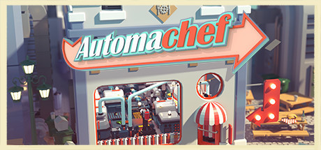
  • Genre Clarity: 7/10 — Management sim visually clear. The retro diner storefront setting with visible kitchen machinery and work stations immediately signals a management/simulation game. The visual style and miniature diorama presentation at full size clearly communicate resource management gameplay. At tiny size, the storefront and machinery silhouette still read as a crafting/management game, though the specific puzzle mechanics are less obvious.
  • Title Readability: 8/10 — Bold retro logo readable. The 'Automachef' title uses a thick, high-contrast red-and-cyan vintage sign with clear letterforms and strong outline against the lighter storefront background. At small and tiny sizes, the arrow-styled logo maintains excellent legibility due to heavy stroke weight and saturated color separation. The retro aesthetic is preserved while remaining functionally readable even at thumbnail scale.
  • Contrast & Color: 8/10 — Strong warm-cool color separation. The capsule leverages a warm cream/tan storefront against cooler blue-gray surroundings, with the red-and-teal title providing bold value contrast. The red awning, marquee sign, and machinery create visual pop against the muted background palette. In grayscale, elements maintain clear separation, and the warm storefront stands distinct from the darker surroundings even at tiny size.
  • Uniqueness & Polish: 7/10 — Distinctive retro diner aesthetic. The capsule uses a charming miniature diorama style—a physical 3D storefront—which differentiates it from typical 2D game artwork and conveys craftsmanship and intentionality. The retro 50s diner aesthetic with period-accurate signage and details creates a memorable visual hook aligned with the game's puzzle-crafting theme. The polish is evident in the detailed miniature construction, though it doesn't break into the highest tier because the core scene is a static storefront without dynamic gameplay storytelling.
  • Brand Consistency: 7/10 — Consistent retro diorama identity. The capsule establishes a strong internal identity through the retro diner storefront aesthetic, warm color palette, and vintage signage style that should be recognizable across marketing materials. The miniature diorama presentation is a distinctive brand cue that sets it apart from generic management sims. However, without reference to other Automachef assets, the score reflects solid cohesion rather than iconic character or motif recognition, and the identity feels thematic rather than character-driven.
  • Composition: 7/10 — Centered focal point, balanced layout. The storefront is centered with clear foreground (signage), midground (storefront facade), and background (street/surroundings) layering that guides the eye naturally to the kitchen machinery visible through the window. The title placement at top-center is prominent without obscuring the primary subject. At small and tiny sizes, the storefront silhouette remains the clear focal point, though some fine detail (window machinery, awning stripes) loses definition and edge cropping is safe.

What works

  • Retro diner aesthetic. The 50s-inspired storefront design with vintage signage, period-appropriate colors, and charming details immediately communicates the game's unique theme and tone.
  • Title legibility at scale. The thick-stroke 'Automachef' logo with red-and-cyan coloring maintains excellent readability from full size down to tiny thumbnail without collapsing or losing character definition.
  • Color contrast and pop. The warm cream storefront and saturated red-teal signage create strong value separation against the cool blue-gray environment, ensuring visibility in Steam's dark browsing context.

What hurts the capsule

  • Gameplay mechanics unclear. While the management/simulation genre is apparent, the puzzle-based kitchen engineering core mechanic is not visually communicated; viewers cannot infer that they will program and design systems from the storefront alone.
  • Static scene presentation. The capsule shows a fixed diorama without dynamic action or character presence, which may feel less immediately engaging compared to top-performing capsules that feature protagonists or active gameplay moments.
  • Fine detail loss at thumbnail. The window machinery details, awning stripes, and mini props that add charm at full size become muddy and illegible at tiny size, reducing visual impact during quick scrolls.

Priority fixes

  1. [genre_clarity] Add a small visual hint of machinery or a character interacting with kitchen equipment in the storefront window to strengthen puzzle/management gameplay signal at tiny size
  2. [composition] Ensure the window machinery and interior details are simplified or emphasized to remain readable at 120x45px without relying on fine striping or small props
  3. [uniqueness_polish] Consider adding a subtle animated element (steam, light, movement) or a character mascot to increase dynamic appeal and storytelling beyond a static storefront

Store copy priority fixes

  1. [feature_communication] Add a concrete sentence explaining the programming system: 'Program conveyor belts, chop stations, and ovens using a visual logic system to handle ingredient orders efficiently' or similar, so players understand interaction depth.
  2. [uniqueness] Insert a differentiator comparing to adjacent games or highlighting unique mechanics: 'Unlike other automation puzzles, Automachef lets you design full restaurant layouts and manage multiple simultaneous orders under time pressure' (or the actual unique angle).
  3. [audience_targeting] Add a sentence clarifying difficulty range and play style: 'Casual players can relax in sandbox mode; competitive solvers can optimize contracts for perfect efficiency,' to signal who should buy.
  4. [feature_communication] Expand the 'Challenging Puzzles' section with one concrete example of a scenario or progression mechanic rather than generic 'hot dogs' flavor text.

Related guides

Steam app ID: 984800 · Tags: Simulation, Indie, Automation, Puzzle, Resource Management