Scoring genre clarity...

Eyes in the Dark capsule

Eyes in the Dark

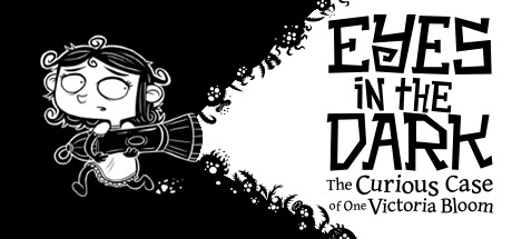
Fight with light against the dark in this "roguelight" platformer starring Victoria Bloom! Drive back the darkness that's overrun Bloom Manor and conquer swarms of creatures as you discover powerful new items to upgrade your arsenal. Are you ready to enter the ever-changing manor?

$14.99Mostly Positive(111)
Action RoguelikeSide ScrollerTwin Stick Shooter
Under the Stairs, KontrastJul 14, 2022

Eyes in the Dark scores 78/100 — better than 84% of Steam capsules we've analysed (n=22,658).

Mostly Positive (111 reviews) · $14.99 · Released Jul 14, 2022 · By Under the Stairs

Quick text summary

Eyes in the Dark scored 78/100 on Steam Analyzer — Good for a Steam capsule. Top priority fix: [title_readability] Remove or significantly reduce the subtitle to a single short phrase, or increase its font size and weight so it reads at 231x87 minimum

Capsule scores by dimension

  • Genre Clarity: 7/10 — Dark platformer tone clear. The center character wielding what appears to be a flashlight or torch against a gothic mansion backdrop, surrounded by creatures and monsters, communicates a dark action-platformer or adventure tone effectively. The whimsical hand-drawn creatures and haunted manor setting suggest an indie gothic platformer with roguelike elements. At tiny size the genre reads as dark indie platformer, though the roguelike element is impossible to infer visually.
  • Title Readability: 7/10 — Title bold, subtitle struggles. The main title EYES IN THE DARK uses bold, high-contrast black lettering on a white banner with strong letterforms that remain readable at small size. At tiny size the main title is still parseable due to its thick strokes and clean white background band, but the subtitle 'The Curious Case of One Victoria Bloom' collapses completely into an unreadable blur. The decorative serif styling on the main title holds up reasonably well due to the deliberate contrast strip.
  • Contrast & Color: 8/10 — High contrast monochrome pops well. The stark black and white composition creates exceptional value separation and the white background actually pops strongly against Steam's dark #1b2838 background, creating an effective inversion contrast. The silhouette of the black foreground foliage and creatures against the white sky creates clean, readable edges even at tiny size. In grayscale this image is already native, so there is no loss, and the central character in the clock circle has strong separation from both the dark foreground and the lighter sky.
  • Uniqueness & Polish: 8/10 — Distinctive monochrome hand-drawn style. The pure black and white hand-drawn aesthetic is immediately distinctive in a genre dominated by colorful pixel art or painterly styles, making this stand out strongly against peers like Hades II or Sea of Stars. The clock motif framing the protagonist, the layered creature silhouettes, and the gothic manor create a cohesive visual storytelling hook that communicates the light-versus-dark premise. The craft feels intentional and premium with consistent line weight and illustration quality throughout.
  • Brand Consistency: 9/10 — Cohesive monochrome identity throughout. The pure black and white ink illustration style is an extremely strong and memorable brand identity signal that would be instantly recognizable across Steam pages, screenshots, and thumbnails. The style is fully committed with no mixed rendering modes or tonal inconsistencies, and the central character Victoria in the clock medallion creates a clear iconic motif. This capsule would be immediately recognizable as the same game if seen again, which is rare and valuable in the indie space.
  • Composition: 8/10 — Strong hierarchy with clear focal point. The composition uses a clear three-layer depth structure with a dark silhouette foreground, a mid-ground scene with creatures and manor, and a white sky background, guiding the eye naturally to the central clock medallion containing the protagonist. The title banner sits in the lower third on a controlled white strip, separating it cleanly from the noisy illustrated elements above. At small and tiny sizes the central medallion character remains the dominant focal point, though the scattered flying creatures around the top edge add some visual noise that competes slightly.

What works

  • Striking monochrome contrast. The pure black and white palette creates instant visual differentiation on Steam's dark background and reads cleanly at all thumbnail sizes.
  • Clear focal point in clock medallion. The central clock circle framing Victoria creates a natural eye anchor that survives compression to tiny thumbnail size.
  • Distinctive brand identity. The hand-drawn ink illustration style is immediately memorable and rare in the indie platformer genre, enabling strong recognition.
  • Effective title placement. The main title sits on a clean white banner strip that ensures high legibility without competing with the illustrated elements.

What hurts the capsule

  • Subtitle completely unreadable at tiny size. The Curious Case of One Victoria Bloom collapses to an illegible smear at 120x45 and even at 231x87 is very difficult to parse.
  • Scattered flying creatures add noise. The multiple floating creature sprites around the top edge compete for attention and dilute the central focal hierarchy at small sizes.
  • Genre specificity limited at tiny size. While dark indie platformer reads well, the roguelike and light-mechanic core concept are impossible to infer from the capsule alone.
  • White background edge risk. The full white background may cause the capsule to visually float or feel unframed when surrounded by other Steam capsule art.

Priority fixes

  1. [title_readability] Remove or significantly reduce the subtitle to a single short phrase, or increase its font size and weight so it reads at 231x87 minimum
  2. [genre_clarity] Add a subtle visual cue for the light mechanic, such as a small beam of light or glow emanating from Victoria's weapon, to hint at the roguelight core gameplay
  3. [composition] Consolidate the scattered flying creatures into fewer, larger, more iconic silhouettes to reduce visual noise and strengthen hierarchy at small sizes
  4. [contrast_color] Consider adding a very thin dark border or vignette frame around the capsule edges to prevent the white background from feeling uncontained against Steam's dark UI

Store copy priority fixes

  1. [uniqueness] Add a sentence or two explaining what makes the light-based combat and synergy-tinkering system distinct from other roguelikes—does the flashlight interact with the environment in unique ways, or is the synergy depth unusually deep?
  2. [feature_communication] Restructure the detailed description with a short bulleted or clearly separated section listing core mechanics (Weapons, Perks System, Meta-Progression) for scannability.
  3. [hook_strength] Rewrite the opening to lead with a gameplay verb: 'Shoot and slash your way through a procedurally-generated manor using light-based weapons and gadgets' to immediately convey player agency.
  4. [audience_targeting] Add one sentence signaling difficulty level explicitly, such as 'Perfect for roguelike veterans seeking a challenge' or 'Supports multiple difficulty modes for all skill levels.'

Related guides

Steam app ID: 1039360