Steam Capsule Art Guide: 2026 Best Practices
A practical guide to Steam capsule art: make the game readable, show the genre quickly, keep the logo clear, and avoid details that disappear at small sizes.
TL;DR
Your Steam capsule is not key art. It is a tiny ad competing inside a grid.
A good pre-launch capsule does five things fast:
- 1Makes the genre obvious.
- 2Makes the title readable at thumbnail size.
- 3Creates strong contrast between the subject, title, and background.
- 4Looks polished enough to trust.
- 5Matches the game people see after they click.
If a stranger cannot understand the game in one second, the capsule is doing too much or saying too little.
Why the capsule decides whether you get a click
Before launch, your Steam page has one job: turn attention into wishlists.
And those wishlists are worth fighting for. Industry wishlist-to-sale conversion has fallen from roughly 20% in 2018 to 5–10% in 2026, per Immutable's analysis of Steam wishlist conversion rates. A stronger capsule widens the top of the funnel to offset that drop: more clicks become more wishlists, and you need more wishlists than the old math implied to hit the same launch sales.
But players do not start by reading your description. They see a capsule in search results, upcoming lists, Steam Next Fest, discovery surfaces, genre pages, creator posts, Discord links, and social shares. Most of the time, they are scanning fast.
That means your capsule has to answer three questions before the player thinks:
The best capsules reduce effort. They do not ask the player to decode the art, zoom into the title, or guess the genre from a mood piece. They make one clear promise.
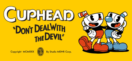
Steam gives you different capsule formats, but the small capsule is the harshest test. Steam's small capsule is uploaded at 462×174 and automatically appears as small as 184×69 and 120×45. If your title, subject, and genre signal survive there, the larger versions usually work too.
A better capsule will not make Steam feature your game by itself. Steam visibility depends on player response, purchases, play, tags, reviews, and other signals. But when Steam, a creator, or your own marketing puts your game in front of someone, the capsule is often the thing that earns the click.
The 6 dimensions, in plain English
These are the criteria Steam Analyzer scores every capsule against. You can apply them by eye before you upload your capsule to Steamworks.
Genre clarity
Can a player name the genre at tiny size (120×45) in under a second?
Players should not need the store description to understand the basic type of game. The harshest test is the smallest one. At 120×45 px the capsule is little more than a silhouette and a colour, and the genre still has to land.
A city builder should read as a city builder. A survival horror game should read as survival horror. A deckbuilder should not look like a generic fantasy RPG unless the cards, UI language, or strategic framing are visible enough to carry the signal.
Genre clarity does not mean being boring. It means using the visual shortcuts your audience already understands: scale, camera angle, character pose, environment, props, enemies, buildings, vehicles, cards, weapons, UI motifs, or the kind of threat in the scene.
A strong test: cover the title and show the capsule to someone for one second. Ask: “What kind of game is this?” If they only answer with mood words like “dark”, “cute”, “epic”, or “fantasy”, the capsule may be attractive but not clear enough.


Title readability at thumbnail size
Is the title still legible at 184×69?
The title is not a decoration. It is the name the player needs to remember, search, mention, and wishlist.
Most capsule titles fail because they were designed at full size and approved in Figma, not tested at real Steam sizes. Thin strokes disappear. Decorative fonts turn into texture. Glows blur. Long titles become grey blocks. The game may look premium in isolation and still fail in the store grid.
Make a small-capsule version of the logo if you need to. The small capsule does not need to be a perfect crop of your main key art. It needs to work in the places Steam actually shows it.
Use this rule: if the title is not readable when you step back from your screen, it is not ready.
Try it
This is the same size simulator we run on every analysis. Tap through the sizes. The capsule on the smallest setting is the only one that matters for legibility.
How You Look on Steam
Main store page — 616×353px
Top scorers on title readability

Contrast and colour
Does the focal subject jump off the background?
A capsule needs separation. The player should know where to look without hunting.
The common mistake is using beautiful art where every part has the same visual weight. Dark character on dark background. Warm title on warm fire. Blue logo on blue sky. Detailed subject on detailed environment. It may look expensive, but it does not pop.
Check the capsule in grayscale. Squint at it. Put it on a dark Steam-like background. The title, subject, and background should sit on different value layers.
Saturation is not the same as contrast. A loud capsule can still be unclear. The goal is not to make everything brighter. The goal is to make the important thing impossible to miss.
Grayscale test
This is the same value-contrast check the analyzer runs. If the subject and title still pop after the colour is stripped out, contrast is doing real work. If everything blurs together, saturation was carrying the image.

In colour
In grayscale
Uniqueness and polish
Does the capsule look like 200 other capsules in the same genre?
A player should be able to remember your capsule after scrolling past it.
This is where a lot of competent capsules fail. They use the right genre signals, but in the same way as everyone else: lone hero, blue mist, red monster, tiny logo, generic background, no specific idea.
Your capsule needs one ownable hook. A strange silhouette. A distinctive face. A specific world detail. A strong graphic shape. A title treatment that belongs to your game and no one else's.
Polish matters too. Cropped limbs, muddy lighting, fake-looking compositing, mismatched fonts, and AI-looking texture all create doubt. Players may not be able to explain why it feels cheap, but they feel it.
Put your capsule in a grid beside 20 games your audience already knows. If it disappears, keep working.
Top scorers on uniqueness & polish
Brand consistency
If a player saw three of your capsules in a row, would they know they were yours?
Brand consistency is scored on internal cohesion. Not capsule vs screenshots. Not capsule vs trailer. The question is whether your capsule has a recognisable identity. A signature you could carry across other games or other capsules in your library and players would still spot the family resemblance.
Studios that score well here have a kit: same font family, same stroke or shadow treatment on the title, the same kind of accent colour, a consistent way of placing the logo. Across multiple capsules in their library you can feel the same hand at work.
Mood language is the other half. A studio that's known for a specific lighting style, a specific framing, or a specific subject type builds memory in a player's brain. The next time their capsule shows up in a feed, the player recognises it before reading the title.
The strongest version is a signature motif. A character, an icon, a pattern, a framing device that becomes your visual fingerprint. You don't need a mascot. You need one repeating element a fan could point at and say “that is a [studio name] capsule.”
Note: matching your capsule to your screenshots and trailer matters too. A click is the start of trust, not the finish line. But that cross-asset cohesion is judged elsewhere on the store page, not by the capsule score itself.
Top scorers on brand consistency

Composition
Where does the eye go, and does it stop where you want it to?
A capsule should have one clear visual path.
The eye should land on the subject, understand the genre, then read the title. Or it should read the title first, then understand the world. Either can work. What fails is when the eye bounces between five competing details and never settles.
Good composition usually has fewer things in it than the first draft. One hero. One readable logo. One clear background idea. Enough negative space to let the important parts breathe.
For horizontal capsules, be careful with tiny details at the edges. They often vanish. For small capsules, avoid placing the title over the busiest part of the art. For darker capsules, give the logo a clean field, rim light, or shadow shape so it does not fight the background.
A simple test: blur the capsule slightly. If the main shape and title still read, the composition is probably working.
Blur test
Blur the capsule. The hero shape and the title should still carry. If everything dissolves into a soft mush, the composition is leaning on detail instead of structure.
Sharp
Blurred
More exemplars coming as we score more capsules.
FAQ
How do I optimise my Steam page?
Five levers move the needle: capsule, screenshots, trailer, short description, and tags. The capsule gates everything else, because no one reads a description they did not click. Fix it first. After the capsule, the first three screenshot slots do the most conversion work; audit data shows 15 to 40 percent of visitors drop off when those are weak. Then make sure the trailer opens with gameplay in the first five seconds, the short description names the genre and the hook in one line, and the top five tags are specific sub-genre signals rather than generic ones like Indie or Action.
What is a good click-through rate (CTR) on Steam?
Above 4 percent is the threshold most indie games miss. Page-audit data across thousands of indie titles shows games clearing 4 percent earn meaningfully more visibility in discovery queues, recommendations, and search. Most indies sit below 2 percent. CTR is not a direct Steam algorithm input, but it gates the funnel: more clicks become more wishlists, more wishlists at launch convert to first-week sales, and Steam rewards revenue and engagement strongly per its own Visibility documentation.
How many wishlists do I need to launch on Steam?
There is no Valve-published threshold, but the empirical pattern from indie post-mortems and discovery analyses points to 30,000 or more wishlists at launch as the floor for a meaningful shot at the visibility ladder. The reason is revenue compounding. Wishlist-to-sale conversion has fallen from roughly 20 percent in 2018 to 5 to 10 percent in 2026 (per Immutable's analysis of Steam wishlist conversion rates), so you need more wishlists than the old math implied to hit the same first-week sales. Those sales generate reviews and revenue, and revenue is the strongest signal Steam's algorithm rewards. Below 30k, most games never clear the threshold to enter Discovery Queue and More Like This rails at scale.
Why is my Steam capsule not getting clicks?
Almost always one of three things. The genre is unclear, so players scrolling a discovery rail can't tell whether to care. The title is unreadable at thumbnail size (Steam renders capsules as small as 120×45 in some surfaces), so the capsule reads as a generic blob. Or there is no contrast between the subject and the background, so the whole image dissolves into mush at small sizes. Across our scored capsule dataset, the same five or six failure modes account for most low-CTR capsules. Run the blur test: if the main shape and the title still read when you blur the image, the structure is fine. If everything dissolves, the capsule is leaning on detail it cannot deliver at thumbnail size.
Does Steam's algorithm reward capsule clicks or wishlists directly?
No, not directly. Steam's official Visibility documentation says the algorithm rewards purchases and ongoing player engagement most strongly. Capsule clicks and wishlists are not in the inputs Valve names. They matter as funnel inputs: a capsule that earns clicks brings more visitors, more visitors become more wishlists, wishlists at launch become sales, and sales are what the algorithm actually weighs. Treat capsule and CTR work as upstream of the signals Steam rewards rather than as direct algorithm hacks.
What is the difference between the header, small, and main Steam capsules?
Header Capsule (920×430) sits on the store page itself and on some featured rails. Small Capsule (462×174) is the workhorse: it appears in search results, top sellers, new releases, browse pages, and recommendation queues, and Steam auto-generates 184×69 and 120×45 versions from it for thumbnails. Main Capsule (1232×706) is for the main carousel on the Steam homepage and featured promotions. You upload all of them; the small capsule (and the 120×45 auto-render of it) is where most discovery actually happens, so design for that size first and scale up.
How do I make my Steam capsule stand out from competitors?
Pull up your top five competitors in the same sub-genre on Steam and lay your capsule next to theirs at thumbnail size. If yours uses the same colour palette, the same character pose, the same composition, you blend in. The capsules that earn clicks usually break one shared convention loudly: a different palette, an unusual silhouette, a subject that is actually showing the gameplay verb rather than a posed character. Strong contrast (a saturated subject against a desaturated background, or a bright subject against a dark one) is the single highest-leverage fix; it is also the dimension where the most low-scoring capsules fail in our dataset.
Should I A/B test my Steam capsule?
Yes, but Steam does not offer native A/B testing for capsules, so you have to do it manually. Swap the capsule, wait a week or two, compare CTR in your Steamworks store-page traffic stats, and revert if the new one underperforms. Run a scoring pass on each candidate before you ship it; spending 30 seconds catching a low-readability or low-contrast capsule on the bench is cheaper than burning two weeks of traffic on it live. Re-test after major events (sale, festival, trailer release) because a capsule that wins in a low-traffic week may not win during a Next Fest spike.
How often should I update my Steam capsule?
Whenever CTR plateaus, whenever the game's visual identity shifts meaningfully, and at minimum before any major event (Steam Next Fest, a publisher push, a sale, a launch). The store page is a live conversion surface, not a set-and-forget asset. Capsules can also age: a capsule that looked sharp two years ago may now look dated next to current releases in the same genre. Re-audit the capsule against current top sellers in your sub-genre every quarter, and update if your capsule reads as the older entry visually.