Scoring genre clarity...

Hundred Days - Winemaking Simulator capsule

Hundred Days - Winemaking Simulator

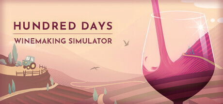
Winemaking could be your best adventure. Make the best wine interacting with soil and nature and take your winery to the top. Your beautiful journey into the winemaking tradition starts now.

$8.49Mostly Positive(1,024)
StrategyColorfulAtmospheric
Broken Arms GamesMay 13, 2021

Hundred Days - Winemaking Simulator scores 80/100 — better than 90% of Steam capsules we've analysed (n=22,658).

Mostly Positive (1,024 reviews) · $8.49 · Released May 13, 2021 · By Broken Arms Games

Quick text summary

Hundred Days - Winemaking Simulator scored 80/100 on Steam Analyzer — Good for a Steam capsule. Top priority fix: [title_readability] Increase the weight and size of the 'WINEMAKING SIMULATOR' subtitle or replace it with a bolder, heavier typeface so it remains readable at 120x45 pixels.

Capsule scores by dimension

  • Genre Clarity: 9/10 — Instantly clear winemaking simulation. The oversized wine glass with pouring wine dominates the left side, and rolling vineyard hills with a tractor on the right immediately communicate the winemaking simulation niche. The subtitle 'Winemaking Simulator' leaves zero ambiguity. At tiny size, the wine glass silhouette and warm pink-rose palette still telegraph the subject matter clearly, making this one of the clearest genre communications in the simulation space.
  • Title Readability: 8/10 — Clean serif title reads well. The title 'HUNDRED DAYS' in bold dark burgundy serif caps on a light peachy background has strong contrast and reads well at full and small sizes. The subtitle 'WINEMAKING SIMULATOR' in a thinner weight is readable at small size but becomes very difficult to parse at tiny thumbnail size. The controlled light background region behind the text is a smart placement choice that aids legibility.
  • Contrast & Color: 7/10 — Warm palette pops against Steam dark. The warm rose, pink, and cream tones contrast well against Steam's dark navy background #1b2838, creating good edge separation for the overall capsule. The wine glass's deep magenta tones provide a clear silhouette anchor. However, in grayscale the vineyard background and sky merge into similar mid-tones, slightly reducing depth separation at tiny size.
  • Uniqueness & Polish: 8/10 — Polished flat illustration style stands out. The flat vector illustration style with soft gradients is cohesive, charming, and unusual compared to the photo-realistic or gritty aesthetics common in simulation titles on Steam. The clever compositional device of showing the vineyard landscape reflected or framed within the wine glass is a memorable visual hook. Compared to genre peers like Supermarket Simulator or House Flipper 2, this capsule feels more artistically intentional and premium.
  • Brand Consistency: 8/10 — Cohesive warm illustration identity. The flat vector art style, warm rose-pink palette, and elegant serif typography form a recognizable and internally consistent identity. The tractor and vineyard landscape complement the wine glass motif without any stylistic inconsistencies. The overall art direction feels deliberate and could be recognized as a brand signature, though the style is somewhat common in indie sim games.
  • Composition: 8/10 — Strong focal anchor with good balance. The large wine glass on the left acts as a dominant foreground element creating clear depth layering against the vineyard midground and soft sky background. The title text occupies the upper right, balancing the composition well with good use of negative space. At small and tiny sizes, the wine glass silhouette remains the clear primary subject, though the tractor detail and text hierarchy compress and flatten slightly.

What works

  • Instant genre clarity. The wine glass combined with vineyard hills and the explicit subtitle makes the game's subject unmistakable even at tiny thumbnail size.
  • Distinctive flat illustration style. The soft vector art with warm gradients gives the capsule a premium, handcrafted feel that stands out against photo-real competitors in the simulation genre.
  • Smart title placement. Placing the title text against the light sky region provides a clean controlled background that maximizes contrast and readability without relying on outlines or drop shadows.
  • Strong warm palette contrast on Steam dark UI. The rose and cream tones create immediate visual separation against Steam's dark navy background, helping the capsule catch the eye during quick scrolling.

What hurts the capsule

  • Subtitle illegible at tiny size. The thinner weight 'WINEMAKING SIMULATOR' subtitle collapses into an unreadable line at approximately 120x45 pixels, losing the genre reinforcement it provides at full size.
  • Grayscale depth loss in background. The vineyard hills, sky, and background elements share similar mid-tone values and merge together in grayscale, reducing the sense of depth and layering at small sizes.
  • Tractor detail lost at small sizes. The small tractor on the right hill, which adds charm and agricultural context, becomes invisible at tiny and small thumbnail sizes.
  • Limited visual tension or dynamism. While charming, the calm composition lacks the visual energy or drama seen in top-performing capsules like Hades II or DAVE THE DIVER, which could limit scroll-stopping power.

Priority fixes

  1. [title_readability] Increase the weight and size of the 'WINEMAKING SIMULATOR' subtitle or replace it with a bolder, heavier typeface so it remains readable at 120x45 pixels.
  2. [contrast_color] Darken or add subtle shadow separation to the vineyard hill layers so they retain depth distinction in grayscale and at tiny sizes.
  3. [uniqueness_polish] Add a subtle dynamic element such as a light sparkle or motion blur on the pouring wine to introduce visual energy without breaking the illustration style.
  4. [composition] Slightly increase the size of the tractor or shift it closer to the center so it survives small capsule cropping and adds its genre storytelling value.

Store copy priority fixes

  1. [hook_strength] Rewrite the short description to lead with a specific gameplay verb: 'Build a winemaking empire from vine to bottle—choose your grapes, manage fermentation, and outsell competitors' instead of 'Winemaking could be your best adventure.'
  2. [uniqueness] Add a differentiating statement in the detailed opening that explains what makes this sim distinct, such as 'combining authentic winemaking science with economic strategy' or 'the only game that models the complete winemaking process from soil pH to market positioning.'
  3. [genre_clarity] Move 'simulative and realistic approach' and the 'Analyze the soil...' feature bullets into the short description opening to immediately signal this is a deep strategy sim, not a narrative adventure.
  4. [audience_targeting] Explicitly state 'for players who enjoy detailed management sims like Two Point Hospital or Planetbase' to anchor expectations early and attract the right audience.

Related guides

Steam app ID: 1042380