Scoring genre clarity...

Still There capsule

Still There

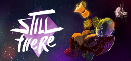
Every day is the same on the faraway Bento space-lighthouse - until a mysterious radio message breaks through. Evade the past, welcome oblivion, make the perfect Italian coffee. Still There is a psychological adventure game about grief, technical puzzles, wacky AIs and dark humour. How far is far enough?

$2.99Very Positive(764)
Point & ClickAdventureEmotional
GhostSharkNov 20, 2019

Still There scores 65/100 — better than 11% of Steam capsules we've analysed (n=22,658).

Very Positive (764 reviews) · $2.99 · Released Nov 20, 2019 · By GhostShark

Quick text summary

Still There scored 65/100 on Steam Analyzer — Solid for a Steam capsule. Top priority fix: [genre_clarity] Replace or repose the armored character to suggest puzzle-solving, introspection, or interaction with technology—consider showing the protagonist at a control panel, radio, or coffee maker to signal the actual gameplay loop.

Capsule scores by dimension

  • Genre Clarity: 6/10 — Space setting clear, genre ambiguous. The sci-fi space-lighthouse setting is immediately evident from the satellite, distant planets, and cosmic starfield background. However, the armored character in the center-right could suggest action or combat rather than psychological adventure, creating genre confusion at first glance. At tiny size, the scene reads as generic space adventure without clear signals of the puzzle, grief, or narrative-focused gameplay that defines the actual experience.
  • Title Readability: 7/10 — Title readable full, solid at small. The 'STILL THERE' logo uses bold white brush-stroke lettering with clean internal spacing and sits on a controlled mid-tone purple star shape, ensuring strong contrast against the dark background. At small size the title remains legible and the star frame helps anchor it; at tiny size it holds up reasonably well but fine brush details begin to blur slightly. The overall placement is strategic and does not compete with the character focal point.
  • Contrast & Color: 7/10 — Good value separation with saturation strength. The purple-to-orange gradient background creates clear value separation from the dark navy space elements, and the bright white title pops strongly against #1b2838. The armored character uses warm golds and oranges in the armor and jetpack, which stand out well; however, the character's dark silhouette blends slightly into the shadowed lower background when squinting or viewing at tiny size. The satellite and planet accents add bright focal points that maintain overall contrast.
  • Uniqueness & Polish: 6/10 — Competent sci-fi scene, generic execution. The capsule features clean artwork with intentional color gradients and a polished rendered character, but the composition reads as a fairly standard space adventure setup—armored figure, distant planets, satellite—without a distinctive visual hook that signals the unique psychological or puzzle narrative. The art style is professional and coherent, but the scene could apply to many space games and does not clearly communicate grief, dark humor, or the core mechanic of making coffee and evading the past. Compared to genre peers like DREDGE or The Invincible, it lacks a memorable visual identity or visual storytelling that stands out.
  • Brand Consistency: 6/10 — Consistent rendering, no iconic motif. The capsule uses a cohesive color palette of purples, oranges, and golds with consistent cel-shaded or illustrative character rendering. However, without reference to additional store screenshots, the visual language feels generic to the space-adventure archetype and does not establish a recognizable brand identity or signature motif that would stick in memory. The star-framed logo is the only distinctive branding element, but it is more functional than iconic.
  • Composition: 7/10 — Clear focal point, balanced layout. The armored character occupies the center-right, creating a strong primary focal point with the title anchored left-center via the purple star frame, establishing clear visual hierarchy. The background layers (starfield, gradient, planets, satellite) provide depth without overwhelming the subject. At small size the composition holds well; at tiny size the character remains recognizable and the title stays legible. However, the character's positioning slightly toward the right edge leaves some dead space in the upper left that could be better utilized, and edge cropping on Steam might clip the satellite slightly.

What works

  • Strong title contrast and placement. White brush-stroke lettering on a purple star frame ensures the 'STILL THERE' logo pops clearly against the dark background and remains readable down to small sizes.
  • Clear depth layering. The background starfield, mid-tone gradient, and foreground character create visual separation that prevents a flat or muddy read at all viewing sizes.
  • Professional rendering quality. The armored character and environmental elements are polished and intentionally colored, conveying a premium production value.

What hurts the capsule

  • Genre messaging lacks clarity. The armored, action-ready character pose suggests combat or action gameplay rather than psychological adventure and puzzle-solving, potentially misleading players about the actual experience.
  • Generic sci-fi composition. The space-lighthouse, planet, and satellite scene is a familiar trope that does not visually communicate the unique grief narrative, dark humor, or coffee-making mechanic that distinguish the game.
  • No iconic visual hook. The capsule lacks a memorable brand identity or visual storytelling element that would distinguish it from other space adventures or stick in quick-scroll recognition.
  • Character silhouette muddy at tiny size. The dark armor blends into the shadowed background when squinting or viewing at thumbnail scale, reducing silhouette clarity.

Priority fixes

  1. [genre_clarity] Replace or repose the armored character to suggest puzzle-solving, introspection, or interaction with technology—consider showing the protagonist at a control panel, radio, or coffee maker to signal the actual gameplay loop.
  2. [uniqueness_polish] Add a visual element that communicates the grief, psychological, or coffee themes—such as a coffee cup, radio equipment detail, or symbolic motif that differentiates from generic space adventure.
  3. [contrast_color] Increase character silhouette separation by adding a subtle glow or outline around the armor edges, or shift the background gradient to create darker contrast bands behind the figure at tiny size.
  4. [composition] Rebalance the layout to reduce dead space in the upper left and ensure all key elements, especially the satellite, remain well clear of potential Steam crop edges.

Store copy priority fixes

  1. [feature_communication] Add a sentence detailing playtime (e.g., '8-12 hours') and clarify whether puzzles are required or optional to set difficulty expectations.
  2. [feature_communication] Replace 'plenty to occupy yourself with' with 2–3 named optional activities (e.g., 'Play chess with Gorky, tend to your pet tuatara, work on the ship's systems') to make side content more tangible.
  3. [audience_targeting] Add a phrase targeting the intended audience explicitly, such as 'Perfect for players who value narrative depth and character-driven mystery over action' to sharpen audience clarity.

Related guides

Steam app ID: 1063490