Scoring genre clarity...

Timemelters capsule

Timemelters

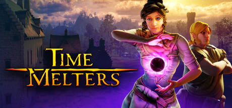
Prevent Doomsday AFTER it happened! Designed by the co-creator of Sang-Froid - Tales of Werewolves and featuring both a single-player and co-op campaign, TimeMelters is a strategy hero defense where you go back in time and fight alongside your past selves.

$7.99Very Positive(152)
Tower DefenseTime ManagementCo-op Campaign
Autoexec GamesFeb 28, 2024

Timemelters scores 73/100 — better than 56% of Steam capsules we've analysed (n=22,658).

Very Positive (152 reviews) · $7.99 · Released Feb 28, 2024 · By Autoexec Games

Quick text summary

Timemelters scored 73/100 on Steam Analyzer — Good for a Steam capsule. Top priority fix: [uniqueness_polish] Add a visual representation of the time-loop mechanic—such as ghosted character duplicates, temporal fractals, or a timeline element—to communicate the core selling point and differentiate from generic fantasy action.

Capsule scores by dimension

  • Genre Clarity: 7/10 — Action fantasy with magic systems. The capsule clearly signals fantasy action through the magical purple orb, period castle setting, and character poses with combat readiness. The glowing magical artifact and armor suggest spellcasting mechanics. At tiny size the purple glow and character silhouettes still communicate 'action fantasy' but the strategy and time-manipulation core mechanic are not visually apparent from imagery alone.
  • Title Readability: 8/10 — Strong yellow serif title readable. The title 'TIME MELTERS' uses bright golden-yellow serif lettering with a horizontal rule accent, positioned in the left-center area over a darkened sky region. The contrast against the dark background is excellent and the letterforms remain legible at small sizes. At tiny size the title still reads clearly and maintains its distinctive serif character without collapse.
  • Contrast & Color: 8/10 — Vibrant purple magic pop clearly. The magenta-purple glowing orb and character's outfit create strong value separation against the cooler blue-toned castle background and dark sky. The bright golden title further reinforces contrast hierarchy. At small and tiny sizes the purple magic and warm golden text both read distinctly against the Steam background, with the silhouettes maintaining sharp edges.
  • Uniqueness & Polish: 7/10 — Polished but familiar fantasy setup. The composition shows professional character rendering, coherent lighting, and a clear visual hook with the glowing time-manipulation orb. However, the castle-siege-with-heroes formula is common in fantasy action games and does not immediately communicate the unique time-loop and co-op simultaneous-selves mechanic that differentiates the game. The craft is solid but the selling point is not visually distinctive from category peers.
  • Brand Consistency: 6/10 — Consistent fantasy rendering style. The visual style shows coherent character design, unified color palette of purples and golds against cool castle tones, and professional rendering throughout. However, there are no memorable iconic symbols, character motifs, or signature visual elements that would make this capsule instantly recognizable as TimeMelters on repeat viewing. The identity is competent but generic within the fantasy action space.
  • Composition: 8/10 — Strong focal hierarchy balanced well. The female mage character with glowing orb occupies clear center-right focus, the male character provides secondary balance on the right, and the castle-tower backdrop grounds the scene. The title sits left-center without competing with the primary subject. At small size the two-character grouping and purple magic remain the clear focal point with good depth layering between foreground characters, midground castle, and background sky.

What works

  • Title legibility and contrast. Golden-yellow serif lettering with horizontal accent reads cleanly at all sizes including tiny, with excellent value separation against dark background.
  • Professional character rendering. Both characters show polished detail, coherent lighting, and expressive poses that communicate action and readiness to the viewer.
  • Effective focal hierarchy. Clear primary subject (mage with orb) and secondary character balance create depth and guide attention without scattering focus.
  • Vibrant magic visual hook. The glowing purple orb provides a memorable color accent that stands out and hints at the game's fantasy-magic identity.

What hurts the capsule

  • Generic fantasy scene. Castle siege with heroes is a well-worn trope that does not immediately differentiate TimeMelters from similar fantasy action games on store shelves.
  • Core mechanic not visually communicated. The time-manipulation and co-op time-loop gameplay at the game's heart is invisible in the capsule; it reads as standard action-fantasy instead of a unique strategic time-bending experience.
  • No memorable brand icon. The capsule lacks a distinctive symbol, character motif, or signature visual element that would make it instantly recognizable on future viewing or marketing materials.

Priority fixes

  1. [uniqueness_polish] Add a visual representation of the time-loop mechanic—such as ghosted character duplicates, temporal fractals, or a timeline element—to communicate the core selling point and differentiate from generic fantasy action.
  2. [brand_consistency] Introduce a signature icon or motif (e.g., a unique time-crystal symbol or stylized temporal vortex) that can carry through store screenshots and become synonymous with TimeMelters' identity.
  3. [genre_clarity] Incorporate a subtle UI or strategic element (towers, defenses, or magic circles) in the background to hint at the 'hero defense' and 'strategy' aspects beyond pure action.

Store copy priority fixes

  1. [hook_strength] Reorder the detailed description to open with 'Unique Time Shift game mechanic' and the core gameplay loop before introducing Teagan's story, reinforcing the hook from the short description immediately.
  2. [feature_communication] Move the Friend's Pass announcement to after the core feature list or into a separate callout box to avoid leading with a secondary feature before establishing what the game is.
  3. [tone_match] Adjust the opening narrative paragraph to match the lighter, more playful tone of the feature list, or shift the feature list language toward darker atmosphere to create consistency.

Related guides

Steam app ID: 1096140