Scoring genre clarity...

Children of Silentown capsule

Children of Silentown

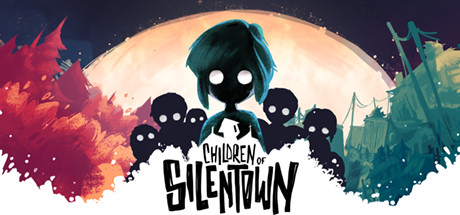
Children of Silentown is a dark adventure game that tells the story of Lucy, a girl growing up in a village deep in a forest inhabited by monsters. People disappearing is nothing uncommon here, but this time, Lucy is old enough to investigate on her own. Or so she thinks.

$5.99Very Positive(978)
AtmosphericPoint & ClickAdventure
Elf Games, Luna2 StudioJan 11, 2023

Children of Silentown scores 82/100 — better than 93% of Atmospheric capsules (n=5,438).

Very Positive (978 reviews) · $5.99 · Released Jan 11, 2023 · By Elf Games

Quick text summary

Children of Silentown scored 82/100 on Steam Analyzer — Good for a Atmospheric capsule. Top priority fix: [title_readability] Increase the minimum font weight and tracking on 'Children of Silentown' so the letterforms remain individually distinguishable at 120x45, potentially with a subtle stroke or expanded white splash area

Capsule scores by dimension

  • Genre Clarity: 8/10 — Dark indie adventure, clear tone. The silhouetted child figures with hollow white eyes, painterly storybook aesthetic, and ominous crowd of shadow children immediately communicate dark narrative adventure. At tiny size the central teal-haired protagonist against the warm orange moon glow reads as a spooky story-driven game. Genre subtype (point-and-click adventure) is not explicitly implied but dark indie adventure reads confidently.
  • Title Readability: 7/10 — Readable at full, marginal at tiny. The hand-lettered black title 'Children of Silentown' sits on a white ink splash which provides good local contrast at full size, and the chunky irregular letterforms are distinctive and stylistically appropriate. At small size the title remains legible due to the white splash background isolating it from the busy scene. At tiny 120x45 size the title becomes very difficult to parse as individual words, though the white blob region still signals text presence.
  • Contrast & Color: 8/10 — Strong silhouette pop on dark Steam BG. The deep black silhouettes of the children figures contrast sharply against the warm orange-peach moon glow, creating excellent value separation. Against Steam's dark #1b2838 background, the warm orange center and white ink splash create immediate luminosity. In grayscale the central composition holds well with the bright moon halo separating the dark figures cleanly.
  • Uniqueness & Polish: 9/10 — Distinctive painterly storybook horror. The watercolor-meets-ink illustration style is highly distinctive and polished, clearly differentiating it from generic dark adventure capsules. The white ink splash title treatment is clever and cohesive, integrating logo into the art rather than floating it on top. The hollow-eyed silhouette children are a memorable, original visual motif that communicates unique selling point immediately.
  • Brand Consistency: 9/10 — Cohesive identity, memorable visual language. The teal-haired girl protagonist with hollow white eyes serves as a strong iconic anchor that would be immediately recognizable across store assets. The warm orange, deep teal, and stark black palette with watercolor texture treatment creates a signature art direction that feels purposeful throughout. The hand-lettered title reinforces the storybook-horror identity established by the illustration style.
  • Composition: 8/10 — Strong focal hierarchy, well-balanced. The central protagonist is clearly the primary focal point, elevated above the surrounding shadow children and backlit by the large moon circle creating a natural focal halo. The white ink splash anchors the lower-center and grounds the title without competing with the character. At small size the composition holds well with the teal protagonist readable against the warm background, though the surrounding shadow figures become a somewhat undifferentiated mass at tiny size.

What works

  • Distinctive art style. The watercolor-ink hybrid illustration style is immediately distinctive and stands out against typical genre capsules at any size.
  • Strong silhouette hierarchy. The teal protagonist backlit by the orange moon creates a clean focal point that survives heavy size reduction and quick scroll.
  • Integrated title treatment. The white ink splash beneath the title elegantly isolates the lettering from the busy scene, aiding readability without feeling like a separate UI element.
  • Memorable character iconography. The hollow-eyed teal-haired girl is a strong brand anchor that would be recognizable across all store assets.

What hurts the capsule

  • Title collapses at tiny size. At 120x45 the hand-lettered title becomes unreadable as individual words, surviving only as a white shape.
  • Shadow crowd becomes undifferentiated mass. At small and tiny sizes the surrounding silhouette children merge into an indistinct dark blob, losing the intentional creepy crowd effect.
  • Genre subtype ambiguity. While dark tone is clear, nothing explicitly signals point-and-click adventure vs atmospheric platformer or horror narrative, which may cost some genre-targeted clicks.
  • Left side color splash feels slightly disconnected. The warm red-orange leaf splash on the far left edge adds color but does not clearly connect to the central narrative composition at small size.

Priority fixes

  1. [title_readability] Increase the minimum font weight and tracking on 'Children of Silentown' so the letterforms remain individually distinguishable at 120x45, potentially with a subtle stroke or expanded white splash area
  2. [genre_clarity] Add a subtle environmental cue such as a dark forest treeline or window frame in the background to more precisely signal point-and-click adventure rather than leaving subgenre ambiguous
  3. [composition] Slightly increase spacing or contrast between the surrounding shadow children so they read as distinct figures rather than a merged mass at small thumbnail size
  4. [contrast_color] Strengthen the left-edge watercolor splash by tying it more visibly to the central scene composition so it contributes to the focal story rather than appearing as a decorative border element

Store copy priority fixes

  1. [feature_communication] Restructure the detailed description to lead with the three core pillars of gameplay (exploration + puzzle-solving, singing mechanic, minigames + character interaction) in a clear, hierarchical format before the bullet points.
  2. [audience_targeting] Add a sentence explicitly targeting the intended player: 'Perfect for fans of atmospheric story-driven adventures and lateral-thinking puzzles' or similar, plus a brief note on tone (dark but not ultra-violent).
  3. [genre_clarity] Add 'point & click adventure' or 'Point-and-Click' to the short description to remove any ambiguity in the opening line about how players interact with the world.
  4. [uniqueness] Expand the singing mechanic description to clarify how it functions: is it used to solve puzzles, calm monsters, or unlock story? This is the most distinctive feature and deserves more specificity.

Related guides

Steam app ID: 1108000 · Tags: Atmospheric, Point & Click, Adventure, Story Rich, Puzzle