Scoring genre clarity...

The Binding of Isaac capsule

The Binding of Isaac

Now 20% More Evil with the Free Halloween update!

$1.54Very Positive(209)
Action RoguelikeRoguelikeIndie
Edmund McMillen, Florian HimslSep 28, 2011

The Binding of Isaac scores 80/100 — better than 91% of Action Roguelike capsules (n=1,708).

Very Positive (209 reviews) · $1.54 · Released Sep 28, 2011 · By Edmund McMillen

Quick text summary

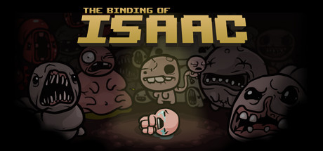
The Binding of Isaac scored 80/100 on Steam Analyzer — Good for a Action Roguelike capsule. Top priority fix: [contrast_color] Add a subtle warm outer glow or slight brightness lift to the outer edges of the capsule so it separates clearly from Steam's #1b2838 background in quick scroll.

Capsule scores by dimension

  • Genre Clarity: 8/10 — Dark roguelike dungeon crawler clear. The central crying child character surrounded by grotesque monsters with jagged teeth and decayed flesh immediately communicates a dark, horror-tinged action game. The dungeon floor vignette and the mob of enemies encircling a small vulnerable protagonist strongly hints at roguelike or dungeon crawler gameplay. At tiny size the monstrous faces flanking the edges and the small hero in the center still read as a survival or action game against overwhelming odds.
  • Title Readability: 8/10 — Bold pixel title reads well. The title 'THE BINDING OF ISAAC' uses a chunky, slightly distressed serif font with good letter spacing, placed in the upper center against the dark background where contrast is clean. 'ISAAC' is set significantly larger than 'THE BINDING OF' which creates a smart hierarchy. At tiny size 'ISAAC' remains legible due to its large weight, though 'THE BINDING OF' becomes very small and unreadable, which is an acceptable tradeoff given the iconic name recognition.
  • Contrast & Color: 7/10 — Strong vignette separation, muted palette. The dark vignette background contrasts well against Steam's #1b2838 dark UI, and the warm spotlight pool in the center creates clear value separation between the main character and the environment. The overall palette is deliberately desaturated and earthy brown-grey, which is tonally appropriate but means the silhouette separation at tiny size relies heavily on the central spotlight rather than color contrast. In grayscale the central protagonist reads clearly due to the lighting, though the flanking monsters partially merge with the dark edges.
  • Uniqueness & Polish: 8/10 — Iconic art style, distinctive horror charm. The grotesque cartoon-horror art style is immediately distinctive and memorable, with the crudely expressive monster faces and the weeping baby protagonist creating a striking tonal contrast between dark subject matter and naive character design. The illustrated background pattern of smaller monster faces filling the dark space adds depth and communicates a rich enemy roster. Compared to genre benchmarks like Hades II or Balatro, this capsule has a strong singular identity that feels authored and intentional rather than template-generated.
  • Brand Consistency: 9/10 — Cohesive identity, signature aesthetic. The hand-drawn grotesque cartoon style is extremely internally consistent, with every element from the title font treatment to the monster illustrations to the background pattern sharing the same rough, darkly humorous visual language. The crying Isaac character is an immediately iconic and recognizable mascot that anchors the brand. The warm spotlight motif, muted earth tones, and dense horror iconography form a signature palette and style that would be instantly recognizable across merchandise, screenshots, and sequels.
  • Composition: 8/10 — Strong central hierarchy, layered depth. The composition uses a clear three-layer structure: the patterned dark background, the mid-ground monster ensemble, and the foreground spotlight containing Isaac as the primary focal point. The title is placed safely at the top center and the monsters frame the hero without obscuring the title zone. At small and tiny sizes the central spotlight pulls focus to Isaac effectively, though the large monster heads at the far left and right edges risk being cropped on some display contexts. The overall hierarchy guides the eye from title to monsters to hero in a natural reading sequence.

What works

  • Iconic mascot character. The weeping Isaac in the foreground spotlight is immediately recognizable and serves as a strong brand anchor even at tiny thumbnail size.
  • Strong tonal identity. The horror-cartoon fusion of crude monster designs and dark dungeon atmosphere communicates tone and genre simultaneously without ambiguity.
  • Title hierarchy. The oversized 'ISAAC' lettering ensures the most important brand word survives compression to tiny sizes while maintaining a legible full title at larger views.
  • Background texture depth. The dense pattern of smaller monster faces in the dark background adds visual richness and communicates enemy variety without cluttering the main focal area.

What hurts the capsule

  • Muted palette limits pop. The desaturated brown-grey palette, while tonally correct, reduces the capsule's ability to stand out against competing colorful titles in a Steam browse grid.
  • Edge monster cropping risk. The large grotesque faces on the far left and right edges sit very close to the crop boundary and may be awkwardly cut on certain display contexts or aspect ratios.
  • Small subtitle text lost at tiny size. 'THE BINDING OF' above ISAAC becomes completely unreadable at 120x45 thumbnail size, leaving only the single word ISAAC visible.
  • Low brightness overall. The dark overall exposure means on Steam's dark background the capsule borders blend into the UI chrome, reducing perceived pop in quick scroll conditions.

Priority fixes

  1. [contrast_color] Add a subtle warm outer glow or slight brightness lift to the outer edges of the capsule so it separates clearly from Steam's #1b2838 background in quick scroll.
  2. [contrast_color] Increase the saturation of the central spotlight pool slightly to give Isaac and the immediate foreground area more warmth and visual pop against the monochromatic surroundings.
  3. [composition] Pull the extreme left and right monster heads inward by 5 to 10 percent to ensure they are not cropped on narrow display contexts and their expressive faces remain fully visible.
  4. [title_readability] Consider adding a very subtle dark halo or drop shadow behind the full title text to ensure 'THE BINDING OF' retains at least some legibility against the textured monster background at small sizes.

Store copy priority fixes

  1. [hook_strength] Replace the short description with a single compelling line that leads with core gameplay and emotional hook, such as: 'Escape into a twisted basement as Isaac, fighting nightmarish creatures in this randomly generated roguelike shooter with over 100 transformative items.'
  2. [uniqueness] Add a sentence after the opening narrative explaining what makes Isaac mechanically distinct, such as the visual character transformation system and how items not only grant powers but visually reshape the protagonist.
  3. [feature_communication] Add estimated playtime, difficulty modes, or a sentence about permadeath/run structure to help players understand the roguelike progression loop.
  4. [audience_targeting] Include an explicit line targeting the core audience, such as 'Perfect for roguelike fans seeking endless replayability and challenging combat' to clarify player expectations.

Related guides

Steam app ID: 113200 · Tags: Action Roguelike, Roguelike, Indie, Replay Value, Difficult