Scoring genre clarity...

Tower Princess capsule

Tower Princess

A charming 3D roguelite platformer about a normal day in the life of a knight! Sharpen the spear and make the Dragon run in fear! Oh, and also try to manage a date with princesses & princes you rescue.

$4.99Mixed(107)
RPGActionProcedural Generation
AweKteaMSep 8, 2022

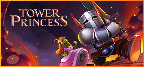
Tower Princess scores 72/100 — better than 44% of Steam capsules we've analysed (n=22,659).

Mixed (107 reviews) · $4.99 · Released Sep 8, 2022 · By AweKteaM

Quick text summary

Tower Princess scored 72/100 on Steam Analyzer — Good for a Steam capsule. Top priority fix: [genre_clarity] Add subtle UI or gameplay element hints such as a visible spear upgrade, platform geometry, or roguelite progression indicator to strengthen mechanical clarity at small size

Capsule scores by dimension

  • Genre Clarity: 7/10 — Fantasy action platformer readable. The armored knight character with sword and the bright action-oriented explosions clearly communicate action-adventure gameplay. The whimsical pink character and playful tone suggest indie charm, though the roguelite platformer mechanics are not visually obvious at tiny size. At small and tiny sizes, the silhouettes read as combat-focused fantasy action without ambiguity about core gameplay loop.
  • Title Readability: 8/10 — Golden text clear at all sizes. TOWER PRINCESS in warm gold serif font is positioned on the left over dark background with excellent contrast and clean letterforms. The title holds legibility even at tiny size due to the strong value separation and substantial font weight. No taglines compete for attention, keeping the read focused and instant.
  • Contrast & Color: 8/10 — Warm fire palette pops cleanly. Golden title and orange-red flame effects create strong warm contrast against the cool dark purple background, with clear silhouette separation in grayscale. The metallic armor catches orange light, creating depth and visual interest that stands out on quick scroll. Even at tiny size, the bright center holds visual weight without the composition feeling muddy.
  • Uniqueness & Polish: 7/10 — Charming style with solid execution. The playful pink character alongside a serious armored knight creates a distinctive tonal mix that communicates the game's dating-sim and action blend. The 3D asset quality is clean and polished with intentional lighting and particle effects, though the composition feels somewhat standard for indie action titles. The concept hook is memorable and sets it apart from generic action platformers, but the visual execution is competent rather than exceptional.
  • Brand Consistency: 6/10 — Coherent but generic fantasy palette. The warm golden and fire-orange color scheme is consistent and the character designs show clear 3D art direction. However, without reference to the full store presence, the capsule lacks a memorable signature visual motif or iconic symbol that would distinguish Tower Princess from other indie action titles. The palette and style are internally consistent but feel like a solid interpretation of fantasy-action conventions rather than a unique brand identity.
  • Composition: 7/10 — Clear focal hierarchy with good balance. The armored knight is the dominant center-right focal point with the pink character providing visual interest and tonal relief on the left, creating strong primary-secondary hierarchy. The title occupies the upper left safely above crop danger zones, and the particle effects frame without overwhelming. At tiny size, the composition reads as unified and the elements don't scatter attention, though the lower portion of the image has less visual weight and could feel slightly bottom-heavy.

What works

  • Strong warm color contrast. Golden title and orange-red fire effects create excellent separation against dark purple background, maintaining visual pop even at tiny size during quick scroll.
  • Clear title legibility. TOWER PRINCESS in substantial serif font with high contrast holds excellent readability across all sizes from full to tiny due to strategic placement on dark background.
  • Distinctive tonal concept. The juxtaposition of serious armored knight with playful pink character immediately communicates the game's unique action-romance hybrid identity.
  • Polished 3D asset quality. Clean character modeling, intentional lighting on metallic surfaces, and particle effects show solid craft and premium presentation.

What hurts the capsule

  • Generic roguelite platformer signals. The capsule communicates action-adventure clearly but gives minimal visual cues about the roguelite mechanics or platformer focus compared to top-performing indie titles.
  • Limited brand memorability. While internally consistent, the visual style lacks a signature motif, iconic character pose, or memorable palette that would allow instant recognition in future marketing.
  • Lower composition weight distribution. The bottom third of the composition has less visual activity, creating subtle imbalance toward the upper half that slightly undermines overall harmony.

Priority fixes

  1. [genre_clarity] Add subtle UI or gameplay element hints such as a visible spear upgrade, platform geometry, or roguelite progression indicator to strengthen mechanical clarity at small size
  2. [brand_consistency] Develop a more distinctive signature visual element such as a unique weapon design, character silhouette motif, or color accent pattern that can anchor brand recognition across assets
  3. [composition] Increase visual activity or balance in the lower third through additional particle effects, supporting character elements, or environmental detail to create more even weight distribution

Store copy priority fixes

  1. [feature_communication] Add a concrete example of the dating mechanic in the detailed description: 'Complete runs to spend time with your chosen suitor—earn gifts from bosses, upgrade your romance meter, and unlock unique dialogue branches that change how your relationship progresses.' [hook_strength] Strengthen the second sentence of the short description by replacing 'Sharpen the spear and make the Dragon run in fear!' with something that hints at the dual gameplay loop, such as 'Survive dungeons, defeat the Dragon, and win the heart of the royal heir of your choice.'
  2. [feature_communication] Add 2-3 concrete upgrade examples (e.g., 'Poison Spear that spreads toxin on hit, Long Rifle that pierces multiple enemies, Shield Bash that staggers bosses') to demonstrate the weapon upgrade system and playstyle variety.
  3. [audience_targeting] Clarify difficulty expectations by adding a sentence like 'Perfect for roguelike newcomers and Dark Souls veterans alike' or specify whether permadeath, hard mode, or assist options exist.

Related guides

Steam app ID: 1138650