Scoring genre clarity...

Divinum capsule

Divinum

Divinum is an action-adventure that blends stylish, expressive combat with rewarding exploration. Master devastating combos and craft unique builds to fight back mysterious invaders and uncover your island’s hidden truth.

CombatFantasyMetroidvania
Sigil Games2026

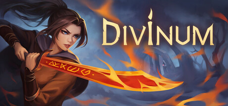
Divinum scores 67/100 — better than 15% of Steam capsules we've analysed (n=22,658).

Released 2026 · By Sigil Games

Quick text summary

Divinum scored 67/100 on Steam Analyzer — Solid for a Steam capsule. Top priority fix: [title_readability] Increase the DIVINUM logo size and weight with a stronger dark outline or glow so it remains legible at 120x45 thumbnail size.

Capsule scores by dimension

  • Genre Clarity: 7/10 — Action RPG fighter implied clearly. The center character wielding a flaming rune-etched sword communicates action-RPG or hack-and-slash reasonably well. The mystical sword with glowing runes and fire effects hints at fantasy combat, which aligns with the genre. At tiny size the flaming sword silhouette still reads as combat-focused, though the specific subgenre could blur between action-RPG and adventure.
  • Title Readability: 7/10 — Title readable at full, borderline tiny. The word DIVINUM is set in a gold serif-style font positioned top-right with a flame accent on the I, offering decent contrast against the dark blue-grey sky. At full size the letterforms are clean and well-spaced. At tiny size the title becomes quite small due to its placement and competes with the character, making it borderline readable though the warm gold color helps it survive against the cool background.
  • Contrast & Color: 7/10 — Warm subject pops on cool background. The warm orange and red flame tones on the sword and the character's skin create a strong complementary contrast against the cold muted blue-grey background and dark silhouetted ruins. The character's lighter face area separates well from the darker background. In grayscale the flaming sword still provides a mid-tone anchor, though the character's brown clothing blends slightly into the murky background at tiny size.
  • Uniqueness & Polish: 6/10 — Competent but genre-generic execution. The illustration quality is solid with a painterly style and good character rendering, but the overall composition of a single fighter with a glowing weapon against a dark fantasy backdrop is a common template in the indie action-RPG space. The flame rune sword is a nice specific detail but doesn't strongly differentiate the game's unique selling point. Compared to benchmark titles like Hades II or Sea of Stars, the visual hook feels somewhat standard.
  • Brand Consistency: 6/10 — Painterly style with limited signature identity. The warm-cool color contrast and painterly illustration style form an internal visual language that feels cohesive. The candle-flame motif on the title I is a small but deliberate identity touch. However, the capsule lacks a truly iconic or instantly recognizable motif or palette signature that would build a recognizable brand identity across multiple touchpoints without relying on the title text.
  • Composition: 7/10 — Clear focal point with decent hierarchy. The character occupies the left two-thirds as the clear primary subject with the title anchored top-right, creating a reasonable diagonal read from face to title. The dark ruined structures in the background provide depth layering without cluttering. At small size the character silhouette and flaming sword remain the dominant focal point, though the title shrinks to near the edge and the overall framing feels slightly tight on the left margin around the character's shoulder.

What works

  • Warm-cool color contrast. The flaming orange sword against the cold blue-grey background creates strong visual separation that survives at small sizes and in partial grayscale.
  • Clear combat subject at small size. The character pose with the extended sword reads as action-oriented even at tiny thumbnail size, communicating genre intent quickly.
  • Clean title placement on controlled background. DIVINUM is placed against the relatively smooth sky area top-right, avoiding noisy texture that would reduce legibility.
  • Painterly illustration quality. The character rendering has polish and personality with a stylized painterly finish that elevates it above a stock or asset-store look.

What hurts the capsule

  • Generic fantasy fighter template. A lone warrior with a glowing weapon against dark ruins is overused in the indie action space and fails to communicate Divinum's specific hook or world at a glance.
  • Title shrinks critically at tiny size. The gold title text is positioned small relative to the character and becomes very difficult to parse at 120x45, reducing discoverability in small thumbnail contexts.
  • Character clothing blends into background. The brown tunic worn by the character loses separation from the murky mid-tone background in grayscale and at very small sizes.
  • No iconic identity anchor. There is no memorable logo mark, symbol, or signature visual motif beyond the character and sword that would make this capsule instantly recognizable without reading the title.

Priority fixes

  1. [title_readability] Increase the DIVINUM logo size and weight with a stronger dark outline or glow so it remains legible at 120x45 thumbnail size.
  2. [uniqueness_polish] Introduce a distinctive visual hook unique to Divinum's world such as a specific environmental motif or stylized UI cue that differentiates it from generic dark fantasy action capsules.
  3. [contrast_color] Add a subtle rim light or edge separation on the character's left shoulder and torso to prevent the brown clothing from merging into the background at small sizes.
  4. [brand_consistency] Develop a small iconic logo mark or emblem tied to the game's identity that can anchor the capsule and be recognized across store pages without relying solely on the title text.

Store copy priority fixes

  1. [hook_strength] Replace "stylish, expressive combat" in the short description with a concrete mechanical differentiator, e.g., "master airborne juggle combos and dynamic weapon-switching" to immediately signal what makes combat special.
  2. [uniqueness] Add 1-2 sentences explicitly comparing Divinum's rune system to standard loot (e.g., "Unlike gear systems that just add numbers, Runes unlock entirely new combos and playstyles—equip the wrong one and you'll struggle, but experiment and you'll dominate").
  3. [audience_targeting] Insert a sentence about difficulty or progression curve (e.g., "Designed for action fans seeking a balanced challenge with plenty of secrets to reward exploration") to clarify who this is for.
  4. [feature_communication] Expand the loot section with one example rune effect (e.g., "A Rune might grant lightning attacks but reduce your defense") to ground the "meaningful bonuses" claim in concrete gameplay.

Related guides

Steam app ID: 1148130