Scoring genre clarity...

The Bloodline capsule

The Bloodline

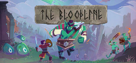
The Bloodline is a sandbox adventure RPG that lets you play your way. Reforge bonds between kingdoms, explore the wilds, craft and plan adventures and wield mighty weapons or magic as you prepare for what is to come…

$9.99Very Positive(36)
RPGCombatAction-Adventure
Shieldbearer StudiosOct 5, 2023

The Bloodline scores 65/100 — better than 11% of Steam capsules we've analysed (n=22,658).

Very Positive (36 reviews) · $9.99 · Released Oct 5, 2023 · By Shieldbearer Studios

Quick text summary

The Bloodline scored 65/100 on Steam Analyzer — Solid for a Steam capsule. Top priority fix: [title_readability] Redesign the title treatment with a bolder, higher-contrast letterform that retains the runic flavor but remains legible at 120x45 by increasing stroke weight and reducing decorative detail in the letterforms.

Capsule scores by dimension

  • Genre Clarity: 7/10 — Fantasy RPG action clear enough. The central large green troll-like enemy, a small armored hero with sword and shield, and flanking goblin creatures with weapons clearly communicate a fantasy action-RPG genre. The runic stone tablet title banner reinforces a Norse or medieval fantasy setting. At tiny size the combat posture between hero and large enemy still reads as an action RPG encounter, though the smaller characters become very hard to distinguish.
  • Title Readability: 6/10 — Runic font readable at full size only. The title 'The Bloodline' is set in a decorative runic hand-lettered style on a carved stone tablet, which is legible at full header size with some effort due to the stylized letterforms. At small capsule size the letters become noticeably harder to parse, and at tiny thumbnail size the title collapses into an unreadable texture smear. The decorative font choice sacrifices legibility for thematic flavor, which hurts discoverability on Steam browse pages.
  • Contrast & Color: 6/10 — Mid-range contrast, some blending. The bright green troll character provides reasonable contrast against the muted blue-grey misty background, and the warm orange flame on the right goblin adds a useful accent. However, the hero character in the center uses mid-tone browns and reds that partially blend into the rocky ground and background foliage at small sizes. In a grayscale test, the hero silhouette loses clear separation from the midground terrain, reducing overall pop against Steam's dark #1b2838 background.
  • Uniqueness & Polish: 6/10 — Competent indie style, somewhat generic. The flat stylized cartoon art style is consistently executed and the runic stone tablet logo device is a memorable thematic touch. However, the overall composition of hero versus oversized enemy in a fantasy landscape is a very common indie RPG trope with no strong unique selling point or mechanic communicated visually. Compared to benchmark titles like Hades II or Sea of Stars which use distinctive color palettes and iconic character designs, this reads as competent but generic within the crowded fantasy RPG space.
  • Brand Consistency: 7/10 — Cohesive Norse-fantasy cartoon identity. The runic stone tablet, green goblin-like enemies, flat stylized illustration style, and misty fantasy forest background form a reasonably coherent visual identity that suggests Viking or Norse-flavored fantasy. The color palette of desaturated blues and greens with warm accent pops is internally consistent. The carved stone title treatment is a distinctive identity element that could become recognizable across marketing assets, though it risks being mistaken for other Norse-themed indie titles.
  • Composition: 7/10 — Clear focal hierarchy, good layering. The composition uses a clear foreground-midground-background layering with large green troll as dominant focal point, the hero character creating a secondary point of tension, and flanking enemies framing the scene. The stone tablet title sits prominently in the upper center and does not compete with the action below. At small size the large troll still anchors the composition effectively, but the hero and side characters shrink to near-unrecognizable blobs, leaving the troll as the sole readable element which may confuse player identification.

What works

  • Dominant enemy silhouette anchors small sizes. The oversized green troll remains the largest and most visually dominant element and holds the composition together even at small and tiny thumbnail sizes.
  • Runic stone tablet is a memorable brand device. The carved stone banner with runic lettering is a distinctive thematic element that communicates Norse or Viking fantasy setting immediately at full size.
  • Clear combat narrative in the scene. The hero-versus-giant-enemy standoff communicates action RPG gameplay intent without needing text support.
  • Effective depth layering. The three-plane composition of foreground objects, midground characters, and misty background forest creates visual depth that reads well at header size.

What hurts the capsule

  • Title collapses at tiny size. The decorative runic font on the stone tablet becomes completely unreadable at 120x45 thumbnail size, reducing the title to a grey smear.
  • Hero character lacks contrast and presence. The protagonist in the center uses mid-tone warm colors that blend into the ground and fails to read as a distinct silhouette at small sizes, undermining player identification.
  • Generic fantasy RPG trope with no unique hook. The hero-fighting-large-monster scene communicates no unique mechanic, sandbox feature, or distinctive world element that differentiates it from dozens of similar indie RPG capsules.
  • Muted background reduces overall pop against Steam dark UI. The blue-grey misty background has low contrast against Steam's #1b2838 dark navy background, causing the capsule edges to bleed into the page at quick scroll speed.

Priority fixes

  1. [title_readability] Redesign the title treatment with a bolder, higher-contrast letterform that retains the runic flavor but remains legible at 120x45 by increasing stroke weight and reducing decorative detail in the letterforms.
  2. [contrast_color] Add a stronger light source or rim light on the hero character and introduce a darker vignette or contrasting color at the capsule edges to separate the image cleanly from Steam's dark #1b2838 background.
  3. [uniqueness_polish] Replace the generic hero-versus-monster scene with a composition that hints at the sandbox or kingdom-building RPG identity, such as showing the hero in a more dynamic or world-building context unique to The Bloodline.
  4. [genre_clarity] Increase the hero character's size and silhouette clarity so the player-character is immediately identifiable at small sizes, reinforcing the RPG protagonist fantasy rather than leaving the troll as the only readable figure.

Store copy priority fixes

  1. [hook_strength] Move foresight mechanic to the short description and lead with a concrete example ('See future goblin attacks and meteor storms before they strike') to create immediate intrigue and differentiation.
  2. [uniqueness] Add a sentence comparing this game's unique blend (e.g., 'The only fantasy RPG where every action—from swimming to ragdolling—levels your character, letting you become a genuinely unique build') to establish a clear competitive edge.
  3. [feature_communication] Reorder the detailed description to lead with the foresight planning mechanic and village construction (the most novel features) before listing generic sandbox activities, so skimmers encounter the game's main hook first.

Related guides

Steam app ID: 1159290