Scoring genre clarity...

Death and Taxes capsule

Death and Taxes

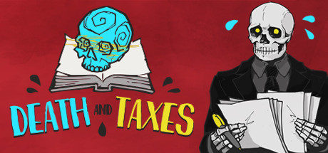
In this 2D, short narrative-based game, you assume the role of the Grim Reaper... on an office job. Your job is to decide which people are going to live or die. The consequences of your choices are yours to bear, while the mystery of your incarnation awaits revelation!

$1.68Very Positive(73)
Choices MatterStory RichSimulation
Placeholder GameworksFeb 20, 2020

Death and Taxes scores 83/100 — better than 95% of Steam capsules we've analysed (n=22,658).

Very Positive (73 reviews) · $1.68 · Released Feb 20, 2020 · By Placeholder Gameworks

Quick text summary

Death and Taxes scored 83/100 on Steam Analyzer — Good for a Steam capsule. Top priority fix: [contrast_color] Increase background simplicity by reducing texture opacity in the red zone to strengthen focal point isolation and clarity at tiny thumbnail size.

Capsule scores by dimension

  • Genre Clarity: 8/10 — Strong narrative adventure with dark humor. The skull-topped open book with glowing cyan mystical symbols instantly signals a narrative-driven game with supernatural or dark themes. The juxtaposition of death imagery with an office/book setting effectively communicates the game's core hook: unconventional premise of the Grim Reaper in an administrative role. At tiny size, the cyan skull and open book remain recognizable as the primary visual cue, clearly distinguishing this from generic adventure fare.
  • Title Readability: 8/10 — Bold, high-contrast title with clear hierarchy. The title 'DEATH AND TAXES' uses bright cyan and yellow text with strong black outlines against the red background, ensuring excellent legibility at all sizes. At tiny size, the two-word structure and bold sans-serif letterforms remain readable, though slight kerning tightness on smaller renders could introduce minor blur. The strategic placement below the central icon avoids overlap and maintains clean compositional separation.
  • Contrast & Color: 9/10 — Excellent value separation and saturation control. The cyan skull, yellow accents, and white book stand out sharply against the deep red background, creating strong silhouette clarity in both color and grayscale. Black outlines on the title reinforce edge definition and prevent any mid-tone muddiness. Even at tiny size with mental squint test, the cyan-red complementary contrast and white-red figure-ground separation remain instantly legible without color bleed or loss of focal point.
  • Uniqueness & Polish: 8/10 — Distinctive art style with cohesive character design. The hand-crafted illustration style with stylized skull geometry, line-art book detailing, and purposeful glyph marks (glowing circles on the skull) conveys a premium indie aesthetic that avoids generic template assets. The visual concept—death as a bureaucratic figure—is communicated purely through imagery and creates a memorable hook that suggests narrative depth and dark comedy. Polish is evident in the clean stroke work, layered shadows, and intentional effect choices like the glowing symbols.
  • Brand Consistency: 8/10 — Strong visual identity with recognizable motifs. The cyan skull with arcane glyphs, open tome, and color palette (red, cyan, yellow, black) form a cohesive visual language that telegraphs mystery, magic, and indie craft. The art style—hand-drawn illustration with clean outlines—creates an identifiable brand signature distinct from AAA or generic assets. These elements would likely recognize the game in future marketing; the skull-book combo is iconic and memorable within the narrative adventure space.
  • Composition: 9/10 — Excellent hierarchy and balanced focal point. The cyan skull-topped book dominates the center with perfect visual weight, flanked by decorative red illustrative elements that guide the eye without competing. The title anchors the lower third with clear separation from the icon above, creating stable three-point hierarchy: icon, space, text. At small and tiny sizes, this composition remains cohesive—the central icon remains the primary subject, supporting elements fade appropriately, and safe margins protect all critical elements from edge crop.

What works

  • Striking cyan-red complementary contrast. The bright cyan skull against deep red background creates immediate visual pop and remains legible at tiny size even in grayscale, ensuring discoverability in Steam lists.
  • Concept-driven visual storytelling. The skull-book-office imagery instantly communicates the game's unique premise without requiring text, making the capsule memorable and distinct within the genre.
  • Clean, readable title typography. Bold sans-serif with black outlines ensures the 'DEATH AND TAXES' text remains crisp and scannable at all viewing sizes.
  • Premium hand-crafted illustration style. The detailed line work, stylized skull geometry, and intentional glyph marks convey indie polish and avoid generic asset library appearance.

What hurts the capsule

  • Decorative red background texture density. While visually appealing, the subtle red gradient and faint illustrative marks in the background add visual noise that could reduce perceived focus at very small sizes.
  • Limited supporting visual hierarchy cues. Beyond the title and skull icon, there are few secondary elements to guide attention; the composition relies heavily on color contrast rather than compositional layering.

Priority fixes

  1. [contrast_color] Increase background simplicity by reducing texture opacity in the red zone to strengthen focal point isolation and clarity at tiny thumbnail size.
  2. [title_readability] Verify black outline thickness maintains crisp edges at 120x45 px thumbnail size through Steam preview tool to catch potential blur at smallest render.

Store copy priority fixes

  1. [hook_strength] Rewrite the short description to lead with 'Play the Grim Reaper—on an office job—deciding who lives or dies' instead of leading with '2D, short narrative-based game,' placing the absurdist premise first.
  2. [feature_communication] Replace the quirky activity list with a 2-3 sentence explanation of the core loop: 'Each day, review cases and vote on who lives or dies. Your choices ripple through the story, alter NPC outcomes, and unlock multiple branching endings.' Then add the existing bulleted activities as flavor.
  3. [genre_clarity] Clarify the role of 'Strategy' by explaining how player decisions involve trade-offs, consequence prediction, or consequence-balancing (e.g., 'preventing one catastrophe may trigger another' or 'balance mercy against the greater good').
  4. [audience_targeting] Add a sentence explicitly naming the player type: 'Perfect for fans of choice-driven indie narratives who enjoy dark humor and replaying for secret endings.'

Related guides

Steam app ID: 1166290