Scoring genre clarity...
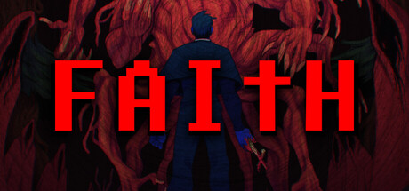
FAITH: The Unholy Trinity capsule

FAITH: The Unholy Trinity

What you are about to do has not been approved by the Vatican. As a young priest, struggle against demons, cultists, and your own weakening faith in this pixel horror game inspired by the era of classic 8-bit gaming and the "Satanic Panic" of the 1980s.

$14.99Very Positive(65)
HorrorPixel GraphicsPsychological Horror
Airdorf GamesOct 21, 2022

FAITH: The Unholy Trinity scores 78/100 — better than 90% of Horror capsules (n=3,630).

Very Positive (65 reviews) · $14.99 · Released Oct 21, 2022 · By Airdorf Games

Quick text summary

FAITH: The Unholy Trinity scored 78/100 on Steam Analyzer — Good for a Horror capsule. Top priority fix: [uniqueness_polish] Introduce a distinctive visual signature such as a unique priest pose, recognizable cult symbol, or signature color accent that differentiates from standard pixel horror covers

Capsule scores by dimension

  • Genre Clarity: 8/10 — Horror indie pixel art clear. The red demonic silhouettes, pixelated priest figure in center, and dark religious horror atmosphere immediately signal indie horror with 8-bit nostalgia. At tiny size, the central blue-robed figure against writhing red shapes reads unmistakably as a lone character facing supernatural threat, though specific pixel art style requires small size to fully register as retro gaming homage.
  • Title Readability: 9/10 — Bold uppercase highly legible. FAITH is rendered in bright red, chunky block lettering with strong contrast against the dark background and positioned prominently in the upper-middle area. At tiny size it remains fully readable; the thick letterforms and high value contrast ensure the title cuts through at all viewing scales without any decorative softness that would blur.
  • Contrast & Color: 8/10 — High value separation excellent. The bright red title and blue priest silhouette create strong luminosity contrast against the deep burgundy and black background, ensuring crisp separation even in grayscale squint test. The design avoids muddy mid-tones; primary elements have distinct edges that hold at small and tiny sizes, though the background texture adds subtle depth without competing.
  • Uniqueness & Polish: 7/10 — Retro horror premise solid. The capsule nails the 8-bit horror niche with intentional pixel art aesthetic and Satanic Panic era theming; the central priest figure and demonic background communicate core narrative conflict. While the concept is well-executed and cohesive, the visual execution relies on established retro-horror language rather than a truly distinctive art direction that would elevate it above solid indie horror peers.
  • Brand Consistency: 7/10 — Retro pixel identity maintained. The capsule consistently employs pixelated character art, dark religious color palette, and supernatural horror imagery that aligns with the game's stated 8-bit inspiration and Vatican-defying premise. The visual language feels intentional and recognizable for the franchise, though without iconic recurring motifs like a signature character or symbol visible here, the brand identity reads as thematic rather than uniquely proprietary.
  • Composition: 8/10 — Clear focal point centered. The blue priest figure anchors the center with the title above and chaotic red demons forming a surrounding halo effect, creating strong visual hierarchy and depth layering. The title placement sits safely within viewing margins and the composition remains readable at all sizes; the background chaos supports rather than distracts from the central subject.

What works

  • Title legibility at all scales. FAITH remains fully readable at tiny thumbnail size due to thick block letterforms and bright red value contrast against the dark background.
  • Genre and theme immediately clear. The combination of religious horror iconography, pixelated style, and demonic imagery instantly communicates indie horror with 8-bit nostalgia without ambiguity.
  • Strong focal point hierarchy. The centered blue priest figure creates a clear primary subject with title above and supporting horror elements around, guiding viewer attention effectively even at small sizes.

What hurts the capsule

  • Generic pixel horror template feel. While well-executed, the visual approach relies on familiar retro-horror tropes without a distinctive art hook that separates it from other 8-bit indie horror games in the crowded genre.
  • Limited visual storytelling depth. The capsule communicates the premise but lacks a unique selling point or memorable visual signature beyond standard demonic imagery and priest silhouette that other pixel horror titles also use.
  • Background texture adds visual noise. The dark red texture in the background, while atmospheric, creates slight mid-tone ambiguity that slightly reduces the sharp separation between character and environment compared to cleaner alternatives.

Priority fixes

  1. [uniqueness_polish] Introduce a distinctive visual signature such as a unique priest pose, recognizable cult symbol, or signature color accent that differentiates from standard pixel horror covers
  2. [brand_consistency] Add an iconic recurring motif or UI element from the game (Vatican seal, demon mark, faith meter) to strengthen proprietary brand identity recognition
  3. [contrast_color] Increase silhouette definition by adding a thin outline or glow around the priest figure to further separate foreground from background texture at small sizes

Related guides

Steam app ID: 1179080 · Tags: Horror, Pixel Graphics, Psychological Horror, Indie, Retro