The best Steam capsule designs of 2026
Explore a regularly updated gallery of strong Steam capsule art, ranked by readability, genre clarity, contrast, composition, and small-size performance.
Benchmarked against 5,000 analyzed Steam capsules · average score 73/100
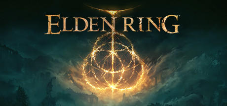
ELDEN RING
Exceptional
Top 5%
Top strengths
100/100
90/100
90/100
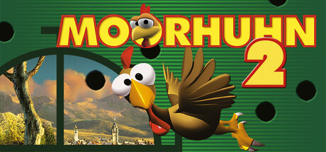
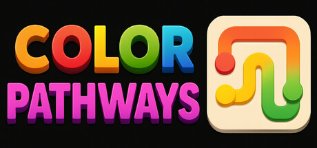
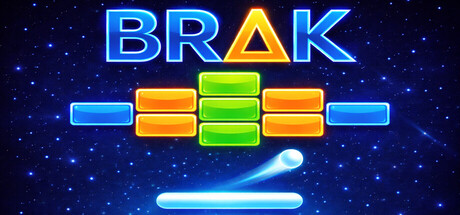
Top examples
A curation of the best examples of Steam Capsules, updated every week.
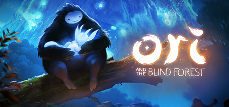
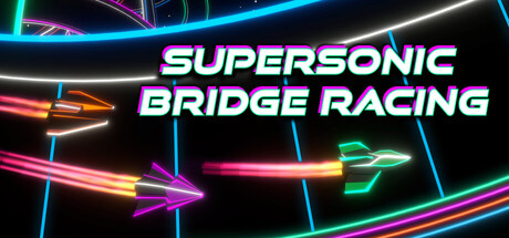
 93/100
Street Fighter™ 6
 93/100
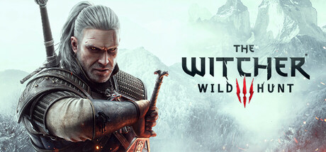
The Witcher 3: Wild Hunt
 92/100
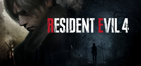
Resident Evil 4
 92/100
Blasphemous 2
 92/100
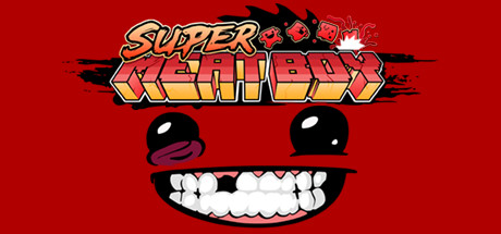
Super Meat Boy
 92/100
Counter-Strike 2
 90/100
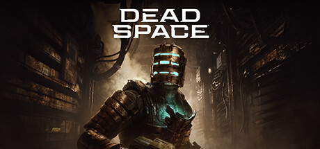
Dead Space
 90/100
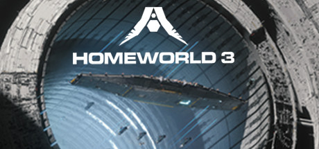
Homeworld 3
 90/100
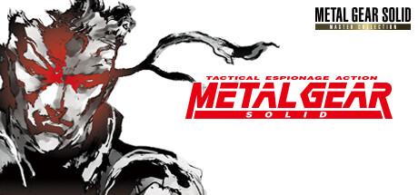
METAL GEAR SOLID - Master Collection Version
 90/100
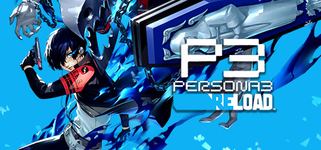
Persona 3 Reload
 90/100
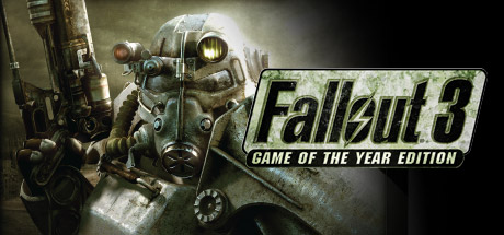
Fallout 3: Game of the Year Edition
 90/100
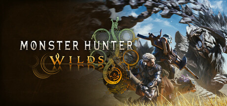
Monster Hunter Wilds
Browse top examples by genre
The four leading capsules in each genre, by score.
Singleplayer
16465 scoredIndie
11629 scored

Casual
10296 scored

2d
9108 scored

Action
8733 scoredAdventure
8133 scored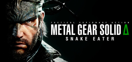
3d
7929 scored


Colorful
5492 scored

Atmospheric
5438 scored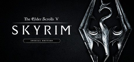
Simulation
5328 scored
Strategy
5232 scored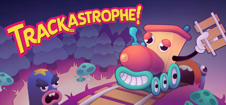

Browse top examples by key scoring dimension
Each block lists the capsules scoring highest on one specific dimension of the rubric. Use these as references when fixing a specific weakness.
Genre Clarity
(Make the genre obvious)Can a player name the genre at tiny size (120×45)? Rewards theme-specific cues, familiar iconography, and clear gameplay signals. Penalises mixed or misleading messaging.


Title Readability
(Make the title readable)Judges letterforms, spacing, contrast, and legibility at both full and tiny sizes. Rewards titles placed on a clean background zone. Penalises decorative fonts that collapse small.
Contrast & Color
(Make it pop at small size)Does the capsule pop against Steam's dark #1b2838 background in a quick scroll? Focuses on value separation and silhouette clarity, checked in grayscale. Penalises muddy mid-tones.
Uniqueness & Polish
(Avoid looking generic)How premium and distinct does it feel vs. other genre capsules? Rewards a clear visual hook, clean craft, and intentional design. Penalises generic or template-looking art.
Brand Consistency
(Make the game feel coherent)Scored on internal cohesion only: consistent style, palette, and recognisable identity cues. Rewards a signature motif or character that could be recognised across a game's library.
Composition
(Stand out in your category)Checks focal point, hierarchy, balance, and crop resilience across all sizes. One clear primary subject at small size. Penalises clutter, edge-hugging titles, and awkward empty space.
What strong Steam capsules tend to do
The six dimensions of a capsule that earns the click — pulled from the full design guide.
Genre Clarity
- Make the game's promise instantly obvious. Show the world and the main action at a glance.
- Use 1–2 genre signals players already recognise (camera angle, characters, props, UI cues), then add one unique twist so it's not generic.
- Avoid mixed messages. Don't blend tone, era, or art cues from different genres unless that mashup is the product.
Title Readability
- Design for the smallest size first. If it's not readable at tiny capsule size, redo it.
- Give the title a clean zone: flat area, vignette, blur, or controlled negative space behind the text.
- Use thick letterforms and strong separation. High value contrast plus stroke or shadow. Keep words short.
Contrast & Color
- Prioritise value contrast over saturation. Check it in grayscale to confirm subject and title still pop.
- Separate layers. Brighten the subject, darken or simplify the background, add rim light or outline if needed.
- Limit the palette. One dominant scheme, one accent colour, one neutral so the image reads cleanly.
Uniqueness & Polish
- Include one instantly identifiable hook that's hard to confuse with other games: character silhouette, creature, tool, world element, or logo treatment.
- Remove visual noise. Fewer elements, cleaner shapes, higher signal per pixel.
- Ship-level finish. Crisp edges, consistent lighting, consistent materials, no muddy compression, no accidental tangents.
Brand Consistency
- Standardise a kit: same font family, stroke/shadow style, colour accents, and logo placement rules across all capsules.
- Keep the same mood language. Similar lighting, contrast style, and framing so your game is recognisable in a grid.
- Repeat your signature motif. A character, icon, pattern, or framing device that becomes your visual fingerprint.
Composition
- Make one clear focal point. Big subject first, then secondary support, then background.
- Use simple shape structure. Foreground, subject, background. Strong silhouette beats detail.
- Respect crops and overlays. Leave safe margins, avoid putting critical detail near edges, and keep the reading path clean.
Frequently asked questions
Where do these Steam capsule examples come from?
Real Steam games we've analyzed. Each genre and tag page links into the analysis pages of games scoring 60+ on the six-dimension capsule rubric. We don't fabricate examples or generate synthetic capsules. Every example is a shipped Steam game with its own analysis page.
How are the genres and tags sorted?
Genres surface once at least 10 eligible analyses share that genre tag; Steam tags surface once at least 3 eligible analyses share the tag. Below those sample sizes, the page would be too thin to be useful, so the hub gates them out. Curated featured-capsule overrides will surface specific contexts even when sample size is below threshold.
Are these the 'best' Steam capsules?
These are capsules scoring at or above the eligibility threshold (60/100) on our six-dimension rubric, sorted by score within each context. They are strong examples, not necessarily 'the best' in any objective sense. A capsule's success on Steam depends on factors beyond visual design, including price, audience, timing, and reviews. The capsule is a necessary condition, not a sufficient one.
Can I see examples of capsules that fail?
Not on this page. We deliberately do not name games as negative examples. Capsules that score below the eligibility threshold appear only in anonymised aggregated form in the patterns section: common pitfalls and strengths summarised across the dataset. Naming individual games as cautionary tales would be unfair and counterproductive.
What capsule examples do you recommend studying?
Look at the top-scoring capsules in your own genre and your own tag set. A horror capsule should learn from horror examples, not from action examples. The conventions are different. Use the six-dimension rubric (genre clarity, title readability, contrast and colour, uniqueness and polish, brand consistency, composition) as the lens, and look at how each example scores on each dimension separately.
How often are the examples updated?
Daily, via incremental static regeneration. As more Steam games get analyzed and cross the eligibility threshold, they appear in the relevant genre and tag hubs automatically. Editorial featured selections are updated by hand. See the lib/featured-capsules.ts curation file for the rules.
What makes good Steam capsule art?
Good Steam capsule art passes the six-dimension test that decides whether a player clicks: genre clarity (instantly readable at 120×45 thumbnail size), title readability, value contrast against Steam's #1b2838 dark UI, a single dominant focal point, brand consistency with the in-game art, and a unique-feeling visual style. The strongest capsules nail all six. Most failed capsules fail genre clarity at thumbnail size first.
What size is a Steam capsule?
Steam uses multiple capsule sizes: the main store capsule is 1232×706, the header capsule on the store page is 920×430, the small capsule rendered in home-page rails is 462×174, and the vertical capsule used in the library is 748×896. Steam auto-generates a 120×45 thumbnail from the small capsule; that thumbnail is the most-seen render of your capsule, by a wide margin.
What is the difference between header, small, main, and vertical capsules?
The header capsule (920×430) is what appears on the store page itself. The small capsule (462×174) is what appears in the home-page rails and search results; Steam scales it down to 120×45 in many discovery surfaces. The main capsule (1232×706) appears in personalised discovery rows and category pages. The vertical capsule (748×896) is the library-shelf format. All four should read as the same game and obey the same legibility rules at their respective sizes.
Should Steam capsule art include text?
Yes, the title should be on the capsule, sized and placed so it stays legible at 120×45. Beyond the title, additional text is risky: review quote pull-outs, feature bullet points, and ESRB ratings are explicitly discouraged by Steam's asset rules and collapse to noise at thumbnail size. The strongest capsules use one piece of text (the title) and let the imagery do the rest.
How do I make my Steam capsule stand out?
Three levers move the needle most across genres: strong value contrast against Steam's dark UI (test in greyscale), a title placed on a controlled background zone (vignette, darker corner, or a deliberately calmer band), and warm-cool colour temperature contrast (not just saturation). These three patterns recur in the top-scoring examples across every genre we have a cohort for.
How do I test my Steam capsule before launch?
Render the capsule at 120×45 in your design tool, place it on a #1b2838 background, and check whether the title is legible and the genre is unambiguous. Repeat at 231×87 (small capsule size). Run a greyscale check to confirm value contrast doesn't collapse to flat mid-tones. Show it to three players outside your genre and ask what kind of game it is. The full pre-launch list is on the capsule checklist page linked in the sidebar.
Ready to analyze your own Steam capsule?
Get an instant score and breakdown across 6 key dimensions.
Last reviewed: 2026-05-24. Sourced from Steam's official Steamworks documentation and the Steam Analyzer scoring methodology.