Scoring genre clarity...

Lost Brothers capsule

Lost Brothers

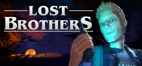
Lost Brothers is a single-player first-person adventure, taking place in an abandoned mine. All you have is a walkie-talkie and a map. Explore a mysterious forest and a labyrinth of underground passages to rescue a mysterious lady.

$8.99Mostly Negative(26)
Walking SimulatorFirst-PersonAtmospheric
BitLightJan 12, 2021

Lost Brothers scores 62/100 — better than 3% of Steam capsules we've analysed (n=22,658).

Mostly Negative (26 reviews) · $8.99 · Released Jan 12, 2021 · By BitLight

Quick text summary

Lost Brothers scored 62/100 on Steam Analyzer — Solid for a Steam capsule. Top priority fix: [uniqueness_polish] Add a distinctive visual hook or environmental storytelling element such as a glowing map overlay or mine entrance visible in the background to differentiate from generic forest adventure capsules.

Capsule scores by dimension

  • Genre Clarity: 6/10 — Outdoor adventure survival hint. The walkie-talkie prop is a smart genre cue tying directly to the game's core mechanic, and the glowing teal character against a forest/campfire background suggests outdoor exploration or survival. However, at tiny size the walkie-talkie dissolves into the character's hand and the genre becomes ambiguous between survival, horror, and adventure. The orange campfire glow behind trees leans atmospheric but doesn't strongly communicate first-person adventure or mystery.
  • Title Readability: 7/10 — Bold title reads at small size. The white serif title 'LOST BROTHERS' with the underline decoration is large, high-contrast, and placed on a relatively dark upper-left region, making it readable at small capsule size. At tiny size the text still resolves into legible letterforms due to the bold weight and tight tracking. The decorative underline stroke is a nice touch but becomes invisible at tiny size, which is acceptable since it is purely ornamental.
  • Contrast & Color: 7/10 — Teal character pops on dark bg. The teal-lit character creates strong hue contrast against the warm orange-red forest background and the Steam dark UI, providing clear silhouette separation. The value split between the bright character face and the darker background works well in grayscale. At tiny size the warm-cool contrast still creates enough separation to distinguish the character from the background, though the muddy mid-dark tree layer slightly compresses the depth.
  • Uniqueness & Polish: 5/10 — Competent but generic indie feel. The 3D character art has a slightly low-budget indie quality compared to benchmark titles like Pacific Drive or Harold Halibut, with the character's face reading as slightly plastic and the overall composition feeling like a common 'character holding item in forest' template. The teal rim lighting is an effective stylistic choice that adds some personality, but the overall execution lacks a distinctive visual hook or storytelling moment that would make it stand out in a genre scroll. Compared to top-performing capsules in this genre, it feels competent but not memorable.
  • Brand Consistency: 6/10 — Cohesive palette, limited identity. The warm orange versus cool teal color split is internally consistent and gives the image a clear art direction identity. The Maine state badge on the character's shirt is a small but appreciated world-building detail. However, without a strongly distinctive art style, logo treatment, or recurring motif, the capsule would be difficult to recognize as part of a series or brand, and it blends into the broader indie adventure visual space.
  • Composition: 6/10 — Standard right-character layout. The character is positioned on the right half with the title dominating the upper left, which is a functional and readable hierarchy. The campfire tent scene in the background midground adds depth layering. However, the character is cropped awkwardly at the chest and right edge, and at small size the composition feels slightly crowded with the title and character competing for equal visual weight. The background detail of the trees and tent is largely lost at tiny size, leaving mostly a glowing face and bold text, which still communicates adequately.

What works

  • Warm-cool color contrast. The teal-lit character against the orange forest background creates immediate visual interest and strong separation from Steam's dark UI.
  • Title placement and weight. The bold serif 'LOST BROTHERS' in the upper left reads clearly at small capsule size with good contrast against the dark sky region.
  • Walkie-talkie prop storytelling. The held walkie-talkie is a direct visual reference to the game's core mechanic and adds narrative specificity beyond a generic character pose.

What hurts the capsule

  • Generic 3D character render quality. The character's face has a slightly plastic, low-budget 3D appearance that positions the game below benchmark titles in perceived production value.
  • Awkward character crop at edges. The character is cut off at the chest and right side, creating an unfinished framing that reduces compositional polish.
  • Background detail lost at tiny size. The campfire tent and forest atmosphere collapse into a muddy dark blob at tiny thumbnail size, losing the atmospheric context.
  • No distinctive visual identity hook. There is no unique motif, logo treatment, or visual idea that makes this capsule memorable or immediately distinguishable from similar indie adventure titles.

Priority fixes

  1. [uniqueness_polish] Add a distinctive visual hook or environmental storytelling element such as a glowing map overlay or mine entrance visible in the background to differentiate from generic forest adventure capsules.
  2. [composition] Reframe the character crop to include more of the figure or zoom into the face and walkie-talkie more tightly so the key elements read cleanly at tiny size without awkward edge cutting.
  3. [brand_consistency] Develop a more stylized or iconic title logo treatment with a distinctive typeface or emblem that can anchor brand recognition across capsule sizes.
  4. [genre_clarity] Introduce a clearer environmental cue for the mine/underground setting, such as a mine shaft entrance or lantern, to prevent ambiguity between outdoor survival and adventure genres at tiny size.

Store copy priority fixes

  1. [hook_strength] Replace the straightforward opening with a single evocative line that emphasizes John's internal conflict or the mystery ('Your brother vanished in these woods years ago. Now a stranger's voice crackles through the radio, calling for help from the same mountain.') to create immediate emotional resonance.
  2. [uniqueness] Add a specific differentiator that explains what makes Lost Brothers distinct—e.g., how the walkie-talkie mechanic shapes the story, whether the brother's fate is central to multiple endings, or what the 'local anomalies' introduce that other walking simulators don't explore.
  3. [feature_communication] Replace the vague key features with concrete gameplay mechanics: specify the map-radio navigation system, clarify puzzle or exploration objectives, state play duration (e.g., 'a 2-3 hour experience'), and describe the nature of player interaction (passive observer vs. active problem solver).
  4. [tone_match] Remove the closing comment ('Well, run to add!!!') and replace it with a final atmospheric line that reinforces the game's mystery and emotional core—e.g., 'The forest never gives up its dead. But perhaps it will give up its secrets.'

Related guides

Steam app ID: 1202790