Scoring genre clarity...

Wreckfest 2 capsule

Wreckfest 2

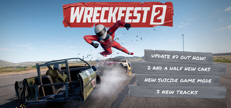
Ready for mayhem? Wreckfest is back, offering the best in full-contact racing with unrivaled destruction! Witness head-to-head battles as you tear apart rival vehicles bit by bit. Powered by the enhanced physics engine, developed by the creators of Wreckfest & FlatOut!

$27.99Mostly Positive(116)
RacingSimulationDestruction
BugbearMar 20, 2025

Wreckfest 2 scores 83/100 — better than 95% of Steam capsules we've analysed (n=22,658).

Mostly Positive (116 reviews) · $27.99 · Released Mar 20, 2025 · By Bugbear

Quick text summary

Wreckfest 2 scored 83/100 on Steam Analyzer — Good for a Steam capsule. Top priority fix: [title_readability] Remove or greatly enlarge the update callout text to prevent illegibility at small sizes, or relocate it to a less critical compositional zone

Capsule scores by dimension

  • Genre Clarity: 9/10 — Destruction racing immediately clear. The wrecked bus, scattered debris field, and chaotic vehicle destruction communicate arcade racing with destruction focus instantly. At tiny size, the mangled vehicle silhouette and wreckage debris remain unambiguous genre signals that distinguish this from simulation racers like F1 or Forza.
  • Title Readability: 9/10 — Bold white title dominates clearly. WRECKFEST 2 uses thick white sans-serif lettering on a bright red banner, positioned prominently in upper-center with strong contrast against sky background. The logo remains fully readable at small and tiny sizes due to high value contrast and chunky letterforms that resist collapse.
  • Contrast & Color: 8/10 — Strong separation with bright palette. The bright red title banner and blue bus wreckage stand out sharply against the sky-dominated background with clear value separation. In grayscale, the dark vehicle silhouettes separate cleanly from the lighter sky, though the midtone earth tones of debris introduce slight muddiness at tiny sizes.
  • Uniqueness & Polish: 8/10 — Signature destruction chaos polished well. The capsule captures Wreckfest's core identity—vehicular destruction and mayhem—with a compelling real-world wreckage scene rather than generic racing imagery. The accompanying update text and promotional layout feel intentional and franchise-specific, avoiding the clean presentation of simulation racers to embrace gritty authenticity.
  • Brand Consistency: 8/10 — Destruction-focused identity reinforced. The wrecked bus, debris field, and chaotic energy align consistently with Wreckfest's brand of full-contact racing and environmental destruction. The red banner and earth-toned palette reinforce the arcade-destruction tone familiar to series fans, though the bright sky background is less iconic than darker, moodier competitor palettes.
  • Composition: 8/10 — Clear hierarchy with focal wreckage. The mangled bus occupies the compositional center with debris radiating outward, creating strong focal depth and layering from background sky through vehicle to foreground destruction. Text placement in upper-right avoids critical elements, though the update callout text becomes unreadable at tiny sizes and competes slightly with the title at small sizes.

What works

  • Genre-specific destruction iconography. The wrecked bus and scattered debris immediately signal arcade destruction racing, differentiating Wreckfest from simulation competitors and communicating core gameplay.
  • Title legibility across all sizes. The thick white WRECKFEST 2 banner maintains full readability at tiny thumbnail size with strong contrast against the red background.
  • Coherent destruction-focused brand identity. Every visual element—wrecked vehicle, debris, chaotic composition—reinforces the franchise's mayhem-first philosophy without generic racing tropes.

What hurts the capsule

  • Update text unreadable at small size. The white callout text describing UPDATE #1, CAR PERFORMANCE UPGRADES, and NEW WAYPOINT becomes illegible at small and tiny capsule sizes.
  • Composition slightly busier than peers. Scattered debris and promotional text create visual clutter compared to cleaner competitors like Forza or F1, which may reduce quick-scroll impact.
  • Sky background lacks distinctive palette anchor. The light blue sky is generic and doesn't establish a memorable brand color that could signal Wreckfest 2 on sight alone the way strong primary colors do in top competitors.

Priority fixes

  1. [title_readability] Remove or greatly enlarge the update callout text to prevent illegibility at small sizes, or relocate it to a less critical compositional zone
  2. [contrast_color] Introduce a stronger, more saturated brand color accent (deep orange, teal, or purple) in the sky or debris to increase memorability and pop at tiny sizes
  3. [composition] Simplify the debris field or tighten the focal area around the bus to reduce visual noise and improve scanning speed during quick scrolls

Store copy priority fixes

  1. [feature_communication] Reorganize the detailed description to lead with 'What You Get Now' (initial Early Access launch features), then expand to roadmap. Move the disclaimer to a separate FAQ or post-content section so it doesn't undermine launch excitement.
  2. [hook_strength] Expand the short description to include one specific game mode or moment (e.g., 'Race, demolish, and customize in full-contact battles with physics destruction'). The current version works but could punch harder by naming a signature mode.
  3. [audience_targeting] Add a 1-2 sentence clarification early in the detailed description explicitly addressing both casual wreckers and sim enthusiasts (e.g., 'Whether you're here for chaotic fun or competitive racing, Wreckfest 2 scales to your playstyle'). This bridges the tone split.
  4. [uniqueness] Include a direct comparative statement such as 'Unlike racing sims focused on pristine performance, Wreckfest 2 rewards destruction and chaos with a rebuilt physics engine' to sharpen differentiation from traditional racing games.

Related guides

Steam app ID: 1203190