Scoring genre clarity...

Grand Theft Auto IV: The Complete Edition capsule

Grand Theft Auto IV: The Complete Edition

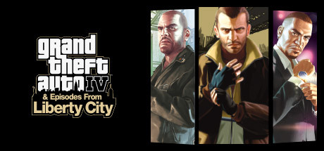
Niko Bellic, Johnny Klebitz and Luis Lopez all have one thing in common - they live in the worst city in America. Liberty City worships money and status, and is heaven for those who have them and a living nightmare for those who don't.

$5.99Very Positive(2,013)
Open WorldActionCrime
Rockstar North, Rockstar TorontoMar 24, 2020

Grand Theft Auto IV: The Complete Edition scores 85/100 — better than 97% of Steam capsules we've analysed (n=22,658).

Very Positive (2,013 reviews) · $5.99 · Released Mar 24, 2020 · By Rockstar North

Quick text summary

Grand Theft Auto IV: The Complete Edition scored 85/100 on Steam Analyzer — Excellent for a Steam capsule. Top priority fix: [genre_clarity] Consider adding a subtle Liberty City skyline or street asset in the background to reinforce open-world crime genre identity at TINY size.

Capsule scores by dimension

  • Genre Clarity: 8/10 — Clear crime action game identity. Three distinct character portraits in sharp focus immediately signal a narrative-driven action game with multiple protagonists, a hallmark of GTA's storytelling approach. The urban setting and character poses convey criminal underworld themes effectively. At TINY size, the three-character layout and posed figures remain recognizable as crime fiction, though specific genre nuance (open-world sandbox) requires familiarity with the franchise.
  • Title Readability: 9/10 — Excellent logo legibility throughout. The iconic 'Grand Theft Auto IV' logotype uses a bold, geometrically clean sans-serif with sharp white-on-dark contrast and generous letter spacing that holds perfectly at TINY size. The secondary line 'Episodes From Liberty City' in smaller yellow text remains readable at SMALL size but becomes indistinct at TINY, yet the main logo dominates clearly. Strategic placement on the left side over a controlled dark background ensures zero competition with character elements.
  • Contrast & Color: 9/10 — Strong value separation, premium lighting. The three character portraits feature warm, well-lit skin tones and saturated clothing (yellow jacket, blue shirt) that create sharp silhouettes against the dark steam background and muted tan/olive mid-tones in the character panels. The white logo pops decisively against the black area, and grayscale conversion shows excellent light-dark separation throughout. At TINY size, the three vertical color blocks and white text remain distinct and scannable.
  • Uniqueness & Polish: 8/10 — Polished, recognizable franchise identity. The portrait-triptych layout with professionally rendered character models, subtle lighting gradients, and careful color grading conveys premium AAA production and narrative weight rather than generic action marketing. Each character's pose and expression communicate distinct personality, reinforcing the game's three-protagonist structure. The design avoids spectacle effects and relies on character artistry, which feels intentional and cohesive rather than derivative.
  • Brand Consistency: 9/10 — Iconic GTA visual language maintained. The capsule adheres closely to GTA IV's established brand: the distinctive geometric logo treatment, the use of multiple character portraits as the narrative hook, the warm-toned urban aesthetic, and the focus on individual personality and attitude over action spectacle. The color palette (yellows, blues, warm tans) and character rendering style align with promotional materials from the 14-screenshot store set. The design signals 'GTA' unmistakably to players familiar with the franchise.
  • Composition: 8/10 — Clear hierarchy, balanced character focus. The layout divides the canvas into two zones: logo and secondary text on the left (occupying ~30% width), three character portraits on the right (occupying ~70% width) with subtle vertical panel separation. The focal point naturally shifts to the character triptych, which maintains balanced weight across three figures without clutter. At SMALL and TINY sizes, the logo anchors the left side while the three-panel character grid reads as the primary visual anchor; safe margins are respected, and Steam cropping poses no risk to key elements.

What works

  • Icon-grade logo execution. The GTA IV logotype is instantly recognizable, maintains crisp geometry at all sizes, and uses high-contrast white-on-dark rendering that never collapses even at TINY resolution.
  • Character personality communication. Each of the three protagonists is clearly lit and posed with distinct visual identity and attitude, communicating the game's narrative focus on individual stories rather than generic action.
  • Lighting and color sophistication. Warm, naturalistic character lighting combined with restrained color grading (yellows, blues, subtle gradients) creates a premium AAA visual feel that avoids over-saturation or cheap effects.
  • Safe layout resilience. No critical elements sit at risky edges; the design respects safe margins and crops naturally at all viewport sizes without content loss.

What hurts the capsule

  • Secondary text legibility at TINY. The 'Episodes From Liberty City' subtitle and any additional tagline text become unreadable at TINY thumbnail size, though the primary logo remains strong.
  • Limited contextual environment. The background is neutral/black rather than a recognizable Liberty City landmark or scene, missing an opportunity to reinforce setting or urban atmosphere at a glance.

Priority fixes

  1. [genre_clarity] Consider adding a subtle Liberty City skyline or street asset in the background to reinforce open-world crime genre identity at TINY size.
  2. [composition] Ensure the character panel separation (vertical dividers) uses slightly higher contrast so the three-portrait structure reads clearly even at TINY thumbnail viewing.

Store copy priority fixes

  1. [feature_communication] Restructure the detailed description: Move all technical update notes into a separate 'Technical Changes' section at the bottom. In the main 'About the Game' section, add 2–3 bullets describing core gameplay loops: 'Complete 100+ story missions across three campaigns,' 'Explore Liberty City's five boroughs with vehicles, weapons, and customization,' 'Engage in side activities: drug deals, street racing, vigilante missions, and more.'
  2. [hook_strength] Rewrite the opening line to lead with a core gameplay verb and value: 'Carve your own path through a sprawling, corrupt metropolis as three antiheroes whose stories collide with devastating consequences.' This communicates player agency and narrative weight, not just setting.
  3. [uniqueness] Add a sentence clarifying what the Complete Edition adds: 'For the first time, experience all of Grand Theft Auto IV, The Lost and Damned, and The Ballad of Gay Tony in one restored package with [specific technical improvements, if any].' This explains why this version exists.
  4. [audience_targeting] Insert an audience signal: 'For players who crave deep narrative-driven open-world crime games with multiple playstyles and character arcs.' This helps self-selection before multiplayer and service removal disappointment.

Related guides

Steam app ID: 12210