Scoring genre clarity...

ULTRAKILL capsule

ULTRAKILL

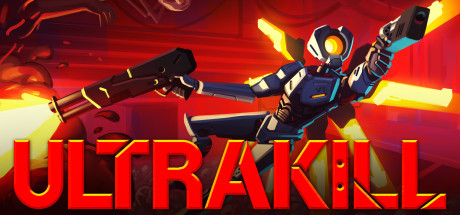
ULTRAKILL is a fast-paced ultra-violent retro FPS that combines the skill-based style scoring of character action games with the unadulterated carnage inspired by the best shooters of the '90s. Rip apart your foes with varied destructive weaponry and shower in their blood to regain your health.

$22.49Overwhelmingly Positive(4,189)
Fast-PacedGoreFPS
Arsi "Hakita" PatalaSep 3, 2020

ULTRAKILL scores 83/100 — better than 95% of Steam capsules we've analysed (n=22,658).

Overwhelmingly Positive (4,189 reviews) · $22.49 · Released Sep 3, 2020 · By Arsi "Hakita" Patala

Quick text summary

ULTRAKILL scored 83/100 on Steam Analyzer — Good for a Steam capsule. Top priority fix: [contrast_color] Darken or simplify the lower enemy crowd background to increase silhouette separation and reduce muddiness at tiny sizes

Capsule scores by dimension

  • Genre Clarity: 9/10 — Fast-paced shooter instantly clear. The dual-wielding robot figure mid-kick with guns blazing and explosive yellow muzzle flash immediately reads as a fast-paced action shooter. The blood splatter, crowd of enemies in the background, and aggressive red hellscape background reinforce the violent FPS/character action genre. At tiny size the dual-gun pose and dynamic energy still communicate 'aggressive action game' without ambiguity.
  • Title Readability: 8/10 — Bold logo reads well at small. The ULTRAKILL logotype uses thick, bold capital letters with a red-to-orange gradient and a subtle outline, placed against the relatively clean upper-left sky area which provides contrast. At full size it is immediately legible; at small capsule size it still reads clearly due to the high letter weight. At tiny size the letters compress but the word remains parseable due to its compact uppercase block form, though the gradient detail is lost.
  • Contrast & Color: 8/10 — Strong warm-cool hero separation. The navy-blue robot character contrasts sharply against the saturated red-orange background, creating a clean warm-cool split that reads well even in grayscale due to strong value difference. The yellow muzzle flashes and eye glow add high-saturation accent pops that draw the eye. Against Steam's dark #1b2838 border, the red background edges pop cleanly, though the lower crowd section gets muddy and loses detail at tiny size.
  • Uniqueness & Polish: 8/10 — Distinct stylized art with energy. The flat-shaded, cel-style robot design is a distinctive visual identity that stands apart from photorealistic genre competitors like Armored Core VI or Space Marine 2, leaning into an intentional retro-indie aesthetic that matches the game's tone. The composition has genuine kinetic energy with the flying kick pose, dual guns, and layered explosion effects. It avoids the generic 'character staring forward' template and communicates personality and speed, though the crowd background is somewhat generic and doesn't add unique storytelling.
  • Brand Consistency: 9/10 — Iconic robot identity well established. The V1 robot character with the distinctive yellow visor eye, navy blue armor, and dual pistols is a recognizable mascot that carries strong brand identity across the game's marketing. The red hellscape palette, cel-shaded rendering, and aggressive kinetic composition all feel internally cohesive and align tightly with the game's visual language. The ULTRAKILL logo treatment with the bold red font is consistent with the game's branding and the overall palette of the art.
  • Composition: 8/10 — Dynamic diagonal with clear focal point. The robot is positioned on a strong diagonal from lower-left to upper-right, creating a sense of movement and energy with the title anchored safely in the upper-left clean sky region. The foreground blood splatter, midground robot, and background enemy crowd create decent depth layering. At small size the robot remains the clear primary subject, though the lower-third crowd and blood effects compete slightly and reduce clarity; the composition holds well under cropping conditions with no key elements dangerously close to edges.

What works

  • Strong genre iconography at tiny size. The dual-gun flying kick pose communicates fast violent action instantly even at 120x45 pixels.
  • Warm-cool color contrast. The navy robot against the red-orange background creates a strong value and hue split that survives grayscale testing.
  • Recognizable mascot identity. The V1 robot with its yellow visor is a distinctive character that builds brand recognition across capsule views.
  • Safe title placement on clean background region. The ULTRAKILL logo sits on the lighter upper sky area, avoiding the noisy texture below and maintaining high legibility.

What hurts the capsule

  • Lower crowd background gets muddy at tiny size. The dense red enemy crowd in the lower half loses all definition at tiny resolution and reads as undifferentiated noise.
  • Blood splatter competes with subject edges. The large foreground blood pool in the bottom-left creates an ambiguous dark shape that slightly muddies the robot silhouette's lower body at small sizes.
  • Logo gradient detail lost at tiny. The red-to-orange gradient within the letterforms of ULTRAKILL collapses to a flat red at tiny size, losing the intended premium finish.
  • Background lacks unique visual storytelling. The crowd of enemies in the background is generic and does not communicate the unique game mechanic of blood-health recovery or the retro-style scoring system.

Priority fixes

  1. [contrast_color] Darken or simplify the lower enemy crowd background to increase silhouette separation and reduce muddiness at tiny sizes
  2. [title_readability] Add a stronger dark outline or drop shadow to the ULTRAKILL logo to ensure it retains legibility when the gradient collapses at tiny size
  3. [uniqueness_polish] Consider adding a subtle visual nod to the blood-health mechanic, such as a health particle effect or blood droplets visibly drawn toward the robot, to communicate the unique core mechanic
  4. [composition] Reduce the visual weight of the foreground blood splatter so it guides rather than competes with the robot as the primary focal point at small sizes

Store copy priority fixes

  1. [feature_communication] Expand the weapon variation line to specify one or two examples of mechanical differences (e.g., 'each gun branches into alternate fire modes that reward different playstyles') to show tactical depth.
  2. [hook_strength] Move the campaign lore entirely or reduce to one sentence; use the saved space to call out one concrete example of a movement mechanic or environmental interaction that sets ULTRAKILL apart.
  3. [feature_communication] Replace 'plentiful hidden secrets' with a concrete example or category (e.g., 'unlockable weapon variations,' 'secret boss encounters,' or 'hidden difficulty modifiers') to clarify what exploration rewards.

Related guides

Steam app ID: 1229490