Scoring genre clarity...

Door Kickers 2: Task Force North capsule

Door Kickers 2: Task Force North

Command military Special Ops Teams in gripping tactical combat against a Middle East-based terrorist network. Sequel to RockPaperShotgun's "Best Tactics Game of 2014".

$14.99Overwhelmingly Positive(186)
TacticalTop-DownReal Time Tactics
KillHouse GamesFeb 10, 2025

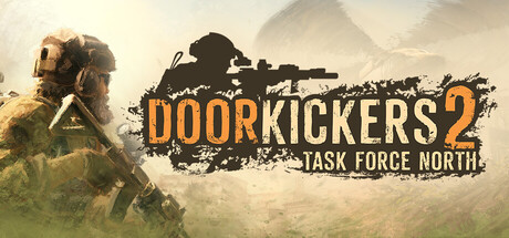
Door Kickers 2: Task Force North scores 83/100 — better than 95% of Steam capsules we've analysed (n=22,658).

Overwhelmingly Positive (186 reviews) · $14.99 · Released Feb 10, 2025 · By KillHouse Games

Quick text summary

Door Kickers 2: Task Force North scored 83/100 on Steam Analyzer — Good for a Steam capsule. Top priority fix: [uniqueness_polish] Add a distinctive visual hook such as an iconic team logo, tactical UI element, or signature color accent that differentiates Door Kickers from generic military games

Capsule scores by dimension

  • Genre Clarity: 8/10 — Clear tactical military action. The soldier in combat gear on the left, sniper silhouette in the center, and desert mountain backdrop immediately signal tactical military gameplay. At TINY size, the soldier profile and weapon silhouettes remain recognizable, though the specific 'Special Ops' angle requires the subtitle to fully clarify. The visual language strongly implies action-strategy gameplay without ambiguity.
  • Title Readability: 9/10 — Bold orange title, excellent hierarchy. The large yellow-orange 'DOORKICKERS 2' text sits cleanly on a semi-transparent dark grunge bar in the center-right, with high contrast against both the light sky and dark background elements. The subtitle 'TASK FORCE NORTH' in white sits directly below at readable size. At TINY size, the main title remains clearly legible and the branding is instantly recognizable without collapsing.
  • Contrast & Color: 8/10 — Strong warm-cool value separation. The warm tan and khaki soldier figure on the left contrasts well against the cooler gray-blue sky and grunge elements. The bold orange-yellow title text pops distinctly against both the dark grunge bar and the pale background. In grayscale, the soldier silhouette maintains clear edge definition and the title remains well-separated from surrounding elements at all sizes.
  • Uniqueness & Polish: 7/10 — Competent military aesthetic, slightly generic. The capsule uses a recognizable tactical game visual language: soldier pose, sniper silhouette, desert setting, and grunge effects. The execution is clean and professional, but the scene composition and elements are common in military shooters and strategy games, lacking a distinctive hook or unique visual storytelling element that would elevate it beyond solid genre convention.
  • Brand Consistency: 7/10 — Consistent tactical military identity. The palette (warm earths, cool grays, orange accents), military equipment rendering, and composition style align well with tactical simulation aesthetics. Without reference to the 19 other screenshots, the capsule communicates a cohesive 'Special Ops command' brand through its visual language, though no iconic character, motif, or signature element stands out as uniquely Door Kickers branded.
  • Composition: 8/10 — Strong focal hierarchy, balanced layout. The soldier figure anchors the left side as primary focus, the sniper silhouette creates a secondary mid-composition element, and the title occupies a safe center-right zone with the grunge bar providing background containment. The depth layering (foreground soldier, mid-ground silhouettes, background sky) is clear and readable at SMALL and TINY sizes. Title placement avoids edge cropping risk and the overall balance feels intentional without dead space.

What works

  • Title legibility at all sizes. The orange 'DOORKICKERS 2' text with supporting grunge bar maintains excellent readability from full header down to TINY thumbnail without degradation.
  • Clear tactical genre signaling. Soldier pose, weapon silhouettes, and desert setting immediately communicate military action-strategy at a glance, supporting discoverability.
  • Strong value contrast against Steam dark UI. The warm soldier tones and bright orange title create clear separation from the #1b2838 background without muddy mid-tones.
  • Balanced composition with clear focal point. The left-anchored soldier and center-right title create intentional hierarchy that guides eye movement without clutter or scattered emphasis.

What hurts the capsule

  • Generic military aesthetic. The scene composition, soldier pose, and desert setting follow well-worn tactical game conventions without a distinctive visual hook or memorable identity signal.
  • Lack of unique brand signature. No iconic character, motif, or signature element that would make this specifically recognizable as Door Kickers rather than a generic military tactical game.
  • Subtle subtitle readability risk. The white 'TASK FORCE NORTH' subtitle is readable at full size but loses clarity at TINY size, relying heavily on the main title for recognition.

Priority fixes

  1. [uniqueness_polish] Add a distinctive visual hook such as an iconic team logo, tactical UI element, or signature color accent that differentiates Door Kickers from generic military games
  2. [brand_consistency] Incorporate a recurring visual motif or icon from the game's 19 other screenshots that creates instant brand recognition
  3. [title_readability] Ensure 'TASK FORCE NORTH' subtitle has stronger contrast or slightly larger sizing to maintain legibility at TINY thumbnail size

Store copy priority fixes

  1. [uniqueness] Add 1–2 sentences after the opening narrative that explicitly state what is mechanically new or different in Task Force North compared to the original Door Kickers or competitors (e.g., 'Expanded unit roster with full doctrine overhauls' or 'Fully destructible level progression system').
  2. [hook_strength] Shorten or move the narrative excerpt to after the gameplay summary, leading the detailed description with 'Control elite Special Operations units in real-time tactical raids across procedurally generated and hand-crafted missions with full pause-at-will control.'
  3. [genre_clarity] Add a bullet point or short sentence early in the detailed description explicitly stating 'No turns, hexes, or action points' to reduce ambiguity for players unfamiliar with the original.
  4. [audience_targeting] Include a sentence that directly addresses modders early (e.g., 'Built-in mission and level editor with Steam Workshop integration already hosting 7000+ community creations') to signal value to the content-creation audience faster.

Related guides

Steam app ID: 1239080