Scoring genre clarity...

Overcooked! All You Can Eat capsule

Overcooked! All You Can Eat

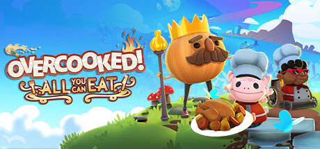
Experience all the Onion Kingdom has to offer, Overcooked! 1 & 2 infused with 4k goodness running at a smooth 60 FPS. Fully remastered and cooked up from scratch. Enjoy 200+ levels (22 new) and 80+ chefs (3 new), this is the ultimate Overcooked! experience.

$11.99Mostly Positive(105)
MultiplayerOnline Co-OpLocal Co-Op
Team17 Digital, Ghost Town GamesMar 23, 2021

Overcooked! All You Can Eat scores 88/100 — better than 100% of Steam capsules we've analysed (n=22,658).

Mostly Positive (105 reviews) · $11.99 · Released Mar 23, 2021 · By Team17 Digital

Quick text summary

Overcooked! All You Can Eat scored 88/100 on Steam Analyzer — Excellent for a Steam capsule. Top priority fix: [genre_clarity] No action needed; genre is crystal clear at all sizes.

Capsule scores by dimension

  • Genre Clarity: 9/10 — Colorful cozy cooking game. The capsule immediately communicates a casual, cheerful cooking simulation with five distinct chef characters, cooking equipment (pots, rolling pins), food items (chicken drumstick), and a bright pastoral kitchen setting. At tiny size, the character lineup and cooking props remain instantly recognizable as a cooperative kitchen game, with zero ambiguity about genre intent.
  • Title Readability: 9/10 — Bold, clear, well-anchored text. The 'OVERCOOKED!' title uses a thick orange outline with yellow fill that contrasts sharply against the blue sky background, with the subtitle 'ALL YOU CAN EAT' directly below in complementary style. At tiny size the title block remains fully legible and punchy; the placement in the upper-center avoids busy background elements and maintains perfect readability even under aggressive downsizing.
  • Contrast & Color: 9/10 — Vibrant, high-saturation pop. The warm orange and yellow title stands out strongly against the cool blue sky background, creating excellent value separation. Character silhouettes (chef costumes in white, red, pastels) and the golden/brown cooking pot and food elements create distinct light-dark separation that reads clearly at all sizes, even in grayscale silhouette testing.
  • Uniqueness & Polish: 8/10 — Polished, joyful, recognizable series. The art style is cohesive, with smooth cartoon rendering, consistent character design language, and a deliberately whimsical tone that matches the Overcooked brand identity perfectly. The composition feels premium and intentional rather than generic; the lineup of diverse chefs with distinct outfits and the oversized golden cooking pot create memorable visual storytelling that communicates multiplayer chaos and fun.
  • Brand Consistency: 9/10 — Strong iconic series identity. The capsule reinforces core Overcooked identity: pastel-colored chefs with distinct silhouettes, bright colorful environments, cartoonish food and cooking equipment, and a warm, inviting palette. The 'ALL YOU CAN EAT' subtitle directly references the compilation nature, and the consistent use of orange/yellow/blue matches expected brand color language that would be instantly recognizable to fans across other marketing materials.
  • Composition: 9/10 — Excellent focal hierarchy and balance. The five-character lineup creates a clear primary focal point in the center-lower frame, with the title anchored above in natural reading order. Background scenery (clouds, distant kitchen) provides depth without competing; foreground props (pot, food, tools) frame and support the character group, creating layered visual interest that guides the eye naturally and reads perfectly at small and tiny sizes.

What works

  • Title contrast and legibility. Orange-yellow title with black outline pops against blue sky and remains fully readable even at tiny thumbnail size.
  • Character diversity and recognition. Five distinct chef silhouettes in different colored outfits create immediate visual interest and communicate multiplayer gameplay without text.
  • Cohesive art direction. Cartoon rendering style, warm color palette, and whimsical tone align perfectly with the established Overcooked brand and genre expectations.
  • Effective composition layering. Clear foreground (props and chefs), midground (kitchen elements), and background (scenery) create depth and natural visual flow.

What hurts the capsule

  • Minor tagline visibility at extreme scale. The 'ALL YOU CAN EAT' subtitle, while readable at small size, loses some impact clarity when compressed to tiny thumbnail dimensions compared to the main title.

Priority fixes

  1. [genre_clarity] No action needed; genre is crystal clear at all sizes.
  2. [title_readability] No action needed; title reads excellently even at tiny size.
  3. [contrast_color] Maintain current saturation and value separation; no changes required.
  4. [composition] Consider testing tagline font weight to ensure subtitle remains readable at extreme compression, but current execution is strong.

Store copy priority fixes

  1. [hook_strength] Replace 'Experience all the Onion Kingdom has to offer' with a verb-forward hook like 'Chop, serve, and save the world—now with online co-op' to create immediate gameplay clarity and excitement.
  2. [uniqueness] Add a sentence in the short description explicitly positioning this as 'the complete Overcooked! collection (games 1 & 2) with online multiplayer for the first time' to make the value proposition clear upfront.
  3. [tone_match] Rewrite marketing-heavy section headers ('A Visual Feast!', 'Tasty New Content!') to match the chaotic, playful tone elsewhere, e.g., 'Stunning 4K Chaos' or 'Fresh Recipes & New Chefs'.
  4. [audience_targeting] Elevate assist mode earlier in the short description or add a dedicated sentence about accessibility to signal inclusivity to families and casual players from first glance.

Related guides

Steam app ID: 1243830