Scoring genre clarity...

Human Farm capsule

Human Farm

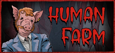
Welcome to Human Farm🐽 – an alternate, Orwellian world where Pigs became the dominant species. Humans are degraded to farmed meat. Create and develop your own slaughterhouse. Your goal: conquer and dominate the human meat industry. Millions of hungry snouts are waiting to be fed!

SimulationManagementGore
AsmodevComing soon

Human Farm scores 65/100 — better than 11% of Steam capsules we've analysed (n=22,658).

Released Coming soon · By Asmodev

Quick text summary

Human Farm scored 65/100 on Steam Analyzer — Solid for a Steam capsule. Top priority fix: [contrast_color] Darken and simplify the meat curtain background behind the character to create stronger silhouette separation and prevent the subject from blending in at tiny size.

Capsule scores by dimension

  • Genre Clarity: 6/10 — Dark sim unclear at tiny. The pig-human hybrid figure in a business suit against a dark meat-curtain background suggests a dark satirical or management sim concept, which aligns with the Orwellian slaughterhouse premise. At full size the concept reads clearly enough, but at tiny size the character detail collapses into a murky blob and the genre signal becomes ambiguous between horror, dark comedy, and simulation. The Orwellian management sim subgenre is not strongly communicated at small or tiny sizes.
  • Title Readability: 7/10 — Bold drip font reads well. The large red dripping horror-style lettering for HUMAN FARM occupies roughly the right half of the capsule and reads clearly at full and small sizes due to strong size and contrast against the dark background. At tiny size the letters are still recognizable as HUMAN FARM because the font is large and blocky enough to survive compression, though the drip details are lost. The placement on the darker right side helps prevent the title from competing with the character illustration.
  • Contrast & Color: 6/10 — Muted palette limits pop. The red title text pops well against the dark grey-black background, providing the strongest contrast element in the design. However, the main character figure uses muted blues, pinks, and tans that sit in a similar mid-value range, causing the pig character to partially blend into the dark reddish background at small and tiny sizes. In a grayscale mental test, the character silhouette lacks strong edge separation from the background, reducing immediate visual impact during a quick scroll on Steam's dark interface.
  • Uniqueness & Polish: 7/10 — Distinctive concept, comic craft. The pig-headed human in a business suit is a genuinely memorable and provocative image that stands out from generic simulation or RPG capsules, communicating the Orwellian satire hook clearly. The comic-book illustration style has consistent linework and coloring that feels intentional rather than template-generated. However, compared to top-tier benchmark capsules, the overall craft feels mid-budget indie rather than premium, and the background meat curtain texture competes rather than supports the focal character.
  • Brand Consistency: 7/10 — Cohesive dark comic identity. The comic-book line art style, dark horror palette, red drip typography, and satirical animal-human concept all work together as a coherent internal art direction. The red border frame reinforces the contained comic-panel aesthetic. The pig character design is a strong, potentially iconic brand mascot that could be recognized across screenshots and store presence. There are no jarring style clashes within the capsule itself.
  • Composition: 6/10 — Split layout works but crowds. The capsule uses a clear left-character right-title split layout which creates readable hierarchy at full size. However, the character is slightly edge-hugging on the left and bottom, and the meat curtain background creates visual noise that competes with the primary focal point. At small and tiny sizes the composition compresses into two roughly equal halves with neither clearly dominating, and the character detail becomes a small indistinct blob on the left. The red border frame is a nice touch but adds to the sense of a cramped composition.

What works

  • Memorable character concept. The pig-headed businessman is a distinctive and immediately provocative visual hook that communicates the Orwellian satire premise at a glance.
  • Title size and placement. HUMAN FARM in large drip-red font occupies a clean dark zone on the right half, ensuring readability at small sizes.
  • Cohesive comic-book art style. Consistent linework, flat coloring, and the horror-comic aesthetic create a recognizable internal visual identity across the capsule.
  • Red drip typography fits theme. The horror-style dripping red letters reinforce the dark slaughterhouse tone without feeling disconnected from the illustration style.

What hurts the capsule

  • Character blends into background. The muted pig character in blues and tans lacks sufficient value contrast against the dark reddish meat curtain, causing silhouette collapse at tiny size.
  • Background texture competes with subject. The meat curtain background is too detailed and tonally similar to the character, creating visual noise that reduces clarity at small and tiny sizes.
  • Genre ambiguity at tiny size. The simulation and management aspects of the game are not visually communicated and at tiny size the capsule could read as horror or dark comedy with no gameplay type implied.
  • Edge-hugging character placement. The pig figure sits close to the left and bottom edges, risking crop issues and making the composition feel compressed rather than purposeful.

Priority fixes

  1. [contrast_color] Darken and simplify the meat curtain background behind the character to create stronger silhouette separation and prevent the subject from blending in at tiny size.
  2. [genre_clarity] Add a subtle environmental or UI cue such as a small farm building, a management interface element, or a pig pen in the background to signal the simulation genre.
  3. [composition] Pull the pig character slightly inward from the left and bottom edges and increase its value contrast with a stronger rim light or outline to survive small size cropping.
  4. [uniqueness_polish] Add a subtle thematic tagline or small secondary visual element such as a dollar sign or meat product icon to strengthen the dark corporate satire unique selling point.

Store copy priority fixes

  1. [genre_clarity] Revise the short description to explicitly include the word 'management' or 'tycoon': e.g., 'Welcome to Human Farm—a dark management tycoon where you build and optimize a human meat slaughterhouse empire in an alternate Orwellian world.'
  2. [uniqueness] Add 1-2 sentences in the detailed description explaining a unique mechanical or systemic hook—e.g., a moral choice system, dynamic consumer preferences, or an automation puzzle that sets this apart from standard management sims.
  3. [audience_targeting] Insert a brief line after the premise clarifying the intended audience, such as: 'For fans of management sims with dark humor and moral transgression' or 'Hardcore simulation players and indie game enthusiasts who appreciate satirical worldbuilding.'

Related guides

Steam app ID: 1276510