Scoring genre clarity...

TOEM: A Photo Adventure capsule

TOEM: A Photo Adventure

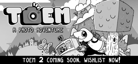
Set off on a delightful expedition and use your photographic eye to uncover the mysteries of the magical TOEM in this hand-drawn adventure game. Chat with quirky characters, solve their problems by snapping neat photos, and make your way through a relaxing landscape!

$1.99Overwhelmingly Positive(301)
CozyWholesomePuzzle
Something We MadeSep 17, 2021

TOEM: A Photo Adventure scores 68/100 — better than 12% of Cozy capsules (n=851).

Overwhelmingly Positive (301 reviews) · $1.99 · Released Sep 17, 2021 · By Something We Made

Quick text summary

TOEM: A Photo Adventure scored 68/100 on Steam Analyzer — Solid for a Cozy capsule. Top priority fix: [title_readability] Increase size and contrast of 'A PHOTO ADVENTURE' subtitle so it remains readable at small (231×87) and tiny (120×45) sizes, or remove it entirely to prioritize 'TOEM' clarity.

Capsule scores by dimension

  • Genre Clarity: 8/10 — Clear adventure photography mechanic. The hand-drawn art style, character holding a camera, and tagline 'A PHOTO ADVENTURE' immediately signal this is a camera-focused indie adventure game. At tiny size, the character silhouette with camera and whimsical environment remain readable, successfully communicating the core gameplay loop of exploration and photography without ambiguity.
  • Title Readability: 7/10 — Bold title, weak tagline at tiny. The 'TOEM' logo in large, chunky white letters with black outline reads clearly at all sizes, including tiny. However, the tagline 'A PHOTO ADVENTURE' becomes difficult to parse at tiny size due to smaller letterforms, and the call-to-action 'TOEM 2 COMING SOON. WISHLIST NOW!' at the bottom collapses into unreadable noise at thumbnail dimensions.
  • Contrast & Color: 7/10 — Strong monochrome contrast, limited palette. The black and white hand-drawn illustration creates excellent value separation and silhouette clarity against the dark Steam background. The solid black outline on the character and scene elements maintains edge definition even when squinting, though the grayscale palette offers no color pop or visual excitement compared to competitors like DREDGE or Viewfinder.
  • Uniqueness & Polish: 6/10 — Charming but generic indie style. The hand-drawn art is competent and fits the whimsical adventure theme, with expressive character animation and environmental detail. However, the visual style feels consistent with many contemporary indie adventures (Harold Halibut, Snufkin) and lacks a distinctive hook or memorable art direction that would make it stand out in a crowded genre at thumbnail size.
  • Brand Consistency: 6/10 — Hand-drawn style is consistent internally. The monochrome hand-drawn aesthetic, character design, and environmental rendering appear cohesive and match the expected visual identity for a quirky adventure game. However, there is no distinctive brand motif, icon, or signature element that would make TOEM immediately recognizable from this capsule alone compared to stronger indie brands like Hades II or DAVE THE DIVER.
  • Composition: 7/10 — Well-structured with minor focal issues. The layout balances the title in the upper left, character with camera in center-left midground, environmental elements across the scene, and call-to-action at bottom. The character functions as a clear focal point, though at tiny size the composition becomes somewhat crowded with multiple elements competing for attention; the bottom text banner also risks being cropped or obscured depending on Steam's display.

What works

  • Clear genre communication. The character holding a camera, whimsical environment, and 'A PHOTO ADVENTURE' tagline immediately establish this is a photography-focused adventure game.
  • Strong silhouette and contrast. The monochrome hand-drawn style with bold black outlines maintains excellent clarity and separation from the dark Steam background at all viewing sizes.
  • Readable primary title. The large 'TOEM' logo in thick white letters with black outline remains legible and impactful from full size down to tiny thumbnail.

What hurts the capsule

  • Unreadable tagline at tiny size. The smaller text elements, especially 'A PHOTO ADVENTURE' and the bottom call-to-action, become illegible blur at thumbnail dimensions.
  • Generic visual identity. The hand-drawn indie aesthetic, while charming, lacks distinctive visual markers or brand motifs that would make TOEM recognizable compared to stronger indie titles in the carousel.
  • Crowded composition at small sizes. Multiple competing elements (character, environment, title, taglines, call-to-action) create visual clutter that diminishes hierarchy when the capsule shrinks below small size.
  • Monochrome limits color impact. The lack of color variation means no warm accent or saturated element to catch the eye in quick-scroll conditions, reducing discoverability against colorful competitors.

Priority fixes

  1. [title_readability] Increase size and contrast of 'A PHOTO ADVENTURE' subtitle so it remains readable at small (231×87) and tiny (120×45) sizes, or remove it entirely to prioritize 'TOEM' clarity.
  2. [contrast_color] Introduce a single warm or saturated color accent (orange, red, or golden tone) on the character's camera or eyes to break the monochrome palette and improve eye-catch in scroll carousel.
  3. [composition] Relocate the bottom call-to-action text ('TOEM 2 COMING SOON. WISHLIST NOW!') to a less crowded position or reduce its prominence to prevent it from competing with the character focal point.
  4. [uniqueness_polish] Add a distinctive brand element—either an iconic character expression, a signature UI detail from gameplay, or a memorable prop—to create visual recall that differentiates TOEM from other hand-drawn indies.

Store copy priority fixes

  1. [feature_communication] Expand the detailed description with at least one paragraph explaining puzzle types, world structure, or number of characters/locations to give players a fuller sense of scope and replayability.
  2. [uniqueness] Add a sentence explaining what makes TOEM's photography puzzle approach distinctive—e.g., 'every photo reveals hidden details,' 'puzzles layer on each other,' or 'photo solutions are context-dependent' (if true).
  3. [hook_strength] Replace 'uncover the mysteries of the magical TOEM' with a more specific hook about what players will discover or achieve—e.g., 'help a cast of quirky islanders unlock their full potential' or 'piece together the island's secrets through your lens.'

Related guides

Steam app ID: 1307580 · Tags: Cozy, Wholesome, Puzzle, Adventure, Exploration