Scoring genre clarity...
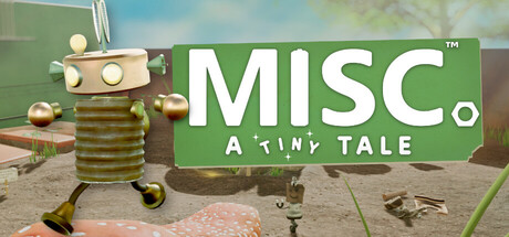
Meet Buddy and Bag Boy – two tiny robots with big hearts and an even bigger mission: spreading joy! After a mysterious explosion rains golden cogs and trash from the sky, it’s their job to collect, clean, and help each village while uncovering the secret behind the blast.
$19.99Very Positive(108)
Story RichIndie3D Platformer
Tinyware GamesJul 31, 2025