Scoring genre clarity...

KinnikuNeko: SUPER MUSCLE CAT capsule

KinnikuNeko: SUPER MUSCLE CAT

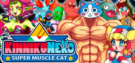
Join KinnikuNeko, a cat with a bodybuilder's body, in this fun 2D platformer and fight against the mysterious alien invasion. A story full of goofy humor, friendship, drama and action. Its aesthetics are a love letter to 90s anime along with an unforgettable soundtrack.

$10.79Very Positive(145)
Side ScrollerHack and Slash2D Platformer
KamotachiMar 19, 2024

KinnikuNeko: SUPER MUSCLE CAT scores 87/100 — better than 99% of Side Scroller capsules (n=1,076).

Very Positive (145 reviews) · $10.79 · Released Mar 19, 2024 · By Kamotachi

Quick text summary

KinnikuNeko: SUPER MUSCLE CAT scored 87/100 on Steam Analyzer — Excellent for a Side Scroller capsule. Top priority fix: [composition] Consider subtle background depth layering to ensure supporting characters recede slightly, strengthening the central muscle cat's dominance at TINY size.

Capsule scores by dimension

  • Genre Clarity: 9/10 — Vibrant anime action platformer instantly recognizable. The central muscular cat character with exaggerated physique, dynamic pose, and surrounded by colorful anime-style creatures immediately signals a quirky action game with comedic tone. Even at TINY size, the absurd juxtaposition of a buff cat and anime aesthetic is unmistakable, clearly communicating both genre (2D action/platformer) and tone (humorous/stylized). The vibrant neon palette and character density reinforce high-energy action gameplay.
  • Title Readability: 8/10 — Clear title with readable branding at all sizes. The logo 'KinnikuNeko: SUPER MUSCLE CAT' uses bold red and blue lettering with strong contrast against the dark background strip at the bottom center. At SMALL size the title remains legible with clear letter separation, though the tagline may blur slightly. The all-caps presentation and color blocking ensure the core branding survives the TINY squint test without significant degradation.
  • Contrast & Color: 9/10 — Neon saturation dominates dark background powerfully. Hot pink, cyan, lime green, and orange elements pop dramatically against the #1b2838 dark background with strong value separation and vibrant saturation. The central muscle cat character features warm orange-tan tones that create clear silhouette separation, while the logo strip uses high-contrast red and blue that anchor the composition. In grayscale simulation, the character and background maintain distinct light-dark separation, ensuring readability even at TINY size during quick scroll.
  • Uniqueness & Polish: 9/10 — Distinctive 90s anime style with premium execution. The design executes a cohesive retro anime aesthetic with intentional typography, clean character rendering, and layered visual storytelling that communicates both the absurdist premise and high-polish craft. The composition feels deliberate rather than template-based, with specific character design choices (oversized musculature, expressive faces, vintage anime proportions) that set it apart from generic action platformers. The accumulated visual detail and character density suggest professional art direction aligned with the 90s anime love-letter narrative.
  • Brand Consistency: 8/10 — Strong anime style identity with memorable mascot. The KinnikuNeko mascot character with its distinctive proportions, cat features, and musculature creates an iconic visual identity that would be recognizable across multiple assets. The neon color palette, dense anime character style, and retro aesthetic are internally consistent throughout the composition. While the capsule may benefit from clearer signature visual motifs (recurring symbols or patterns), the overall art direction feels unified and distinct enough to build lasting brand recognition.
  • Composition: 9/10 — Balanced focal hierarchy with strategic element placement. The muscular cat character anchors center-stage as the primary focal point, with supporting characters radiating around it in a dynamic but organized density that guides eye movement without overwhelming. The title placement at the bottom-center on a contained dark bar preserves the upper composition for maximum visual impact while ensuring text safety margins. At SMALL and TINY sizes, the central character remains dominant while the surrounding cast reads as unified background energy, creating effective depth layering and avoiding scattered attention.

What works

  • High contrast neon palette. Vibrant pinks, cyans, and oranges create powerful separation against dark background with excellent TINY size readability.
  • Iconic mascot character design. The absurdist muscle cat with expressive anime proportions functions as a memorable brand anchor that immediately communicates the game's comedic tone.
  • Clear focal point hierarchy. Central character dominates composition while supporting elements enhance rather than compete, maintaining visual clarity across all viewing sizes.
  • Strong genre communication. 90s anime aesthetic combined with action pose and colorful cast instantly signals stylized platformer gameplay to potential players.

What hurts the capsule

  • Dense background composition risks visual fatigue. The packed arrangement of characters surrounding the center, while energetic, borders on cluttered and may overwhelm quick-scroll perception if not careful.
  • Limited visual breathing room. The composition fills nearly all available space with character elements, leaving minimal negative space that could strengthen focus or improve sophisticated polish.

Priority fixes

  1. [composition] Consider subtle background depth layering to ensure supporting characters recede slightly, strengthening the central muscle cat's dominance at TINY size.
  2. [uniqueness_polish] Introduce a subtle recurring visual motif (icon, symbol, or design pattern) that appears in both the capsule and game UI to strengthen brand recognition across store presence.

Store copy priority fixes

  1. [feature_communication] Add a concise explanation of what the 'mini-games' are and how frequently they appear, e.g., 'Puzzle-solving segments between action sequences' or 'Rhythm-based challenges that reward exploration.'
  2. [genre_clarity] Explicitly mention one or two Metroidvania elements (e.g., 'unlock new abilities to access previously unreachable areas' or 'interconnected levels to explore') to clarify progression and replayability beyond just 'secrets.'
  3. [audience_targeting] Add a line about difficulty options or intended skill level, e.g., 'Accessible to newcomers, with optional challenges for veterans' or 'Precision platforming for players who want a test.'

Related guides

Steam app ID: 1332950 · Tags: Side Scroller, Hack and Slash, 2D Platformer, Metroidvania, Platformer