Scoring genre clarity...

Cat Cafe Manager capsule

Cat Cafe Manager

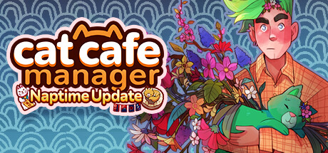
Travel to the sleepy village of Caterwaul Way and rebuild your grandmother's cat cafe. Renovate your restaurant, befriend the local cats and townsfolk, forge lasting friendships, unravel catty mysteries, and build a home for dozens of unique felines!

$5.99Very Positive(12)
CozySimulationManagement
Roost GamesApr 14, 2022

Cat Cafe Manager scores 75/100 — better than 68% of Steam capsules we've analysed (n=22,658).

Very Positive (12 reviews) · $5.99 · Released Apr 14, 2022 · By Roost Games

Quick text summary

Cat Cafe Manager scored 75/100 on Steam Analyzer — Good for a Steam capsule. Top priority fix: [title_readability] Remove or significantly downsize the 'Naptime Update' subtitle banner and its icon badges to keep the main logo visually dominant and uncluttered at all sizes.

Capsule scores by dimension

  • Genre Clarity: 8/10 — Cozy cafe sim clear read. The cat ears integrated into the logo, the plush green cat being cradled, and the warm pastel illustrated style immediately communicate a cozy, wholesome simulation game. The lucky cat icon and cafe iconography in the subtitle banner reinforce management/sim genre cues strongly. At tiny size the cat motifs and illustrated character still suggest cozy life-sim, though the specific 'cafe' subgenre detail is lost.
  • Title Readability: 7/10 — Bold logo readable, subtitle struggles. The main 'cat cafe manager' logo uses bold white lettering with a warm orange outline and high contrast, making it readable at small sizes. The 'Naptime Update' subtitle banner is decorative and drops to near-illegible at tiny size due to smaller font size and busy surrounding icon badges. At full size the hierarchy is clear, but the subtitle competes with the main logo rather than subordinating cleanly.
  • Contrast & Color: 7/10 — Warm palette pops on Steam dark BG. The warm orange and white title logo contrasts well against the muted teal-blue scallop background, creating clear separation on Steam's dark interface. The character's orange plaid shirt and pink skin tones provide warmth against the cool background, though the colorful flowers create some midtone clutter around the character's head. In grayscale the title remains readable but the character silhouette softens due to similar values between flowers, hair, and background.
  • Uniqueness & Polish: 8/10 — Charming illustrated style, memorable cat hook. The hand-illustrated art style with expressive character design, integrated cat-ear logo treatment, and cohesive pastel palette feel intentional and premium for the indie cozy sim space. The character holding a plush cat while surrounded by flowers is a distinctive visual storytelling moment that communicates the game's warmth. Compared to top-performing capsules in the genre, it holds its own with a clear personality, though it lacks the iconic graphic punch of something like DAVE THE DIVER.
  • Brand Consistency: 8/10 — Strong internal cohesion, clear identity. The illustrated character style, warm orange brand color carried through the logo outline and subtitle banner, and persistent cat motif across logo and props create a recognizable visual identity. The scallop pattern background is a subtle but effective signature texture. The lucky cat badge and plush green cat are consistent with the game's cat-cafe theme and would be recognizable across multiple brand touchpoints.
  • Composition: 7/10 — Left title right character, functional split. The classic left-text right-character split composition is clean and functional, with the large bold logo anchoring the left and the illustrated character filling the right. The floral arrangement around the character's head adds visual interest but creates slight clutter that competes with the title at small sizes. The 'Naptime Update' banner sits between logo and character and acts as a visual interruption that slightly weakens the hierarchy, and at tiny crop the character may be partially cut on the right edge.

What works

  • Integrated cat-ear logo. The cat ears built into the 'cat cafe manager' wordmark instantly communicate the theme and double as a memorable brand mark.
  • Warm-cool color contrast. The orange-white title against the muted teal scallop background creates immediate pop on Steam's dark #1b2838 interface.
  • Cohesive illustrated art style. The character design, logo treatment, and background pattern all share the same hand-illustrated warmth, reinforcing a premium indie identity.
  • Clear genre messaging at small size. Even at small capsule size the plush cat, cat-ear logo, and cozy pastel palette reliably signal cozy management sim.

What hurts the capsule

  • Naptime Update subtitle clutters logo zone. The 'Naptime Update' banner with its small icon badges interrupts the main logo hierarchy and becomes illegible noise at tiny size.
  • Floral cluster blurs character silhouette. The dense flower arrangement around the character's head reduces clean silhouette separation, especially noticeable in grayscale and at small sizes.
  • Character risks right-edge crop. The character extends close to the right edge of the capsule, risking awkward cropping in certain Steam layout contexts.
  • Subtitle badge icons unreadable at small size. The small game-mode icon badges inside the Naptime Update banner add visual noise without conveying meaningful information at reduced sizes.

Priority fixes

  1. [title_readability] Remove or significantly downsize the 'Naptime Update' subtitle banner and its icon badges to keep the main logo visually dominant and uncluttered at all sizes.
  2. [composition] Pull the character slightly left and reduce the floral cluster density around the head to sharpen the character silhouette and improve separation from the background.
  3. [contrast_color] Add a subtle dark vignette or soft shadow behind the character to increase value separation between the figure and the teal background in grayscale.
  4. [genre_clarity] Consider adding a small but clear cafe-related prop or environment hint in the background to reinforce the cafe management subgenre for browsers unfamiliar with the title.

Store copy priority fixes

  1. [feature_communication] Consolidate befriending mechanics into one clear paragraph explaining how relationships (both cat and human) unlock cafe benefits and story progression, eliminating redundancy.
  2. [uniqueness] Add one sentence explicitly stating what makes the mystery/relationship system distinct—e.g., 'Your relationships directly unlock story clues, making the mystery unfold at your own pace' or 'Each friendship reveals a piece of Caterwaul Way's past.'
  3. [feature_communication] Clarify the scope of cafe customization by mentioning whether players can freely design layout/decor or if there are guided options, helping players understand their agency.

Related guides

Steam app ID: 1354830