Scoring genre clarity...

Decimated capsule

Decimated

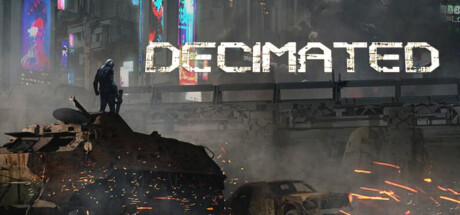
Decimated is a third-person online survival game set in a post-apocalyptic sci-fi world where players scavenge, fight, and team up in a hostile open world. Featuring PvP, PvE, missions, and vehicle combat, it’s a dynamic sandbox of danger, strategy, and exploration!

Early AccessSurvivalShooter
Fracture LabsComing soon

Decimated scores 73/100 — better than 56% of Steam capsules we've analysed (n=22,658).

Released Coming soon · By Fracture Labs

Quick text summary

Decimated scored 73/100 on Steam Analyzer — Good for a Steam capsule. Top priority fix: [uniqueness_polish] Add a distinctive visual signature—iconic weapon, armor detail, or unique character silhouette—that differentiates the protagonist and makes the brand memorable on repeat viewings.

Capsule scores by dimension

  • Genre Clarity: 8/10 — Clear post-apocalyptic action setup. The silhouette of a solitary figure perched on debris against a neon-lit dystopian cityscape immediately signals action-survival in a sci-fi setting. Glowing fires, urban decay, and the lone protagonist pose communicate hostile open-world gameplay clearly at all sizes. At tiny size, the neon skyline and rubble remain visually distinct enough to recognize the genre intent.
  • Title Readability: 7/10 — Bold readable title with minor spacing. DECIMATED uses a strong, high-contrast all-caps sans-serif positioned in the lower-center area with good separation from the busy cityscape above. The white letterforms maintain legibility at small size due to solid weight and clean spacing. At tiny size the title remains readable but loses some detail in the texture of the letters themselves.
  • Contrast & Color: 8/10 — Strong neon-dark separation effective. Bright magenta, cyan, and green neon signs cut through a dark moody gray-blue atmosphere, creating excellent value contrast against the #1b2838 Steam background. The white title and bright fires form clear silhouettes even in grayscale. The composition relies on mid-to-bright neon spots against shadow, which reads well at small sizes but the overall dark palette could use slightly more primary subject luminosity.
  • Uniqueness & Polish: 7/10 — Polished cyberpunk aesthetic, familiar angle. The image demonstrates clean rendering, cohesive lighting, and intentional art direction with a cyberpunk-meets-post-apocalypse aesthetic that feels premium and detailed. However, the lone-figure-on-rubble-against-neon-city composition is a well-worn visual trope in action and survival game marketing. The execution is solid but the core concept lacks a distinctly memorable hook or unique mechanical storytelling cue.
  • Brand Consistency: 6/10 — Cohesive visual style, limited identity motif. The capsule maintains consistent rendering quality and a unified dark-neon color palette that aligns with a mature sci-fi survival aesthetic. There is no immediately iconic symbol, character signature, or recognizable brand motif visible that would make Decimated stand out on repeat viewings. The visual language is professional but generic within the cyberpunk-action space.
  • Composition: 8/10 — Strong focal hierarchy, well-positioned title. The lone figure occupies the left-center as primary focus with the sprawling cityscape providing context and depth in the background, creating clear layering. The title placement in the lower-center zone avoids competing with the figure and maintains safe margins from edges. At tiny size the composition holds together with the figure and neon skyline remaining the dominant readable elements, though some mid-ground debris detail compresses and loses distinction.

What works

  • Neon-dark contrast pops on Steam background. Vibrant magenta, cyan, and green signs cut through gray shadows with strong value separation that survives the #1b2838 dark background and reads at thumbnail size.
  • Clear apocalyptic action-survival visual language. The silhouette of a solitary figure on debris in a decaying neon city immediately communicates post-apocalyptic PvP and open-world combat without ambiguity.
  • Legible title with stable positioning. DECIMATED is rendered in clean high-contrast white sans-serif in the lower third, maintaining readability at small sizes with good separation from competing background elements.
  • Effective depth and layering across space. Foreground rubble with embers, midground figure, and far background cityscape create visual hierarchy that persists even when compressed to thumbnail scale.

What hurts the capsule

  • Generic composition trope overused in action games. The lone figure on debris against a neon cityscape is a familiar marketing visual that does not differentiate Decimated from dozens of other action-survival titles.
  • No distinctive brand identity or iconic motif. The capsule lacks a signature character, symbol, or visual hook that would make Decimated instantly recognizable on second viewing compared to peers.
  • Overall dark palette reduces primary subject luminosity. While neon accents pop, the figure itself is rendered in muted grays and blacks, making it less visually dominant than optimal for a survival action game centered on player agency.
  • Mid-ground rubble compresses into noise at tiny size. Fine detail in the scattered debris and ground-level fires loses clarity when viewed as a 120×45 thumbnail, reducing compositional clarity at scroll speed.

Priority fixes

  1. [uniqueness_polish] Add a distinctive visual signature—iconic weapon, armor detail, or unique character silhouette—that differentiates the protagonist and makes the brand memorable on repeat viewings.
  2. [contrast_color] Increase the figure's luminosity or add a rim-light accent in neon color to make the protagonist visually compete with the background cityscape at small and tiny sizes.
  3. [composition] Reduce mid-ground debris clutter or simplify foreground rubble so the primary figure remains the clear focal point even when compressed to thumbnail scale.

Store copy priority fixes

  1. [hook_strength] Rewrite the short description to lead with jetpacks or a unique survival mechanic rather than generic 'dynamic sandbox'—e.g., 'Survive a cyberpunk wasteland with jetpacks, faction warfare, and base building in this third-person multiplayer sandbox.'
  2. [feature_communication] Reorganize the detailed description to eliminate the 'Team & Community' and 'Alpha Development' preamble and move core gameplay (classes, missions, survival loops, factions) to the top third of the copy.
  3. [uniqueness] Emphasize jetpacks and cyberpunk setting as core differentiators—add a sentence explaining how vehicle and mobility combat (jetpacks + vehicles) changes survival gameplay compared to other MMO survival games.
  4. [audience_targeting] Add a paragraph early that clarifies whether the game targets hardcore PvP players, cooperative survival groups, or both, and hint at what reward/playstyle appeals to each (e.g., 'Law enforcement roles suit cooperative base defense; Marauder roles suit competitive looting').

Related guides

Steam app ID: 1354980