Scoring genre clarity...

Pizza Slice capsule

Pizza Slice

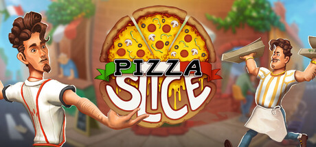
More than just a simulator, Pizza Slice is a true Italian adventure! Take on the role of Tonio, manage your family pizzeria, bake authentic Italian pizzas, fight the competition and grow your business. See if you can win the title of the best pizzeria in the area!

$10.49Mixed(203)
PvPCookingSimulation
Quest Craft, Gaming FactoryMar 13, 2026

Pizza Slice scores 68/100 — better than 19% of Steam capsules we've analysed (n=22,658).

Mixed (203 reviews) · $10.49 · Released Mar 13, 2026 · By Quest Craft

Quick text summary

Pizza Slice scored 68/100 on Steam Analyzer — Solid for a Steam capsule. Top priority fix: [contrast_color] Add a stronger dark vignette or shadow behind the central pizza and title to increase value contrast against Steam's #1b2838 dark background and improve pop during quick scroll.

Capsule scores by dimension

  • Genre Clarity: 8/10 — Clear cooking simulation theme. The oversized pizza at center, chef characters in aprons, and Italian street setting immediately communicate a food/restaurant simulation game. At tiny size the pizza icon and chef silhouettes still suggest the cooking genre clearly. Minor ambiguity exists between a casual arcade game versus a deeper management sim, but the overall message lands well.
  • Title Readability: 7/10 — Readable at full, shaky at tiny. The 'PIZZA SLICE' logo uses bold, chunky lettering with green and red Italian flag color accents that read clearly at full and small sizes. At tiny size around 120x45 the word 'SLICE' remains visible but the decorative flag stripe detail and fine outlines begin to collapse, reducing crispness. The centered placement over the pizza creates decent contrast but the busy illustrated background competes slightly.
  • Contrast & Color: 6/10 — Warm palette, moderate separation. The warm golden and cream tones of the pizza and characters sit against a muted teal-green street background, providing moderate separation. Against Steam's dark #1b2838 background the capsule's warm center pops reasonably well, but the two flanking characters on the left and right edges blend into the background at small sizes due to similar mid-tone values. A grayscale test reveals the pizza reads clearly but the characters lose definition toward the edges.
  • Uniqueness & Polish: 6/10 — Competent but genre generic. The illustration style is clean and cheerful with decent character expressiveness, and the large pizza as a central design element is a solid visual hook. However the overall composition and style feels close to many casual mobile or Steam cooking game capsules, lacking a distinctive visual differentiator or standout craft moment. The Italian setting is implied but not strongly unique compared to top-performing genre peers like DAVE THE DIVER or Go-Go Town.
  • Brand Consistency: 7/10 — Cohesive Italian pizzeria identity. The Italian flag color palette of red, green, and cream runs through the logo, character clothing, and background architecture, creating a recognizable internal identity. The cartoon illustration style is consistent between the two characters and the environment. The pizza as a central motif is a memorable brand anchor that could carry recognition across screenshots and store assets.
  • Composition: 7/10 — Clear center focus, edge characters thin. The giant pizza in the center acts as a strong focal point with the title logo overlaid directly on it, creating a clear hierarchy. The two chef characters flank the pizza symmetrically, which is balanced but pushes them close to the edges where Steam cropping could cut them at certain capsule formats. At small size the center pizza and logo remain readable but the flanking characters become supporting noise rather than meaningful elements.

What works

  • Instant genre recognition. The oversized central pizza and chef characters communicate a cooking or restaurant simulation within under one second even at small sizes.
  • Italian flag color coding. Red, green, and cream consistently thread through the logo, clothing, and background, creating a coherent and thematic visual identity.
  • Strong center focal anchor. The pizza and title logo are layered at the center creating a clear reading hierarchy that survives cropping well at small capsule sizes.
  • Expressive character poses. The dynamic poses of both chefs, especially the right character throwing a pizza peel, add energy and storytelling to the scene.

What hurts the capsule

  • Edge characters lose definition at tiny size. At 120x45 the two flanking chefs blend into the mid-tone background and contribute little readable information, wasting prime compositional real estate.
  • Background competes with title at small sizes. The illustrated street scene behind the logo has enough detail and color noise to slightly reduce title clarity during a quick scroll at small capsule sizes.
  • Generic casual game polish level. Compared to top-performing genre peers the illustration lacks a distinctive stylistic hook or premium craft detail that would make it memorable in a dense browse grid.
  • Mid-tone value range limits contrast punch. The overall warm mid-tone palette reduces pop against Steam's dark background, with no strong dark anchor or dramatic lighting to create maximum silhouette separation.

Priority fixes

  1. [contrast_color] Add a stronger dark vignette or shadow behind the central pizza and title to increase value contrast against Steam's #1b2838 dark background and improve pop during quick scroll.
  2. [title_readability] Thicken the title logo outline and increase the size of 'SLICE' slightly so both words remain crisp and fully legible at tiny 120x45 thumbnail size.
  3. [uniqueness_polish] Introduce a more distinctive visual differentiator such as a signature lighting style, exaggerated caricature detail, or a unique Italian environment prop that separates this from generic cooking game capsules.
  4. [composition] Pull the two flanking characters slightly inward and increase their contrast against the background so they read as meaningful story elements rather than edge decorations at small sizes.

Store copy priority fixes

  1. [hook_strength] Rewrite the short description opening to lead with a specific action verb: 'Inherit your grandfather's failing pizzeria in New York and race against corporate chains and a culinary mafia to become the city's best chef—solo or with friends.' This replaces 'true Italian adventure' with concrete stakes.
  2. [uniqueness] Add one sentence in the detailed description that explicitly differentiates Pizza Slice from other restaurant sims: e.g., 'Unlike other cooking sims, Pizza Slice forces you to master every aspect of the business—ingredients, prep, customer service, and sabotage—or fail completely.' This articulates mechanical depth.
  3. [genre_clarity] In the short description, add 'online competitive' or 'PvP' to the initial pitch, not just 'fight the competition.' This clarifies that multiplayer is core, not optional.
  4. [feature_communication] Expand the 'Face the problems' section with specific gameplay consequences: e.g., 'Fail a health inspection and lose customers for a week' or 'Out-bid rivals at the market to secure rare ingredients.' This converts narrative threats into mechanical tension.

Related guides

Steam app ID: 1385290