Scoring genre clarity...

Mech Armada capsule

Mech Armada

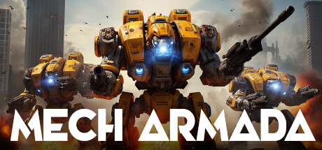
Create and command custom Mechs to outmaneuver The Swarm in this post-apocalyptic tactical turn-based rogue-lite. Leverage the terrain, learn each Mech's unique skills and use strategy and resources to survive an ever-changing series of battles to give humanity hope.

$3.99Very Positive(647)
Turn-Based TacticsMechsRoguelite
Lioncode GamesJun 16, 2022

Mech Armada scores 70/100 — better than 30% of Steam capsules we've analysed (n=22,658).

Very Positive (647 reviews) · $3.99 · Released Jun 16, 2022 · By Lioncode Games

Quick text summary

Mech Armada scored 70/100 on Steam Analyzer — Good for a Steam capsule. Top priority fix: [uniqueness_polish] Add a visual hint of the swarm enemy or tactical grid element to the background to communicate the rogue-lite tactical identity rather than a generic mech shooter feel.

Capsule scores by dimension

  • Genre Clarity: 8/10 — Mech combat genre clear. Three large yellow combat mechs dominating the frame immediately signal a mech/robot combat game, with visible weapon attachments like the cannon on the right mech reinforcing an action or strategy subgenre. The post-apocalyptic rubble, smoke, and fire in the background further hint at a combat-heavy setting. At tiny size the yellow mech silhouettes remain distinctive enough to imply the genre, though the tactical turn-based rogue-lite nuance is not communicated visually.
  • Title Readability: 8/10 — Bold white title reads well. The title 'MECH ARMADA' uses a bold, wide sans-serif font in white placed across the lower third on a relatively controlled dark background region, providing strong contrast. At full size it is very legible with clear letterforms and generous spacing. At tiny size the large blocky letters still hold their shape and remain readable, though the bottom crop may trim the descender slightly on some display contexts.
  • Contrast & Color: 7/10 — Strong yellow pops on dark bg. The saturated yellow-orange mech coloring creates a strong warm-versus-cool contrast against the muted grey-blue smoky background, and this separation holds reasonably well in grayscale due to the value difference. The white title text pops cleanly against the darker lower background. At small and tiny sizes the yellow mech mass reads as a bright warm blob against the duller background, maintaining adequate visual pop against Steam's dark #1b2838 interface, though the mid-gray smoke can merge slightly with the background at very small sizes.
  • Uniqueness & Polish: 6/10 — Competent but genre-generic. The rendered mechs are detailed and the yellow color choice is somewhat distinctive compared to the typical grey or green military aesthetic of the genre, giving it a slight visual identity. However, the overall composition of 'three mechs walking toward the viewer against a smoky ruin backdrop' is a very common template in mech and strategy game marketing, and compared to top-tier benchmarks like Hades II or Shadow Gambit the art direction feels closer to AI-rendered stock imagery than a crafted, distinctive identity. There is no visual storytelling cue about the tactical rogue-lite or swarm mechanics that differentiates this from a generic mech shooter.
  • Brand Consistency: 6/10 — Yellow mech palette is memorable. The distinctive yellow-and-blue-accented mech design provides a recognizable visual motif that could carry across store assets if consistently applied. The bold white title typography is clean and could serve as a recurring brand element. However, without evidence of a unique logo mark, iconographic symbol, or signature compositional style beyond the yellow color, the brand identity relies heavily on a single color choice and lacks deeper identity cues that would make it instantly recognizable in a thumbnail lineup.
  • Composition: 7/10 — Clear hierarchy with central focus. The central large mech acts as the primary focal point with two flanking mechs providing depth and scale, and the title anchors the bottom third creating a classic subject-above-title hierarchy. The composition avoids clutter and uses the foreground rubble to ground the mechs. At small size the three-mech grouping compresses into a readable yellow mass above the white title text, though the flanking mechs lose individual detail and the right mech with the cannon becomes less distinct; the composition still holds its core read without critical elements being edge-cropped.

What works

  • Distinctive yellow color scheme. The saturated yellow mech coloring is immediately eye-catching and differentiates this from grey or green mech games at a glance.
  • Clear subject hierarchy. The central dominant mech flanked by two smaller ones creates an instant focal point and sense of scale that reads at small size.
  • Bold legible title placement. The large white sans-serif title on a darker lower region ensures strong readability even at tiny thumbnail sizes.
  • Genre signaling through weapon detail. Visible cannons and weapon arms on the mechs immediately imply combat gameplay to a passing viewer.

What hurts the capsule

  • Generic mech-walking-toward-viewer template. The composition mirrors dozens of mech game capsules and does not communicate the unique tactical turn-based rogue-lite identity of the game.
  • No swarm or tactical gameplay cue. The post-apocalyptic setting and enemy swarm concept central to the game are completely absent, missing a major differentiation opportunity.
  • AI-rendered asset feel reduces premium perception. The mech rendering has qualities associated with AI-generated imagery that may lower perceived production value compared to top genre benchmarks.
  • Smoke background merges with Steam dark UI at tiny size. The mid-gray smoky background has low value separation from Steam's #1b2838 dark interface color, weakening edge definition at thumbnail scale.

Priority fixes

  1. [uniqueness_polish] Add a visual hint of the swarm enemy or tactical grid element to the background to communicate the rogue-lite tactical identity rather than a generic mech shooter feel.
  2. [contrast_color] Darken the mid-section background behind the mechs to increase silhouette separation and prevent the smoke from blending into Steam's dark interface at tiny size.
  3. [brand_consistency] Introduce a unique logo mark or icon alongside the title text to build a recognizable brand identity beyond just the yellow color scheme.
  4. [genre_clarity] Incorporate a subtle UI or strategic overlay element such as a hex grid or action indicator to differentiate from action games and signal turn-based strategy at a glance.

Store copy priority fixes

  1. [hook_strength] Reorder the short description to lead with 'Command custom Mechs and outmaneuver The Swarm' before the genre tags, so the exciting verb and conflict come before tactical jargon.
  2. [uniqueness] Add a sentence clarifying what makes Mech Armada's combination of mech building and roguelikes distinct (e.g., 'the only roguelike where you design your own units from 80+ parts' or a specific comparison to define the niche).
  3. [feature_communication] Define what 'resources' means concretely—are they currency between runs, limited actions per battle, or something else? One sentence would clarify player resource decisions.
  4. [audience_targeting] Briefly mention progression or meta-progression (upgrades that persist across runs, unlocks) if present, to signal depth for players seeking long-term engagement.

Related guides

Steam app ID: 1389360