Scoring genre clarity...

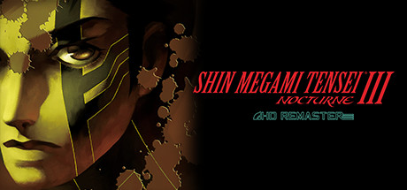
Shin Megami Tensei III Nocturne HD Remaster capsule

Shin Megami Tensei III Nocturne HD Remaster

Reawaken your inner demon in a modernized version of the acclaimed ATLUS classic, Shin Megami Tensei III Nocturne HD Remaster.

$14.99Very Positive(48)
JRPGRPGCreature Collector
ATLUSMay 20, 2021

Shin Megami Tensei III Nocturne HD Remaster scores 75/100 — better than 73% of JRPG capsules (n=432).

Very Positive (48 reviews) · $14.99 · Released May 20, 2021 · By ATLUS

Quick text summary

Shin Megami Tensei III Nocturne HD Remaster scored 75/100 on Steam Analyzer — Good for a JRPG capsule. Top priority fix: [genre_clarity] Add subtle UI or environmental element that reinforces the demon-collecting or fusion mechanic core to SMT—consider a hint of demon silhouette or battle interface in the background.

Capsule scores by dimension

  • Genre Clarity: 7/10 — Dark fantasy RPG reads clearly. The demonic masked character with glowing yellow eyes and ornate armor immediately signals a dark fantasy or occult RPG aesthetic. At TINY size, the silhouette of the mask and the contrast of the yellow glow still register as supernatural and distinctive. Genre intent is clear, though the specific SMT identity could be stronger without series familiarity.
  • Title Readability: 8/10 — Title legible with strong styling. SHIN MEGAMI TENSEI III appears in bold red italicized text positioned on the right side against dark background, readable at all sizes including TINY. NOCTURNE subtitle and 4HD REMASTER tagline are smaller but still discernible at small sizes. The red color choice contrasts well against the dark background and the supporting elements do not obscure the main title.
  • Contrast & Color: 8/10 — Strong warm-cool separation. The warm yellow-gold glow on the left character face contrasts sharply against cool dark tones and black voids on the right side. Bright red title text pops effectively against the dark background. At TINY size, the yellow glow and red text remain distinct and separable, creating clear value hierarchy and silhouette definition.
  • Uniqueness & Polish: 7/10 — Polished aesthetic with character focus. The mask design is detailed and premium-looking with metallic accents and intricate line work. The composition feels intentional and elevated beyond generic RPG fare, with a clear visual identity rooted in occult themes. However, the approach is somewhat conventional for the SMT series—a strong character face presentation without a particularly unexpected hook or visual mechanic showcase.
  • Brand Consistency: 7/10 — Recognizable SMT visual language. The demonic mask, occult iconography, and warm yellow-gold lighting are consistent with SMT series identity and dark JRPG branding. The color palette and character rendering style align with the franchise's established aesthetic. Internal cohesion is strong, though the capsule does not introduce any new or standout brand signature beyond expected SMT visual conventions.
  • Composition: 8/10 — Balanced focal hierarchy with clear subject. The masked character face dominates the left-center as the clear primary focal point, with the glowing eyes drawing immediate attention. Title anchors the right side without competing for focus. The layering of the character against darker elements creates depth, and the composition remains readable and focused even at TINY size. Spacing respects safe margins and the design does not suffer from Steam cropping.

What works

  • Strong character silhouette. The demonic mask is instantly recognizable and visually distinct at all sizes, creating a memorable primary subject that anchors the entire composition.
  • Excellent contrast palette. Warm yellow glow against cool dark tones and red title against black background create clear visual separation that reads well at TINY size and in quick scroll.
  • Clean title placement and legibility. Bold red italicized text positioned on controlled dark background ensures readability across all viewing sizes without obstruction or blur risk.

What hurts the capsule

  • Generic character presentation. The mask-focused approach is a safe SMT aesthetic choice rather than a hook that communicates a unique selling point or core mechanic of this remaster.
  • Limited visual storytelling. The capsule does not clearly communicate what makes the HD Remaster version distinctive or what gameplay experience awaits—it reads as a standard character showcase.
  • Minimal environmental context. The abstract dark background with particle elements does not establish setting or world depth, reducing the sense of immersion or place.

Priority fixes

  1. [genre_clarity] Add subtle UI or environmental element that reinforces the demon-collecting or fusion mechanic core to SMT—consider a hint of demon silhouette or battle interface in the background.
  2. [uniqueness_polish] Strengthen the remaster hook by subtly incorporating modern rendering cues or lighting that differentiates this from the original—consider more dynamic particle effects or enhanced metallic sheen on the armor.
  3. [brand_consistency] Introduce or emphasize a signature SMT symbol, rune, or glyph in the composition that becomes an iconic brand marker for this specific entry.

Related guides

Steam app ID: 1413480 · Tags: JRPG, RPG, Creature Collector, Party-Based RPG, Demons