Scoring genre clarity...

Cataclismo capsule

Cataclismo

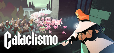
Design and build fortresses brick by brick to stand against endless hordes of Horrors in this real-time strategy game with resource management, siege defense, and exploration. Lead from the ramparts, push back the darkness, and hold fast against the creatures of the Mist.

$14.99Very Positive(38)
Base BuildingColony SimStrategy
Digital SunMar 20, 2025

Cataclismo scores 77/100 — better than 77% of Steam capsules we've analysed (n=22,658).

Very Positive (38 reviews) · $14.99 · Released Mar 20, 2025 · By Digital Sun

Quick text summary

Cataclismo scored 77/100 on Steam Analyzer — Good for a Steam capsule. Top priority fix: [genre_clarity] Incorporate a visible structure being built or assembled, such as stacked stone blocks or scaffolding, to communicate the unique brick-by-brick construction mechanic and differentiate from generic RTS capsules.

Capsule scores by dimension

  • Genre Clarity: 7/10 — Medieval defense strategy implied. The image shows armored characters standing atop a stone fortification with castle battlements visible in the background, clearly implying a medieval siege or tower defense context. The archer, warrior, and commanding figure together suggest RTS or strategy with unit management. At tiny size the fortification silhouette and character grouping still hint at a defense strategy game, though the specific build-and-defend mechanic is not communicated.
  • Title Readability: 8/10 — Bold title reads well at small. The title 'Cataclismo' uses a heavy, slightly condensed serif-style display font placed against the warm bright sun disc and light sky in the lower right, providing strong contrast. At small capsule size the lettering remains legible due to its weight and size. At tiny thumbnail size the word is compressed and some letterforms begin to merge, but the bold weight keeps it identifiable as a word rather than noise.
  • Contrast & Color: 8/10 — Warm amber glow separates well. The large amber-orange sun disc creates a strong warm backlit halo that silhouettes the central commanding character effectively against the Steam dark background. The dark foreground figures and structures contrast sharply against the bright central glow, creating clear value separation. In grayscale the foreground-background split remains readable, though the dark left-side foliage and the dark right-side structure blend somewhat at tiny size.
  • Uniqueness & Polish: 8/10 — Stylized art with strong craft. The flat-shaded illustrative art style is distinctive and polished, avoiding the generic photo-realistic or dark-fantasy look common in the strategy genre. The composition feels deliberate with strong silhouette shapes and a limited but cohesive warm-to-dark palette. Compared to genre peers like Manor Lords or Frostpunk 2, the graphic novel aesthetic gives it a unique identity hook, though the scene itself is a fairly conventional 'heroes surveying the land' moment without showing the unique brick-by-brick building mechanic.
  • Brand Consistency: 8/10 — Cohesive palette and art direction. The warm amber background, flat cel-shaded character rendering, and dark silhouetted structures form a recognizable and internally consistent visual identity. The color palette of burnt orange, dark slate, and soft whites is applied uniformly across figures and environment. The bold chunky typography matches the graphic-novel illustration style, reinforcing a single coherent brand voice that would likely translate well to screenshots and promotional material.
  • Composition: 7/10 — Clear focal hierarchy with minor edge tension. The central commanding figure elevated on the battlement creates a natural primary focal point, supported by the sun disc halo behind them and the flanking archer and armored soldier in lower positions. The title is placed bottom-right in open sky space, avoiding overlap with key characters. At small size the composition holds reasonably well, though the title competes slightly with the busy character cluster on the left, and the dark left-edge tree mass creates an unbalanced weight that could cause cropping issues.

What works

  • Strong backlit silhouette. The amber sun disc creates a powerful backlight that cleanly separates the central character from the background even at tiny thumbnail size.
  • Distinctive illustrative art style. The flat cel-shaded rendering stands out from the photorealistic or dark-brown aesthetic of most strategy genre competitors on Steam.
  • Legible heavyweight title. The bold condensed font for 'Cataclismo' placed against the bright sky region maintains readability down to small capsule dimensions.
  • Clear genre cues via fortification. Stone battlements, castle structure silhouettes, and an archer character quickly communicate a medieval defense or strategy context.

What hurts the capsule

  • Build mechanic not communicated. The unique brick-by-brick fortress construction, the game's core selling point, is completely absent from the image, making it look like a generic RTS rather than a distinctive builder-defender hybrid.
  • Heavy dark mass on left edge. The large dark foliage and rocky structure on the far left creates visual imbalance and risks being cropped awkwardly in some Steam capsule display formats.
  • Genre ambiguity at tiny size. At 120x45 pixels the castle and characters compress into a vague cluster that could suggest action-RPG or even a platformer rather than clearly signaling strategy or simulation.
  • Right-side structure underutilized. The castle wall and tower silhouette on the right mid-ground is too dark and low-detail to reinforce the fortress-building theme, blending into the background without adding readable narrative content.

Priority fixes

  1. [genre_clarity] Incorporate a visible structure being built or assembled, such as stacked stone blocks or scaffolding, to communicate the unique brick-by-brick construction mechanic and differentiate from generic RTS capsules.
  2. [composition] Reduce or darken the heavy left-edge foliage mass to improve horizontal balance and ensure no key visual content sits in crop-risk zones near the edges.
  3. [contrast_color] Add a subtle light rim or edge highlight to the right-side castle silhouette so it reads as a distinct fortress shape rather than a dark blob at small and tiny sizes.
  4. [title_readability] Add a very thin dark outline or soft shadow behind the 'Cataclismo' lettering to improve separation when the capsule is viewed on lighter Steam page backgrounds or in edge-case display contexts.

Store copy priority fixes

  1. [feature_communication] Add a bullet-point list of 4-5 unit types with one-word descriptors (e.g., Bowmen—ranged; Cannoneers—explosive; Knights—melee tank) to clarify unit roster depth and variety early in detailed description.
  2. [audience_targeting] Insert a sentence explicitly addressing difficulty scaling or tutorial availability (e.g., 'From beginner-friendly skirmishes to punishing challenge mode, difficulty adapts to your skill') to signal accessibility without lowering perceived depth.
  3. [hook_strength] Strengthen the short description's second sentence by replacing the poetic 'push back the darkness' with a more mechanical hook like 'design defenses that exploit physics and terrain to turn the tide' to reinforce the unique building-strategy angle.
  4. [feature_communication] Add clarification on resource acquisition scope—briefly explain whether you're gathering from the map passively, actively foraging, or defending resource nodes to set expectations for economic gameplay rhythm.

Related guides

Steam app ID: 1422440