Scoring genre clarity...

BRAVELY DEFAULT II capsule

BRAVELY DEFAULT II

A new entry in the “Bravely" series! Four new Heroes of Light emerge in a new world and story!

$59.99Very Positive(14)
RPGJRPGTurn-Based Combat
Square Enix, ClaytechworksSep 2, 2021

BRAVELY DEFAULT II scores 85/100 — better than 98% of RPG capsules (n=3,813).

Very Positive (14 reviews) · $59.99 · Released Sep 2, 2021 · By Square Enix

Quick text summary

BRAVELY DEFAULT II scored 85/100 on Steam Analyzer — Excellent for a RPG capsule. Top priority fix: [contrast_color] Consider subtle background gradient or atmospheric effect to add depth while maintaining character silhouette clarity and readability.

Capsule scores by dimension

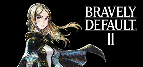
  • Genre Clarity: 8/10 — Clear JRPG character focus. The elegant anime-styled female character in ornate armor immediately signals a Japanese RPG aesthetic. The fantasy costume, pose, and art style are unmistakably genre-specific, though at TINY size the face detail softens but the silhouette and armor still read as fantasy RPG. The overall presentation aligns well with the Bravely Default franchise's established visual identity.
  • Title Readability: 9/10 — Bold, clean sans-serif hierarchy. BRAVELY DEFAULT II displays in a strong, all-caps sans-serif font with excellent contrast against the black background. The white letterforms remain fully readable even at TINY size, and the underline beneath the main title reinforces branding. The TM symbol and II designation are small but acceptable secondary information that does not clutter the primary read.
  • Contrast & Color: 8/10 — Strong character-background separation. The character's light skin tone, blonde hair, and metallically-accented armor create clear value separation from the pure black background. Even at TINY size the silhouette remains distinct, and the blue-gold accent lighting on the cape adds visual interest without muddying the core contrast. The design holds well in grayscale due to strong value range between subject and void.
  • Uniqueness & Polish: 8/10 — Premium anime illustration quality. The character artwork demonstrates high polish with careful attention to fabric texture, lighting, and anatomical proportion. The illustration feels premium and distinct from generic fantasy RPG templates—the specific color palette (cool blues, warm golds, pale skin) and the character's elegant pose convey narrative intent rather than a stock pose. This sets it apart from lower-effort competitor capsules in the RPG space.
  • Brand Consistency: 9/10 — Recognizable franchise visual identity. The art style, character design philosophy, and color treatment align with the established Bravely Default aesthetic seen across marketing materials and previous entries. The serif-and-sans-serif title treatment, monochromatic background approach, and focus on a single iconic character are franchise hallmarks. The consistent high-quality illustration style reinforces brand trust and recognition.
  • Composition: 9/10 — Excellent focal point and balance. The character is centered and clearly the primary focal point, with the title positioned in the upper right in a non-intrusive manner that complements rather than competes. Safe margins are respected around all edges, and there is no visual clutter or dead space—the composition uses negative space strategically to enhance focus. The layering of character in foreground against black void creates clear depth and draws the eye immediately at all viewing sizes.

What works

  • Title remains fully legible at tiny size. The bold sans-serif BRAVELY DEFAULT II maintains excellent readability even at 120x45 pixels due to thick strokes and high contrast against black.
  • Character silhouette reads instantly. The distinctive pose, hair flow, and armor shape create a memorable silhouette that communicates 'fantasy RPG protagonist' even when squinted or viewed at thumbnail size.
  • Premium illustration polish. The character artwork demonstrates professional-grade rendering with attention to lighting, fabric detail, and anatomical accuracy that elevates the capsule above generic templates.
  • Strong value contrast separation. Light character elements against the pure black background create clarity and visual pop that ensures the design remains distinct during quick scrolls.

What hurts the capsule

  • Limited color palette. The capsule relies almost entirely on black, white, and metallic accents; while this works for brand consistency, it lacks the visual variety and saturation energy of top-tier RPG competitors.
  • Minimal environmental context. The void background, while clean, provides no world-building visual cues or secondary storytelling elements that could distinguish this entry from the broader Bravely franchise.

Priority fixes

  1. [contrast_color] Consider subtle background gradient or atmospheric effect to add depth while maintaining character silhouette clarity and readability.
  2. [uniqueness_polish] Introduce a second character or a signature visual motif unique to Bravely Default II to increase visual distinctiveness in genre comparison.

Related guides

Steam app ID: 1446650 · Tags: RPG, JRPG, Turn-Based Combat, 3D, Adventure