Scoring genre clarity...

At Dead Of Night capsule

At Dead Of Night

At Dead Of Night is part horror film, part horror game and part ghost hunt. It blends live-action and graphics to create a unique immersive horror experience like no other.

$11.99Very Positive(30)
Survival HorrorHorrorStrategy
Baggy Cat Ltd.Nov 19, 2020

At Dead Of Night scores 73/100 — better than 69% of Survival Horror capsules (n=1,222).

Very Positive (30 reviews) · $11.99 · Released Nov 19, 2020 · By Baggy Cat Ltd.

Quick text summary

At Dead Of Night scored 73/100 on Steam Analyzer — Good for a Survival Horror capsule. Top priority fix: [title_readability] Reduce texture noise on 'Of Night' text and add a subtle outline or shadow to ensure legibility at 120×45 thumbnail scale without sacrificing mood.

Capsule scores by dimension

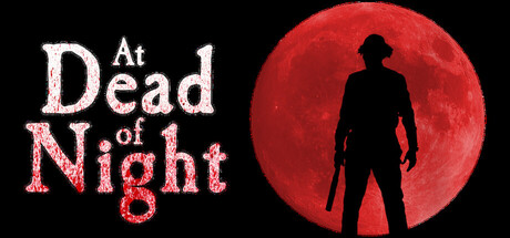
  • Genre Clarity: 8/10 — Horror immersive experience clearly signaled. The silhouetted figure against the ominous red moon immediately communicates horror and supernatural dread, evoking the blend of live-action cinematic horror described. At tiny size, the iconic moon and figure silhouette remain instantly recognizable as horror genre, though the specific hybrid nature (game/film) is not obvious from visuals alone. The color palette and composition strongly favor survival horror or paranormal investigation aesthetics.
  • Title Readability: 7/10 — Title readable at full size, fragile at tiny. The white serif-style 'At Dead' and red speckled 'Of Night' text are clearly legible at full header size with good contrast against the black background. However, at tiny thumbnail size (120×45), the textured red letters on 'Of Night' begin to lose definition and the overall title legibility drops noticeably due to fine detail collapse. The asymmetric layout places title on the left, leaving the right side for the visual centerpiece, which is a strong structural choice.
  • Contrast & Color: 8/10 — Strong red-black value separation. The deep red moon and warm orange-red lighting on the silhouette create excellent contrast against the pure black background and the Steam dark theme. The silhouette reads crisply in grayscale due to pure black figure against bright red orb, and the saturation of red is bold enough to catch attention in quick scroll without feeling garish. The white title text adds a third contrast layer that keeps focus on the top-left narrative.
  • Uniqueness & Polish: 7/10 — Distinctive horror aesthetic, moderate execution. The haunting figure-against-moon composition is evocative and thematic, communicating the paranormal investigation hook effectively. The textured red letters suggest a gritty, film-noir horror aesthetic that aligns with the live-action hybrid pitch. However, the silhouette pose and moon backdrop, while atmospheric, are somewhat familiar tropes in horror marketing; the execution is polished but not as distinctive as top-tier horror capsules like Lies of P or Resident Evil 4, which introduce more visual specificity or character personality.
  • Brand Consistency: 6/10 — Coherent mood, limited visual identity. The red moon, silhouette, and grainy texture create internal cohesion and a recognizable atmospheric identity suited to the horror-game-film hybrid concept. However, without reference to the 15 store screenshots, the capsule does not yet establish a unique iconic character, symbol, or signature motif that would be immediately recognizable on repeat viewing. The palette and mood are consistent and intentional, but generic enough that other horror titles could adopt similar visual language.
  • Composition: 8/10 — Strong focal hierarchy, balanced asymmetry. The composition is well-structured: the large red moon dominates the center-right as the primary focal point, drawing the eye immediately, while the silhouetted figure provides secondary interest and narrative weight. The title anchors the left side without competing for dominance, and the pure black background creates safe margins and prevents edge-hugging problems. At small and tiny sizes, the moon and figure remain the clear primary subject while the title stays legible and unobstructed, showing strong resilience to Steam's cropping and scaling.

What works

  • Instantly recognizable horror mood. The red moon and silhouette combination immediately signal supernatural horror and paranormal investigation, aligning perfectly with the live-action ghost hunt description.
  • Excellent contrast against Steam background. The red-black-white color scheme pops dramatically against the #1b2838 Steam dark theme and maintains silhouette clarity even in grayscale.
  • Strong asymmetric composition. Title placement on the left and focal moon on the right create balanced visual flow that guides the eye naturally and avoids dead-center voids.
  • Resilient focal hierarchy at smaller sizes. The moon and silhouette read clearly at small and tiny sizes without collapsing into visual noise, maintaining genre clarity during quick scroll.

What hurts the capsule

  • Title texture fragility at tiny size. The red speckled texture on 'Of Night' loses legibility and fine detail at thumbnail scale, reducing readability below ideal standards.
  • Generic silhouette pose and moon trope. While atmospheric, the figure-against-moon composition is a familiar horror marketing trope that does not establish a distinctive visual identity unique to At Dead Of Night.
  • Limited character or brand icon. The capsule does not feature a recognizable character, mascot, or unique visual symbol that would serve as a memorable brand identity for repeat recognition.

Priority fixes

  1. [title_readability] Reduce texture noise on 'Of Night' text and add a subtle outline or shadow to ensure legibility at 120×45 thumbnail scale without sacrificing mood.
  2. [uniqueness_polish] Introduce a distinctive character pose, prop, or visual signature (e.g., a specific weapon, emblem, or gesture) that ties the silhouette to At Dead Of Night's unique live-action hybrid identity.
  3. [brand_consistency] Establish and reinforce an iconic visual motif or color accent that can serve as a recognizable brand mark across future marketing materials and trailers.

Store copy priority fixes

  1. [feature_communication] Add a sentence explaining the core gameplay loop: how players investigate, what decisions they make, and how ghost communication influences progression—e.g., 'Piece together clues from supernatural encounters to unlock the truth and negotiate for your friends' release.'
  2. [hook_strength] Replace 'unique immersive horror experience like no other' with a specific emotional hook or consequence tied to player agency—e.g., 'Every ghost's revelation brings you closer to freedom—or deeper into Jimmy's madness.'
  3. [audience_targeting] Clarify the tactical and strategy elements: mention whether players make meaningful choices during investigations, manage resources, or plan escape routes to better signal the game's depth to strategy-minded players.
  4. [tone_match] Move all technical and administrative notes (beta options, audio latency, reviewer limits, merch) into a separate section below the main description to preserve the horror atmosphere of the core pitch.

Related guides

Steam app ID: 1450830 · Tags: Survival Horror, Horror, Strategy, Investigation, Supernatural