Scoring genre clarity...

Minicology capsule

Minicology

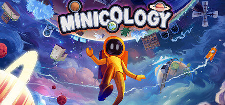
You have crash-landed into a mini-verse of tiny planets. Welcome to Minicology! Embark on an interstellar survival sandbox journey. Use your crafting, combat, and automation skills to survive the many challenges this mini-verse throws at you.

$3.74Mixed(53)
SimulationSpace SimAliens
Isaac DennerApr 25, 2024

Minicology scores 75/100 — better than 68% of Steam capsules we've analysed (n=22,658).

Mixed (53 reviews) · $3.74 · Released Apr 25, 2024 · By Isaac Denner

Quick text summary

Minicology scored 75/100 on Steam Analyzer — Good for a Steam capsule. Top priority fix: [composition] Reduce or simplify peripheral floating debris elements to create cleaner negative space around the central astronaut and improve focus at small sizes.

Capsule scores by dimension

  • Genre Clarity: 7/10 — Space survival sandbox vibes clear. The orange astronaut character, floating mini planets, rocket, windmill, and crafted structures collectively signal a space-themed survival sandbox with some clarity. At tiny size the astronaut silhouette and colorful space setting still read as sci-fi adventure or survival, which aligns well with the actual genre. The crafting and automation angle is hinted by the structures but not strongly communicated at small sizes.
  • Title Readability: 8/10 — Bold logo reads well at most sizes. The MINICOLOGY title uses a thick, chunky white font with a dark outline and is placed in the upper center against a relatively controlled blue-sky background, giving it good separation. At small capsule size it remains clearly legible. At tiny thumbnail size the letters compress but the bold weight and high contrast outline keep the title identifiable, though fine details like the embedded planet icons within letters are lost.
  • Contrast & Color: 8/10 — Warm astronaut pops on cool background. The bright orange astronaut suit creates strong warm-cool contrast against the blue and purple space background, producing a clear silhouette that holds up in grayscale. The saturated palette separates well from Steam's dark #1b2838 border. At tiny size the orange figure remains the dominant focal point without blending into the background, though the busy surrounding elements reduce some edge clarity.
  • Uniqueness & Polish: 7/10 — Charming style with busy composition. The cartoon astronaut with expressive pose, whimsical mini-planet ecosystem, and vibrant illustrative art style give it a distinctive and polished feel above the genre average. The floating debris, turtle, windmill, and rocket add personality and hint at the sandbox variety of the game. However, the busy background competes with the hero and reduces the premium feel slightly, keeping it from standing out as sharply as top-tier capsules like COCOON or DAVE THE DIVER.
  • Brand Consistency: 8/10 — Cohesive mini-verse identity established. The orange astronaut character, miniaturized planet aesthetic, and warm-meets-cosmic color palette form a recognizable internal identity that would carry across marketing materials. The chunky rounded logo with embedded planet icons reinforces the 'mini' theme consistently. The illustrative cartoon style is coherent throughout all visible elements, and the character design is distinctive enough to serve as a recurring brand anchor.
  • Composition: 7/10 — Strong focal point, busy periphery. The centered astronaut with arms outstretched creates a clear primary focal point, and the title above him forms a natural top-to-subject reading hierarchy. At small and tiny sizes the center-stage orange figure remains the dominant read. However, the many floating objects around the edges — debris, planets, structures, rocket — create peripheral clutter that competes for attention and somewhat dilutes the composition at full size; at tiny size most of this detail disappears harmlessly.

What works

  • Strong warm-cool contrast. The orange astronaut against the blue-purple space background creates immediate visual separation that reads clearly even at tiny thumbnail size.
  • Readable bold title logo. The thick white chunky lettering with dark outline sits on a clean sky area and holds legibility down to small capsule dimensions.
  • Distinctive character anchor. The expressive orange astronaut with arms wide is a memorable and genre-appropriate hero image that can serve as a recurring brand identity.
  • Whimsical world-building details. The windmill, turtle, mini planets, and rocket efficiently communicate sandbox variety and the game's unique mini-verse concept at full header size.

What hurts the capsule

  • Peripheral clutter competes with focus. The many floating objects around the edges — can tabs, boxes, structures — create visual noise that reduces composition clarity at full and small sizes.
  • Crafting and automation not obvious at tiny size. The game's key survival and automation mechanics are not communicated at small or tiny sizes, leaving the genre impression slightly generic space-adventure.
  • Background sky area slightly busy behind title. The swirling blue clouds and debris near the title zone reduce the clean contrast anchor the logo needs for maximum small-size legibility.
  • Mid-range depth lacks separation. The midground structures and floating islands blend somewhat into the background, reducing the layered depth cues that help the composition read at reduced sizes.

Priority fixes

  1. [composition] Reduce or simplify peripheral floating debris elements to create cleaner negative space around the central astronaut and improve focus at small sizes.
  2. [genre_clarity] Add a subtle ground-level crafting or base-building element near the bottom edge to reinforce the survival sandbox genre signal at small capsule size.
  3. [contrast_color] Darken or desaturate the background cloud and debris elements slightly behind the title area to increase logo contrast without altering the character's visibility.
  4. [uniqueness_polish] Strengthen the depth layering by increasing value contrast between foreground astronaut, midground structures, and background space to push premium quality closer to top-tier genre benchmarks.

Store copy priority fixes

  1. [uniqueness] Add a sentence that explicitly differentiates Minicology: e.g., 'Unlike other automation games, Minicology ties survival directly to procedural events—your farm strategy must adapt to meteor showers and seasonal hazards.' This clarifies why the game's automation is distinct.
  2. [audience_targeting] Insert a clear player profile statement in the short or opening paragraph: e.g., 'Perfect for players who enjoy Stardew Valley's farming depth combined with Factorio's automation complexity.' This immediately signals the intended audience.
  3. [hook_strength] Rewrite the opening to lead with the most exciting differentiator rather than the crash premise: e.g., 'Build, automate, and defend your tiny planet fortress against invasions while exploring a procedurally-shifting universe.' This prioritizes gameplay over scenario.
  4. [feature_communication] Reorganize the detailed description to establish core loop first, then optional depth: Lead with 'Survive by farming or hunting while automating your base,' then expand into bosses, terraforming, and events.

Related guides

Steam app ID: 1471700