Scoring genre clarity...

IdleOn capsule

IdleOn

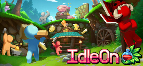
The incremental MMO where your heroes keep fighting even when you're gone! Spend their loot on upgrades, unlock classes from Elemental Wizard to Cannon Pirate, and level up 19 unique skills like Farming, Sailing, and even Construction!

Free to PlayMostly Positive(397)
IdlerIncrementalFree to Play
Lavaflame2Nov 6, 2025

IdleOn scores 63/100 — better than 6% of Steam capsules we've analysed (n=22,658).

Mostly Positive (397 reviews) · Free to Play · Released Nov 6, 2025 · By Lavaflame2

Quick text summary

IdleOn scored 63/100 on Steam Analyzer — Solid for a Steam capsule. Top priority fix: [composition] Establish a single dominant focal character — ideally the red demon or a hero character — large and centered, with supporting characters scaled down and pushed to the periphery to create clear visual hierarchy at tiny size.

Capsule scores by dimension

  • Genre Clarity: 7/10 — Idle RPG town builder vibes. The colorful stickfigure characters performing various tasks around a cottage — one mining, one carrying a coin, a demon reading a book — communicate an idle/management RPG fairly well. The whimsical fantasy setting with multiple character classes visible hints at the MMO-RPG blend. At tiny size, the busy scene reads as a casual RPG or idle game, which is accurate, though the specific idle/management mechanic is not immediately obvious without the title context.
  • Title Readability: 7/10 — Readable at full, passable at tiny. The 'IdleOn' logo sits at the bottom center in a large pixel-style font with a pink-white gradient and dark outline, making it readable at full size. The small potion-and-leaf icon next to the logo is a nice brand touch but becomes invisible at tiny size. At tiny size the title remains legible as the high-contrast letterforms hold, though fine details in the font styling are lost and the logo icon disappears entirely.
  • Contrast & Color: 6/10 — Bright but midtone heavy scene. The overall palette is saturated greens, blues, and warm earth tones that sit in a mid-value range throughout, which means many elements blend together in the busy scene. The red demon character on the right and the blue stickfigure on the left provide some contrast anchors, but in grayscale the scene collapses into a relatively uniform mid-tone mass. Against Steam's dark #1b2838 background, the bright sky and green grass create reasonable edge separation, but the subject density makes silhouette reading difficult at small sizes.
  • Uniqueness & Polish: 6/10 — Charming but cluttered execution. The stickfigure-meets-fantasy-RPG aesthetic is genuinely distinctive and communicates the game's quirky identity well. However, the composition feels crowded with too many characters and props competing for attention, which dilutes the impact of the unique art style. Compared to top-performing capsules like Go-Go Town! or DAVE THE DIVER which use confident focal hierarchy, this reads more like a gameplay screenshot than a crafted marketing asset.
  • Brand Consistency: 7/10 — Coherent stickfigure RPG identity. The simple stickfigure characters with round heads and flat-shaded bodies are a consistent and recognizable visual identity that distinguishes IdleOn from other RPGs. The pixel font logo, potion icon, and fantasy cottage environment all feel internally cohesive and align with the game's casual-MMO-RPG positioning. The color palette of bright primaries against lush green environments creates a signature look that would be recognizable across store assets.
  • Composition: 5/10 — Busy scene lacks clear focal point. The image presents many characters and props at roughly equal visual weight — blue figure left, pink pig center-top, red demon right, cottage center — creating scattered attention with no single dominant focal point. The title is well-placed at the bottom center on a relatively clean lower band, which saves the composition somewhat. At small and tiny sizes the scene collapses into visual noise, with no single element commanding the eye, reducing the capsule's effectiveness in quick scroll browsing.

What works

  • Distinctive stickfigure art style. The simple stickfigure character designs are immediately recognizable and differentiate IdleOn from standard fantasy RPG capsules in the genre.
  • Title placement on clean lower band. The 'IdleOn' logo sits on the darker lower portion of the image, giving it enough contrast separation to remain legible at small sizes.
  • Accurate genre mood. The whimsical, busy fantasy village scene with multiple characters doing tasks effectively communicates a casual idle-RPG tone.
  • Saturated, energetic color palette. The bright greens, blues, and warm accents create a cheerful, approachable visual energy that fits the free-to-play casual RPG audience.

What hurts the capsule

  • No clear focal hierarchy. Five or more characters and multiple props compete at similar visual weight, making it impossible to identify a single hero or hook at tiny size.
  • Midtone scene collapses in grayscale. Most elements share similar mid-range values, causing the scene to merge into an undifferentiated mass when contrast or color is reduced.
  • Logo icon invisible at tiny size. The small potion-and-leaf icon beside the title disappears entirely at thumbnail sizes, wasting a brand identity opportunity.
  • Cluttered composition undermines polish. The capsule feels more like a packed gameplay screenshot than a designed marketing asset, which lowers perceived production value compared to genre peers.

Priority fixes

  1. [composition] Establish a single dominant focal character — ideally the red demon or a hero character — large and centered, with supporting characters scaled down and pushed to the periphery to create clear visual hierarchy at tiny size.
  2. [contrast_color] Darken the background midground elements and increase the value contrast between the primary character and the environment so the silhouette reads cleanly in grayscale and at thumbnail scale.
  3. [uniqueness_polish] Redesign the capsule around one iconic moment or character pose rather than a busy scene overview, to match the composed storytelling clarity of top genre performers like Go-Go Town! or DAVE THE DIVER.
  4. [title_readability] Scale up the potion-leaf brand icon and integrate it more prominently alongside the logo so it survives at small sizes and reinforces brand recognition.

Store copy priority fixes

  1. [feature_communication] Replace the entire detailed description with actual game information: progression system depth, prestige/reset mechanics, multiplayer interactions (guilds, trade, PvP), and what separates IdleOn from other idlers.
  2. [uniqueness] Add a 1-2 sentence statement of differentiation in the short description, such as 'with cross-platform multiplayer and 19 interconnected skills' or highlight a specific mechanic no other idle game offers.
  3. [tone_match] Move the Discord/community reference to a separate community section or sidebar; keep the main store copy focused on the game itself and maintain consistent casual-friendly tone throughout.

Related guides

Steam app ID: 1476970