Scoring genre clarity...

Empires Shall Fall capsule

Empires Shall Fall

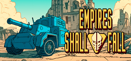
Empires Shall Fall is a turn-based tactics game set in a dieselpunk world. Upgrade your army and command your troops, then exploit terrain to eradicate your enemies with sheer power and sharp tactics.

$4.54Very Positive(127)
StrategyTurn-Based StrategyTurn-Based Tactics
Weird Penguin GamesFeb 19, 2024

Empires Shall Fall scores 67/100 — better than 15% of Steam capsules we've analysed (n=22,658).

Very Positive (127 reviews) · $4.54 · Released Feb 19, 2024 · By Weird Penguin Games

Quick text summary

Empires Shall Fall scored 67/100 on Steam Analyzer — Solid for a Steam capsule. Top priority fix: [title_readability] Darken or simplify the background directly behind the title text with a subtle vignette or color wash to isolate the yellow lettering and prevent ruin texture from competing.

Capsule scores by dimension

  • Genre Clarity: 7/10 — Military vehicle dieselpunk warfare. The large blue armored tank/vehicle on the left clearly signals military combat, and the ruined tower structure in the background reinforces a war-torn setting. The dieselpunk aesthetic is readable at full size, giving strong strategy or tactics game vibes. At tiny size the tank silhouette still reads as military, though the specific subgenre of turn-based tactics is not distinguishable from an RTS or action game without the title context.
  • Title Readability: 7/10 — Bold gold title reads clearly. The title 'EMPIRES SHALL FALL' uses bold yellow-gold block lettering with a dark outline that creates good contrast against the lighter background. At full size it is easily readable with clear letterforms and a skull-like emblem integrated between 'SHALL' and 'FALL'. At tiny size the individual words compress but the large bold font still allows the title to be parsed, though the skull emblem between the words becomes unreadable noise at 120x45.
  • Contrast & Color: 7/10 — Warm sandy palette pops on dark Steam background. The warm sandy beige and light blue vehicle create reasonable contrast against Steam's dark #1b2838 background, particularly the bright sky area and the cyan-tinted tank. The yellow title text reads well against the mid-tone background. In grayscale, the tank silhouette has decent separation from the background sky, though the ruined building in the center-right blends into the warm dust tones and loses definition at small sizes.
  • Uniqueness & Polish: 6/10 — Competent but genre-generic execution. The cartoon-comic art style with bold outlines is charming and differentiates it from hyper-realistic strategy titles, giving it a personality closer to Advance Wars than the benchmark titles listed. However, the composition of 'big vehicle on left, ruins in background, title on right' is a fairly common indie strategy template. The skull motif embedded in the title adds a small distinctive touch, but overall the capsule feels competent rather than premium or surprising.
  • Brand Consistency: 6/10 — Consistent style but weak identity hook. The bold outline cartoon rendering style is internally consistent throughout the image, with the vehicle, background ruins, and sky all sharing the same stylized aesthetic. The skull emblem between the title words is a potential brand anchor but is too small and underdeveloped to serve as a strong identity symbol. The color palette of sandy warm tones and cyan accents is cohesive, but the overall visual identity is not yet distinctive enough to be recognizable at a glance without the title.
  • Composition: 7/10 — Clear left-right split with good hierarchy. The composition uses a clean left-right split with the tank occupying the left half and the title dominating the right half, creating a natural reading flow. The ruined tower in the background provides depth and connects the two halves. At small size the tank and title still coexist without fighting for attention, though at tiny size the background ruins compete slightly with the title text area due to similar mid-range values. The focal point is clear and no important elements appear dangerously close to crop edges.

What works

  • Tank silhouette is immediately readable. The large cyan armored vehicle on the left creates an instantly recognizable military silhouette that persists even at tiny thumbnail sizes.
  • Bold title font survives small sizes. The thick yellow-gold block lettering with dark outline retains legibility at small capsule sizes better than decorative or thin fonts would.
  • Distinctive cartoon art style. The bold-outline comic aesthetic sets the capsule apart from the hyper-realistic competitor titles in the strategy genre, giving it a unique personality.
  • Warm palette contrasts against Steam dark UI. The sandy beige sky and warm dust tones create a natural value pop against Steam's dark #1b2838 background, drawing the eye during quick scroll.

What hurts the capsule

  • Background ruins blend with title area. The ruined tower structure sits behind and adjacent to the title text, creating mid-tone noise that slightly reduces title readability at small sizes.
  • Skull emblem too small to register. The skull icon embedded between 'SHALL' and 'FALL' is a potential brand anchor but is too small and low-contrast to read at any size below full resolution.
  • No clear strategy subgenre signal. The image reads as broadly military but does not communicate turn-based tactics specifically, making it blend with action or RTS games at a glance.
  • Generic composition template. The vehicle-left, title-right, ruins-center layout follows a common indie game capsule formula without a distinctive visual hook or storytelling element.

Priority fixes

  1. [title_readability] Darken or simplify the background directly behind the title text with a subtle vignette or color wash to isolate the yellow lettering and prevent ruin texture from competing.
  2. [uniqueness_polish] Add a stronger visual storytelling element such as a unit grid overlay, battle action lines, or hex/tile motif that signals turn-based tactics rather than generic military action.
  3. [brand_consistency] Enlarge and stylize the skull emblem into a more prominent logo mark that could serve as a recognizable brand symbol across capsule, icon, and UI.
  4. [contrast_color] Increase the value contrast between the tank and the background by darkening the sky or ground plane directly behind the vehicle to sharpen its silhouette in grayscale.

Store copy priority fixes

  1. [uniqueness] Add 1-2 sentences explaining what makes Empires Shall Fall distinct in the turn-based tactics genre—highlight the dieselpunk setting, hand-drawn aesthetic, or specific mechanical innovation that separates it from classics it's inspired by.
  2. [feature_communication] Expand the Features section to include concrete descriptions: 'Unit Upgrades: Unlock special abilities and manage weaknesses as your soldiers and tanks progress' and 'Non-random Combat: Every attack resolves based on positioning and stats, never luck.'
  3. [hook_strength] Rewrite the faction choice paragraph to lead with player motivation rather than lore: 'Choose your path: the Black Empire's mechanized aggression or the Blue League's defensive strategy—each faction plays entirely differently.'
  4. [audience_targeting] Add a sentence explicitly acknowledging the Lovecraftian element and clarifying whether this appeals to horror-strategy crossover fans or if it's purely aesthetic flavor.

Related guides

Steam app ID: 1477170