Scoring genre clarity...
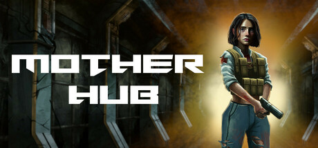
A retro FPS with an artistically gritty setting from the early 2000's. Uncover futuristic weapons lost to time and face off against terrifying bosses. Do you have what it takes to stand against the darkness and save humanity from the brink of extinction?
$9.99Mostly Positive(70)
HorrorSci-fiSpace
ODale StudiosApr 23, 2025