Scoring genre clarity...

Isles of Krom capsule

Isles of Krom

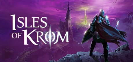
Isles of Krom is a dark fantasy top-down extraction ARPG blending challenging visceral combat with a high-stakes extraction loop. Craft and upgrade gear for your Ward before deploying them into the perilous Krom archipelago to retrieve vital materials and halt the creeping Corruption.


IndieDark FantasyRPG
Floppy Goat Inc.To be announced

Isles of Krom scores 77/100 — better than 77% of Steam capsules we've analysed (n=22,658).

Released To be announced · By Floppy Goat Inc.

Quick text summary

Isles of Krom scored 77/100 on Steam Analyzer — Good for a Steam capsule. Top priority fix: [genre_clarity] Add extraction-specific visual language such as loot containers, portal effects, or mission objective UI elements to differentiate from standard action RPG and communicate the high-stakes extraction loop mechanic.

Capsule scores by dimension

  • Genre Clarity: 8/10 — Dark fantasy action RPG clear. The armored character silhouette, dramatic fantasy architecture, and purple arcane lighting immediately signal dark fantasy action gameplay. At tiny size, the imposing figure with cape and weapon stance reads as a combat-focused character class, supporting the action RPG expectation. The Gothic tower and mystical color palette reinforce extraction dungeon exploration without ambiguity.
  • Title Readability: 8/10 — Strong serif logo, readable at scale. The title 'ISLES OF KROM' uses a bold serif font with excellent contrast against the purple gradient background, maintaining legibility from full header down to small capsule size. The circular rune symbol integrated into the 'O' adds visual interest without compromising letterform clarity. At tiny size the logo remains recognizable though fine details of the rune soften slightly.
  • Contrast & Color: 8/10 — Purple gradient pops on dark background. The saturated purple-to-magenta gradient creates strong value separation from Steam's #1b2838 background, with the armored character rendered in darker purples and cyan accents that create silhouette clarity. The character's bright cyan weapon and armor trim provide strategic highlight points that guide the eye. The composition maintains readable separation in grayscale despite the warm purple cast.
  • Uniqueness & Polish: 7/10 — Polished dark fantasy without standout hook. The rendering quality is high with clean lighting, detailed character model, and cohesive atmospheric effects that feel premium and intentional. However, the composition—armored figure before a Gothic landscape—is a familiar dark fantasy trope seen in Lies of P, Bloodborne-inspired titles, and similar action RPGs. The visual execution is excellent but the core concept lacks a distinctive selling point unique to Isles of Krom's extraction mechanics.
  • Brand Consistency: 7/10 — Consistent dark fantasy aesthetic. The purple-blue color palette, Gothic architecture style, and armored Ward character create a recognizable internal visual identity that could support brand recognition. The rune motif in the logo ties to the fantasy setting and suggests magical systems. Without access to additional store screenshots, the consistency appears solid but the identity feels tied more to dark fantasy genre conventions than to specific Isles of Krom mechanical hooks like 'extraction ARPG' or 'Corruption' systems.
  • Composition: 8/10 — Strong focal point, balanced layout. The armored character positioned right-of-center commands clear primary focus while the Gothic tower provides secondary interest in the background, creating effective depth layering. The title anchors the left side with confident placement on a controlled gradient zone, avoiding text-on-texture collision. At small and tiny sizes the character silhouette remains the dominant read, and title placement survives Steam's crop safety margins well.

What works

  • Bold readable logo with integrated symbol. The serif 'ISLES OF KROM' title with circular rune motif maintains clarity across all viewing scales and adds visual personality without sacrificing legibility.
  • Strong color contrast against Steam background. The saturated purple-magenta gradient pops distinctly against #1b2838, with cyan accents on the character creating visual hierarchy that guides the eye effectively.
  • Clear focal point with depth layering. The armored Ward character dominates the composition while Gothic architecture recedes naturally, creating visual hierarchy that reads instantly at small thumbnail size.
  • Polished high-quality render and lighting. Character modeling, atmospheric effects, and gradient blending demonstrate premium craft and technical execution that signals AAA-adjacent production value.

What hurts the capsule

  • Generic dark fantasy visual concept. The armored figure before a Gothic landscape is a familiar trope across the top-performing action RPG genre, lacking visual differentiation specific to Isles of Krom's extraction mechanics.
  • Extraction ARPG identity not visually communicated. The capsule communicates 'dark fantasy action' effectively but provides no visual cue that this is an extraction-loop dungeon crawler, potentially misaligning player expectations with actual gameplay loop.
  • No iconic character or signature motif. While the Ward is rendered well, the character design uses generic dark fantasy armor without distinctive silhouette or color scheme that would remain memorable after scrolling past.

Priority fixes

  1. [genre_clarity] Add extraction-specific visual language such as loot containers, portal effects, or mission objective UI elements to differentiate from standard action RPG and communicate the high-stakes extraction loop mechanic.
  2. [uniqueness_polish] Introduce a distinctive visual hook unique to Isles of Krom such as the Corruption corruption mechanic visualization, character customization previews, or archipelago map geography that differentiates from competitor dark fantasy titles.
  3. [brand_consistency] Develop and reinforce a signature symbol or color accent tied to the Ward progression system or Krom setting that can anchor future marketing and in-game asset cohesion.

Store copy priority fixes

  1. [feature_communication] Add a second paragraph to the detailed description listing 3–4 core mechanics: e.g., 'Combat abilities, gear progression, island biomes, Corruption scaling.' This directly answers 'what will I actually do?'
  2. [uniqueness] Insert a differentiating sentence in the short description: 'Unlike traditional extraction games, [specific mechanic]. For example, 'permanent Ward death forces meaningful character rebuilds' or 'dynamic Corruption spreads across islands based on failed runs.'
  3. [genre_clarity] Clarify player role in the opening: Replace 'SEND YOUNG WARDS TO SACRIFICE' section with a single sentence: 'As the Intendant, prepare your Wards; as a Ward, brave the archipelago to extract resources or perish trying.' This removes perspective confusion.
  4. [audience_targeting] Add a sentence addressing difficulty or accessibility: 'Demanding Souls-like combat meets permadeath stakes—built for players who thrive on challenge' or 'assists available' depending on design intent.

Related guides

Steam app ID: 1490990