Scoring genre clarity...

Fall Balance Ball capsule

Fall Balance Ball

A physics-based platformer where you challenge time! Control a ball with unique superpowers, overcome tricky obstacles, battle the forces of gravity, and race toward victory. Time is your ultimate rival!

$2.044 user reviews
ArcadePhysicsRacing
Livinskii AleksandrJan 11, 2021

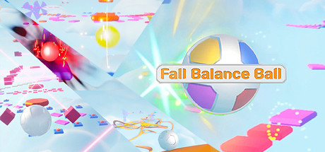
Fall Balance Ball scores 70/100 — better than 30% of Steam capsules we've analysed (n=22,658).

4 user reviews · $2.04 · Released Jan 11, 2021 · By Livinskii Aleksandr

Quick text summary

Fall Balance Ball scored 70/100 on Steam Analyzer — Good for a Steam capsule. Top priority fix: [genre_clarity] Add a subtle visual cue such as a clock or time indicator, or emphasize the gravity/momentum mechanic more explicitly through motion lines or directional emphasis to communicate the core gameplay loop.

Capsule scores by dimension

  • Genre Clarity: 7/10 — Physics platformer with ball mechanics clear. The central multicolored ball with physics-based visual language (floating particles, motion blur, rainbow platform segments) immediately signals a physics platformer. At TINY size, the ball silhouette and colorful environmental elements remain readable enough to suggest casual action gameplay. However, the 'race against time' mechanic and gravity-combat hook are not visually obvious from the capsule alone—the design leans on the ball protagonist rather than time pressure or gravity mechanics.
  • Title Readability: 8/10 — Orange outline title readable at all sizes. The 'Fall Balance Ball' title uses a bold orange outline on a white/cream rounded rectangle background, positioned centrally in the upper-middle area. The outline and background isolation ensure clarity even at TINY size with no competing visual noise. Letterforms remain distinct and the wordmark does not collapse under compression.
  • Contrast & Color: 8/10 — Strong value separation and vibrant saturation. The light cyan-blue gradient background contrasts sharply against the saturated magenta, orange, yellow, and blue elements throughout the composition. The multicolored ball and neon particle trails read distinctly in grayscale due to strong value separation; the white title background further isolates the text. At SMALL and TINY sizes, the composition maintains silhouette clarity because core elements (ball, title, platform segments) use distinct hue and brightness.
  • Uniqueness & Polish: 6/10 — Competent but generic physics platformer aesthetic. The capsule uses professionally rendered 3D assets, clean particle effects, and a cohesive light color palette that feels polished and complete. However, the overall visual composition—floating geometric shapes, neon trails, glowing orbs, and a central ball—closely mirrors dozens of other casual/arcade physics games and does not communicate a distinctive hook or memorable identity. The 'time pressure' and 'superpowers' USPs mentioned in the description are not visually emphasized.
  • Brand Consistency: 6/10 — Consistent rendering style, lacks iconic identity. The 3D rendering style, particle system quality, and color palette are internally cohesive and professional. All visible elements (ball, platforms, particles, UI) share the same art direction and lighting treatment. However, there are no iconic character, symbol, or signature motifs visible that would make this capsule immediately recognizable as 'Fall Balance Ball' in isolation; the design could apply to many similar physics games.
  • Composition: 7/10 — Clear focal point with balanced depth layering. The multicolored ball dominates the center-right area as the primary focal point, supported by layered background platforms and particle effects that create depth and guide the eye. The title sits prominently in the upper-center without obscuring the ball. At SMALL size, the focal hierarchy remains clear; at TINY size, the ball and title are both readable without crowding. Minor spacing issue: the left side (spinning rocket/shape) competes slightly for attention, but does not significantly harm the overall read.

What works

  • Title isolation and readability. The orange outlined text on a contrasting rounded rectangle background ensures legibility across full, small, and tiny viewing sizes without degradation.
  • Vibrant color palette and contrast. Saturated magenta, orange, yellow, and blue elements pop sharply against the light cyan background and maintain silhouette clarity even in grayscale simulation.
  • Cohesive 3D rendering and polish. Consistent lighting, shadow treatment, and particle effects create a professional, complete visual presentation across all assets.

What hurts the capsule

  • Generic visual identity. The capsule lacks memorable or distinctive motifs; the composition could represent any casual physics platformer and does not visually signal the game's unique superpowers or time-pressure mechanic.
  • Competing focal elements. The spinning shape on the left side (rocket or energy burst) draws attention away from the main ball, creating slight visual noise that dilutes the primary focal point.
  • Missing USP visual emphasis. The description highlights time pressure and gravity combat as core mechanics, but neither concept is visually communicated through iconography or composition in the capsule.

Priority fixes

  1. [genre_clarity] Add a subtle visual cue such as a clock or time indicator, or emphasize the gravity/momentum mechanic more explicitly through motion lines or directional emphasis to communicate the core gameplay loop.
  2. [uniqueness_polish] Introduce a signature character or symbolic motif (e.g., a unique ball texture, iconic superpower visual, or distinctive platform shape) that differentiates the game from generic physics platformers and improves brand recognition.
  3. [composition] Reduce or reposition the left-side competing element (spinning shape) to strengthen the central ball as the sole primary focal point and reduce visual clutter.

Store copy priority fixes

  1. [uniqueness] Name and explain one concrete superpower mechanic (e.g., "freeze time to slow gravity," "shift the ball's weight mid-air") to differentiate from generic physics platformers.
  2. [feature_communication] Add a bulleted list of 3–4 core mechanics: what the ball does, what obstacles require, what crystals provide, and how leaderboards are scored.
  3. [tone_match] Rewrite the opening of the detailed description to drop flowery adjectives and use plain, confident language suited to arcade platformers (e.g., "Guide your ball through 20+ levels of tricky jumps, momentum puzzles, and timing challenges").
  4. [hook_strength] Clarify the time-pressure mechanic in the short description: is there a countdown timer, or is 'time' purely about chasing fast completion times on the leaderboard?

Related guides

Steam app ID: 1496470