Scoring genre clarity...

Captains of the Wacky Waters capsule

Captains of the Wacky Waters

Sail across the Wacky Waters to reach Heaven alive. Loot, shoot and defeat other captains as you find more crew members and upgrade your ship with new cannons and crazy gadgets. Sink. Repeat.

$7.99Positive(20)
Action RoguelikeRoguelitePirates
Ceiling GamesAug 11, 2023

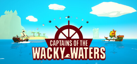
Captains of the Wacky Waters scores 70/100 — better than 30% of Steam capsules we've analysed (n=22,658).

Positive (20 reviews) · $7.99 · Released Aug 11, 2023 · By Ceiling Games

Quick text summary

Captains of the Wacky Waters scored 70/100 on Steam Analyzer — Good for a Steam capsule. Top priority fix: [title_readability] Condense the title treatment so 'WACKY WATERS' is the dominant large text and 'CAPTAINS OF THE' is visually subordinate but still legible, reducing collapse at tiny size.

Capsule scores by dimension

  • Genre Clarity: 8/10 — Pirate nautical action clear. The central ship wheel icon, two cartoon pirate ships flanking the composition, and open ocean setting immediately communicate a nautical pirate theme. At tiny size the ship wheel silhouette and bright ocean background still read as a seafaring game, and the cartoonish style hints at a lighthearted action or adventure tone. Genre is clear though the roguelite or combat-depth elements are not implied visually.
  • Title Readability: 7/10 — Readable at small, cramped at tiny. The bold white text with a dark red banner backing provides solid contrast at full and small sizes, making 'CAPTAINS OF THE WACKY WATERS' legible. At tiny thumbnail size the word 'CAPTAINS OF THE' shrinks considerably and the multi-line stacked layout compresses, making the secondary line harder to parse quickly. The chunky font choice is a strength but the long title across two lines hurts tiny-size legibility.
  • Contrast & Color: 7/10 — Bright palette pops on dark Steam. The bright blue sky and ocean create strong separation from Steam's dark #1b2838 background, and the white title text with deep red banner provides clear value contrast. The central ship wheel in dark maroon sits well against the mid-tone sky. In grayscale the ships on the left and right edges lose some definition against the water, but the core composition still reads clearly at small size.
  • Uniqueness & Polish: 6/10 — Competent but genre-generic feel. The flat cartoon art style is charming and consistent, and the ship wheel as a central hero element is a smart thematic choice. However the overall composition feels like a standard indie pirate game banner without a strong unique hook or visual storytelling moment that differentiates it from similar titles. The polish level is competent but not distinctive enough to stand out in a crowded scroll compared to top indie benchmarks like DAVE THE DIVER or Balatro.
  • Brand Consistency: 7/10 — Cohesive cartoon nautical identity. The flat low-poly cartoon style is internally coherent across the sky, ocean, ships, and island elements, suggesting a consistent art direction. The dark red and white color pairing on the title treatment feels like a deliberate brand choice that could carry across screens. The ship wheel motif is a strong recurring identity anchor, though the overall palette is fairly common for the subgenre.
  • Composition: 7/10 — Centered focal point, balanced layout. The ship wheel centered in the mid-frame creates a clear focal anchor, with the title text directly below it forming a natural reading hierarchy. The two ships placed symmetrically on left and right edges frame the composition without competing with the center. At small size the layout holds reasonably well, though the left ship and island get cropped or lost at tiny sizes, and the large sky area above the wheel feels like underutilized prime real estate.

What works

  • Clear nautical genre signal. The central ship wheel icon and flanking pirate ships immediately communicate the seafaring theme even at small sizes.
  • Strong title contrast. White bold text on a deep red banner creates reliable readability against varied backgrounds including Steam dark.
  • Internally consistent cartoon style. The flat low-poly art direction is cohesive across all visible elements, creating a unified visual identity.
  • Bright palette separates from Steam dark background. The light blue sky and ocean create immediate value contrast against #1b2838, making the capsule pop in browse.

What hurts the capsule

  • Long title collapses at tiny size. The four-word top line 'CAPTAINS OF THE' becomes very small at 120x45 and risks being unreadable during quick scroll.
  • Underutilized upper sky region. The large blank sky area above the ship wheel wastes prime real estate that could reinforce genre or add visual drama.
  • No unique visual hook or gameplay moment. The composition shows a generic pirate scene rather than a specific gameplay mechanic or memorable character that differentiates this title.
  • Edge ships lose detail at tiny size. The flanking ships blend into the ocean at thumbnail size, reducing the sense of action and depth in the smallest viewing context.

Priority fixes

  1. [title_readability] Condense the title treatment so 'WACKY WATERS' is the dominant large text and 'CAPTAINS OF THE' is visually subordinate but still legible, reducing collapse at tiny size.
  2. [uniqueness_polish] Replace the generic pirate scene composition with a single hero character or ship in a dynamic action moment that communicates the roguelite shoot-and-sink gameplay loop.
  3. [composition] Use the upper sky region to add a dramatic lighting element, storm effect, or heavenly destination motif that creates depth and fills dead space with thematic content.
  4. [contrast_color] Add a subtle dark vignette or atmospheric gradient around the ship edges to sharpen silhouette separation from the background in grayscale and at tiny size.

Store copy priority fixes

  1. [hook_strength] Rewrite the opening line of the detailed description to lead with a distinctive mechanic or visual hook instead of 'boat roguelike'—e.g., 'Combine the wind and your crew's strength to fight across a procedurally generated ocean where every captain and kraken wears its own hat.'
  2. [feature_communication] Add 2-3 sentences explaining combat mechanics (how targeting works, ranged vs. melee distinction, positioning importance) and ship upgrade progression so players understand how they grow stronger between runs.
  3. [audience_targeting] Clarify difficulty level and difficulty settings in one sentence—e.g., note whether permadeath is toggleable, if there are assist options, or if the game is balanced for casual or hardcore roguelike players.
  4. [uniqueness] Emphasize what makes naval roguelike combat distinct—e.g., mention how wind mechanics or crew positioning during combat differentiate this from land-based roguelikes.

Related guides

Steam app ID: 1571130