Scoring genre clarity...

Strange Horticulture capsule

Strange Horticulture

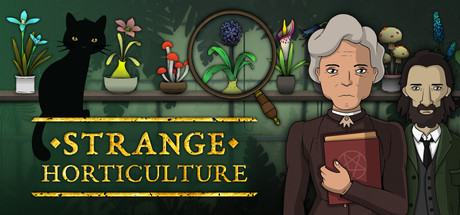
Strange Horticulture is an occult puzzle game in which you play as the proprietor of a local plant store. Find and identify new plants, pet your cat, speak to a coven, or join a cult. Use your collection of powerful plants to influence the story and unravel Undermere’s dark mysteries.

$5.43Overwhelmingly Positive(226)
MysteryPuzzleCozy
Bad VikingJan 21, 2022

Strange Horticulture scores 72/100 — better than 44% of Steam capsules we've analysed (n=22,658).

Overwhelmingly Positive (226 reviews) · $5.43 · Released Jan 21, 2022 · By Bad Viking

Quick text summary

Strange Horticulture scored 72/100 on Steam Analyzer — Good for a Steam capsule. Top priority fix: [contrast_color] Add a subtle dark vignette or shadow behind the character group to lift them off the warm background and improve silhouette separation in grayscale

Capsule scores by dimension

  • Genre Clarity: 7/10 — Occult mystery puzzle vibes clear. The illustrated map background, magnifying glass, botanical journal entry, hooded figures, and a red book with a pentagram strongly suggest an occult mystery or narrative puzzle game. At small size the hooded cloaked figure and the elderly woman holding the occult book still read as mysterious and story-driven. At tiny size the genre narrows to dark narrative or mystery but the plant store simulation angle is completely invisible, which is acceptable since the occult puzzle identity is the stronger sell.
  • Title Readability: 7/10 — Gold title reads well at small. The title 'STRANGE HORTICULTURE' is set in a bold serif font with gold coloring and decorative diamond bullet separators, placed on a dark horizontal band that provides solid contrast. At small capsule size the two-line stack reads clearly due to the controlled dark strip behind it. At tiny size 'STRANGE' remains legible but 'HORTICULTURE' compresses and the individual letterforms become harder to distinguish, though the gold band still draws the eye to the correct region.
  • Contrast & Color: 6/10 — Warm mid tones blend somewhat. The overall palette is warm sepia and earthy brown with muted greens, which blends with the Steam dark background less than a high-contrast capsule would. The characters sit against the map background in similar warm tones, reducing silhouette separation especially for the dark-clothed hooded figure. The gold title band is the strongest contrast element and saves the piece, but in grayscale the characters and background merge into a similar mid-tone mass, weakening pop at small and tiny sizes.
  • Uniqueness & Polish: 8/10 — Distinctive illustrated occult aesthetic. The hand-drawn illustration style, botanical journal prop in the upper left, the magnifying glass revealing a map, and the ensemble of morally ambiguous-looking characters all communicate a very specific and premium game identity. The decorative gold title treatment with diamond separators feels intentional and thematically matched. Compared to genre benchmarks like Slay the Princess or Chants of Sennaar the capsule holds its own with a coherent visual theme that avoids feeling generic or asset-store assembled.
  • Brand Consistency: 8/10 — Cohesive illustrated occult identity. The flat vector illustration style, warm sepia map background, botanical herbarium prop, occult symbols, and ensemble character design are all internally consistent with a single art direction. The color palette of warm browns, gold, and muted greens with dark outlines creates a recognizable signature. The title lockup with gold serif type and decorative separators reinforces the antique occult shopkeeper identity and would be recognizable as part of a consistent brand family.
  • Composition: 7/10 — Characters right, title anchored center. The three characters are arranged right of center with the primary protagonist elderly woman slightly forward, creating a loose focal hierarchy. The botanical journal prop upper left and the map magnifier center-left provide background interest and context without overwhelming the characters. The title band anchors the lower third cleanly. At small size the composition holds with characters and title both visible, but at tiny size the multi-character grouping compresses into an undifferentiated cluster and no single dominant face commands attention.

What works

  • Distinctive illustrated style. The flat hand-drawn art direction is immediately recognizable and premium-feeling compared to photobashed or generic indie capsules in the genre.
  • Gold title band provides anchor. The dark horizontal strip behind the gold serif title ensures readability at small sizes even when the surrounding illustration compresses.
  • Occult props tell the story. The botanical journal, magnifying glass over a map, and red pentagram book efficiently communicate the occult puzzle narrative without needing text.
  • Cohesive warm palette. The consistent sepia and warm earth tones across characters, background, and props create a unified antique atmosphere that feels intentional.

What hurts the capsule

  • Low contrast against Steam background. The warm sepia and brown tones do not separate sharply from Steam's dark blue-grey #1b2838, reducing the capsule's pop during quick scroll.
  • No dominant single focal character at tiny size. Three characters of similar visual weight compress into an undifferentiated cluster at 120x45, removing any single clear hero to anchor viewer attention.
  • Horticulture simulation angle invisible. Nothing in the capsule communicates the plant store management or identification mechanic, which could attract a broader sim audience.
  • Title collapses slightly at tiny size. HORTICULTURE in particular becomes difficult to parse at 120x45, and the decorative separators add visual noise without aiding legibility.

Priority fixes

  1. [contrast_color] Add a subtle dark vignette or shadow behind the character group to lift them off the warm background and improve silhouette separation in grayscale
  2. [composition] Increase the visual prominence of the central elderly protagonist by making her slightly larger or brighter so she functions as a single dominant focal point at tiny size
  3. [title_readability] Slightly increase the font weight or add a thin dark outline to HORTICULTURE to preserve legibility when the capsule is viewed at 120x45
  4. [genre_clarity] Introduce a small but visible plant or herb element closer to the characters to reinforce the horticulture simulation hook alongside the occult mystery cues

Store copy priority fixes

  1. [feature_communication] Clarify the consequence of 'losing your mind'—is it a game over state, a story branch, a mechanic? Replace vague language with mechanical clarity: 'The dark woods and lakes are not always friendly to a simple herbalist. Venture too far unprepared and you risk gaining sanity debuffs or triggering story penalties.'
  2. [genre_clarity] Add one sentence in the detailed description explicitly mentioning the investigative/detective loop: 'Use context clues from customers and the environment to determine which plants to find and where to search—solving the mystery requires both exploration and deduction.'
  3. [feature_communication] Expand the plant effects description with 1–2 concrete examples: 'From hypnotic hallucinogens that unlock secret dialogue to powerful poisons that remove obstacles, each plant unlocks new story paths and solutions.'

Related guides

Steam app ID: 1574580